FabCon is coming to Atlanta
Join us at FabCon Atlanta from March 16 - 20, 2026, for the ultimate Fabric, Power BI, AI and SQL community-led event. Save $200 with code FABCOMM.
Register now!- Power BI forums
- Get Help with Power BI
- Desktop
- Service
- Report Server
- Power Query
- Mobile Apps
- Developer
- DAX Commands and Tips
- Custom Visuals Development Discussion
- Health and Life Sciences
- Power BI Spanish forums
- Translated Spanish Desktop
- Training and Consulting
- Instructor Led Training
- Dashboard in a Day for Women, by Women
- Galleries
- Data Stories Gallery
- Themes Gallery
- Contests Gallery
- QuickViz Gallery
- Quick Measures Gallery
- Visual Calculations Gallery
- Notebook Gallery
- Translytical Task Flow Gallery
- TMDL Gallery
- R Script Showcase
- Webinars and Video Gallery
- Ideas
- Custom Visuals Ideas (read-only)
- Issues
- Issues
- Events
- Upcoming Events
Get Fabric Certified for FREE during Fabric Data Days. Don't miss your chance! Request now
- Power BI forums
- Forums
- Get Help with Power BI
- Desktop
- Line Chart - Measure Name in Y Axis
- Subscribe to RSS Feed
- Mark Topic as New
- Mark Topic as Read
- Float this Topic for Current User
- Bookmark
- Subscribe
- Printer Friendly Page
- Mark as New
- Bookmark
- Subscribe
- Mute
- Subscribe to RSS Feed
- Permalink
- Report Inappropriate Content
Line Chart - Measure Name in Y Axis
Hello All,
We have a Line Chart with 3 Measures so we represented 3 lines in the chart. Our requirement is to disable the name of 2 Measures from the Y Axis as these information is laready available in the legend.
How to achieve it?
Thanks,
PBI V2
Solved! Go to Solution.
- Mark as New
- Bookmark
- Subscribe
- Mute
- Subscribe to RSS Feed
- Permalink
- Report Inappropriate Content
Hi @Anonymous
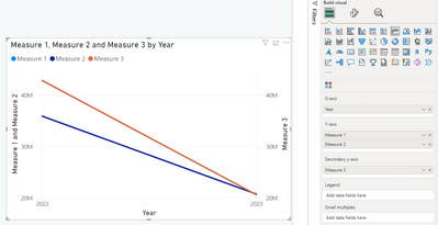
From your description, it seems like you have a line chart similar to this one:
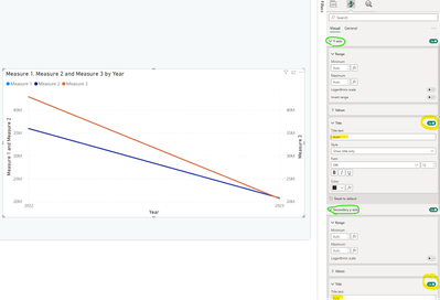
You can adjust the visual options "Format visual".
Using the options, you can either
- turn off Y-axis label and/or secondary Y-axis label
- Customize Title Text. Default is "Auto", i.e. the names of the measures. Here you can specify the axis labels as you want.
See below snip of the visual and the relevant options.
Does this solve your problem?
If so, consider marking the answer as a solution.
If not, consider sharing the visual so it is easier for other user to see what you want to achive.
Kind regards!
- Mark as New
- Bookmark
- Subscribe
- Mute
- Subscribe to RSS Feed
- Permalink
- Report Inappropriate Content
Thanks for your soltuion @Anonymous Customize Title Text has resolved our issue.
- Mark as New
- Bookmark
- Subscribe
- Mute
- Subscribe to RSS Feed
- Permalink
- Report Inappropriate Content
Hi @Anonymous
From your description, it seems like you have a line chart similar to this one:
You can adjust the visual options "Format visual".
Using the options, you can either
- turn off Y-axis label and/or secondary Y-axis label
- Customize Title Text. Default is "Auto", i.e. the names of the measures. Here you can specify the axis labels as you want.
See below snip of the visual and the relevant options.
Does this solve your problem?
If so, consider marking the answer as a solution.
If not, consider sharing the visual so it is easier for other user to see what you want to achive.
Kind regards!
Helpful resources

Power BI Monthly Update - November 2025
Check out the November 2025 Power BI update to learn about new features.

Fabric Data Days
Advance your Data & AI career with 50 days of live learning, contests, hands-on challenges, study groups & certifications and more!


