FabCon is coming to Atlanta
Join us at FabCon Atlanta from March 16 - 20, 2026, for the ultimate Fabric, Power BI, AI and SQL community-led event. Save $200 with code FABCOMM.
Register now!- Power BI forums
- Get Help with Power BI
- Desktop
- Service
- Report Server
- Power Query
- Mobile Apps
- Developer
- DAX Commands and Tips
- Custom Visuals Development Discussion
- Health and Life Sciences
- Power BI Spanish forums
- Translated Spanish Desktop
- Training and Consulting
- Instructor Led Training
- Dashboard in a Day for Women, by Women
- Galleries
- Data Stories Gallery
- Themes Gallery
- Contests Gallery
- QuickViz Gallery
- Quick Measures Gallery
- Visual Calculations Gallery
- Notebook Gallery
- Translytical Task Flow Gallery
- TMDL Gallery
- R Script Showcase
- Webinars and Video Gallery
- Ideas
- Custom Visuals Ideas (read-only)
- Issues
- Issues
- Events
- Upcoming Events
The Power BI Data Visualization World Championships is back! Get ahead of the game and start preparing now! Learn more
- Power BI forums
- Forums
- Get Help with Power BI
- Desktop
- Line Chart - Industry average per year
- Subscribe to RSS Feed
- Mark Topic as New
- Mark Topic as Read
- Float this Topic for Current User
- Bookmark
- Subscribe
- Printer Friendly Page
- Mark as New
- Bookmark
- Subscribe
- Mute
- Subscribe to RSS Feed
- Permalink
- Report Inappropriate Content
Line Chart - Industry average per year
Hi,
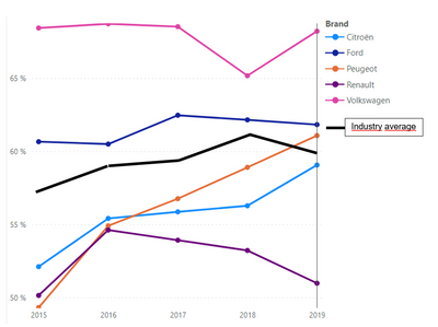
I made a line chart for several brands and with year on axis level.
I need to add an average line for automotive industry (all brands selected) on this graph per year.
As I put the brand in legend, I don't see how to make it. Any idea ?
I draw it in black on this example :
- Mark as New
- Bookmark
- Subscribe
- Mute
- Subscribe to RSS Feed
- Permalink
- Report Inappropriate Content
Hi @v-henryk-mstf,
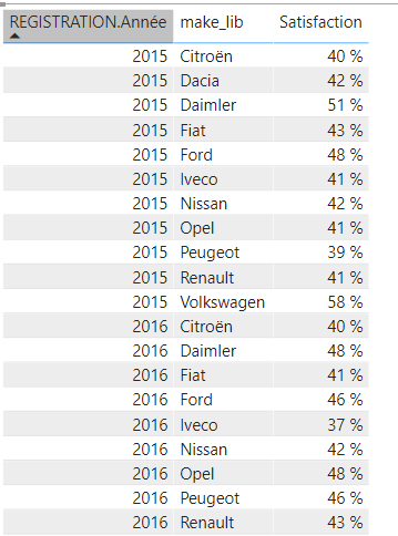
Thank you for answering. Unfortunately I cannot do that as Ford, Renault and Peugeot are values of column BRAND.
Data are as below :
Best regards
Clement
- Mark as New
- Bookmark
- Subscribe
- Mute
- Subscribe to RSS Feed
- Permalink
- Report Inappropriate Content
Hi @clem312 ,
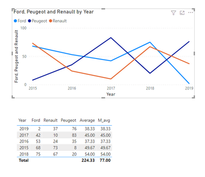
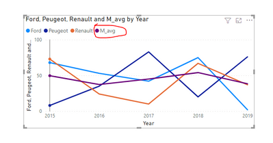
I did a test, and the reference is as follows: You can create a measure or calculated column to find the average value in different years. Then put it in the "value" in the line visual.
M_avg = (MAX('Table (2)'[Ford])+MAX('Table (2)'[Peugeot])+MAX('Table (2)'[Renault]))/3Average = ('Table (2)'[Ford]+'Table (2)'[Peugeot]+'Table (2)'[Renault])/3
If the problem is still not resolved, please provide detailed error information and let me know immediately. Looking forward to your reply.
Best Regards,
Henry
If this post helps, then please consider Accept it as the solution to help the other members find it more quickly.
Helpful resources

Power BI Dataviz World Championships
The Power BI Data Visualization World Championships is back! Get ahead of the game and start preparing now!

| User | Count |
|---|---|
| 39 | |
| 37 | |
| 33 | |
| 32 | |
| 29 |
| User | Count |
|---|---|
| 132 | |
| 88 | |
| 82 | |
| 68 | |
| 64 |


