A new Data Days event is coming soon!
This time we’re going bigger than ever. Fabric, Power BI, SQL, AI and more. We're covering it all. You won't want to miss it.
Learn more- Power BI forums
- Get Help with Power BI
- Desktop
- Service
- Report Server
- Power Query
- Mobile Apps
- Developer
- DAX Commands and Tips
- Custom Visuals Development Discussion
- Health and Life Sciences
- Power BI Spanish forums
- Translated Spanish Desktop
- Training and Consulting
- Instructor Led Training
- Dashboard in a Day for Women, by Women
- Galleries
- Data Stories Gallery
- Themes Gallery
- Contests Gallery
- QuickViz Gallery
- Quick Measures Gallery
- Visual Calculations Gallery
- Notebook Gallery
- Translytical Task Flow Gallery
- TMDL Gallery
- R Script Showcase
- Webinars and Video Gallery
- Ideas
- Custom Visuals Ideas (read-only)
- Issues
- Issues
- Events
- Upcoming Events
Level up your Power BI skills this month - build one visual each week and tell better stories with data! Get started
- Power BI forums
- Forums
- Get Help with Power BI
- Desktop
- Re: Line Chart: Conditional Formatting
- Subscribe to RSS Feed
- Mark Topic as New
- Mark Topic as Read
- Float this Topic for Current User
- Bookmark
- Subscribe
- Printer Friendly Page
- Mark as New
- Bookmark
- Subscribe
- Mute
- Subscribe to RSS Feed
- Permalink
- Report Inappropriate Content
Line Chart: Conditional Formatting
Hi,
I'm trying to visualise e.g.. sales for a product during a year with campaign periods.
Say the product was on campaign in Q1 and Q3 and not Q2 and Q4, I would like to show this in a line chart with different colours for campaign and not campaign. Is this possible? And can you apply this for several products (lines) in the same chart area?
Kind regards SirLearnALot
Solved! Go to Solution.
- Mark as New
- Bookmark
- Subscribe
- Mute
- Subscribe to RSS Feed
- Permalink
- Report Inappropriate Content
Hi @Sirlearnalot,
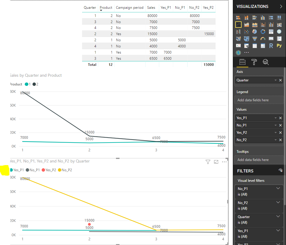
For your scenario, you should create the four measures below to achieve your desired output.
Yes_P1 = CALCULATE(SELECTEDVALUE(Table1[Sales]),FILTER('Table1','Table1'[Campaign period]="Yes"&&'Table1'[Product]=1))

Yes_P2 = CALCULATE(SELECTEDVALUE(Table1[Sales]),FILTER('Table1','Table1'[Campaign period]="Yes"&&'Table1'[Product]=2))

No_P1 = CALCULATE(SELECTEDVALUE(Table1[Sales]),FILTER('Table1','Table1'[Campaign period]="No"&&'Table1'[Product]=1))

No_P2 = CALCULATE(SELECTEDVALUE(Table1[Sales]),FILTER('Table1','Table1'[Campaign period]="No"&&'Table1'[Product]=2))
Then you drag these measure to Values Field to create the line chart.
In addition, you could refer to this attachment.
Best Regards,
Cherry
If this post helps, then please consider Accept it as the solution to help the other members find it more quickly.
- Mark as New
- Bookmark
- Subscribe
- Mute
- Subscribe to RSS Feed
- Permalink
- Report Inappropriate Content
We have this workaround which is simple to implement
Conditional Format a line chart in Power BI - Select Distinct
- Mark as New
- Bookmark
- Subscribe
- Mute
- Subscribe to RSS Feed
- Permalink
- Report Inappropriate Content
Hi @Sirlearnalot,
I'm not very clear about your scenario.
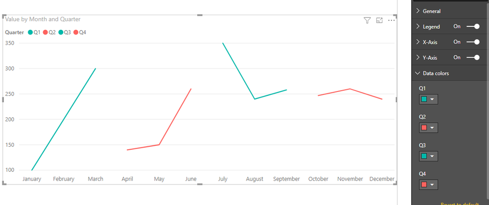
It seems that there is no direct option of conditional formatting for line chart, but we could set the color each line based on legend.
If you do not have the column for legend, we could create the measure to achieve it.
You could have a reference of this similar thread.
If you still need help, please share some data sample so that I can copy and test to get your desired output.
Best Regards,
Cherry
If this post helps, then please consider Accept it as the solution to help the other members find it more quickly.
- Mark as New
- Bookmark
- Subscribe
- Mute
- Subscribe to RSS Feed
- Permalink
- Report Inappropriate Content
Thank you @v-piga-msft !
To explain what I mean:
I want to show Quarter on x, Sales on Y and Product as the legend, but with colour change if Campaign period says yes or no.
| Product | Sales | Quarter | Campaign period |
| 1 | 7000 | 1 | Yes |
| 1 | 5000 | 2 | No |
| 1 | 6500 | 3 | Yes |
| 1 | 4000 | 4 | No |
| 2 | 80000 | 1 | No |
| 2 | 15000 | 2 | Yes |
| 2 | 7000 | 3 | No |
| 2 | 7500 | 4 | No |
I saw the post you referred to and it's exactly the result I want, but not sure how to apply it when it's a "4th variable", maybe I can structure the data differently?
- Mark as New
- Bookmark
- Subscribe
- Mute
- Subscribe to RSS Feed
- Permalink
- Report Inappropriate Content
Hi @Sirlearnalot,
For your scenario, you should create the four measures below to achieve your desired output.
Yes_P1 = CALCULATE(SELECTEDVALUE(Table1[Sales]),FILTER('Table1','Table1'[Campaign period]="Yes"&&'Table1'[Product]=1))

Yes_P2 = CALCULATE(SELECTEDVALUE(Table1[Sales]),FILTER('Table1','Table1'[Campaign period]="Yes"&&'Table1'[Product]=2))

No_P1 = CALCULATE(SELECTEDVALUE(Table1[Sales]),FILTER('Table1','Table1'[Campaign period]="No"&&'Table1'[Product]=1))

No_P2 = CALCULATE(SELECTEDVALUE(Table1[Sales]),FILTER('Table1','Table1'[Campaign period]="No"&&'Table1'[Product]=2))
Then you drag these measure to Values Field to create the line chart.
In addition, you could refer to this attachment.
Best Regards,
Cherry
If this post helps, then please consider Accept it as the solution to help the other members find it more quickly.
- Mark as New
- Bookmark
- Subscribe
- Mute
- Subscribe to RSS Feed
- Permalink
- Report Inappropriate Content
Hi,
Sorry for late replay! I actually solved it in an other way and got the result I was looking for:

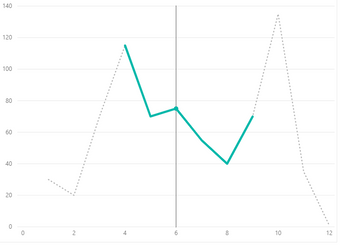
The dotted line is the "no campaign" and the green the campaign period during the year.
What I did was to put the values for "campaign" and "no campaign" in different columns (even though they represent total quantity for that period) and then made a measure:
And then put TotalQuantity and Quantity Campaign as values.
Helpful resources

Power BI Monthly Update - April 2026
Check out the April 2026 Power BI update to learn about new features.

Data Days 2026 coming soon!
Sign up to receive a private message when registration opens and key events begin.

New to Fabric Survey
If you have recently started exploring Fabric, we'd love to hear how it's going. Your feedback can help with product improvements.

| User | Count |
|---|---|
| 38 | |
| 29 | |
| 28 | |
| 20 | |
| 18 |
| User | Count |
|---|---|
| 66 | |
| 34 | |
| 31 | |
| 25 | |
| 23 |


