A new Data Days event is coming soon!
This time we’re going bigger than ever. Fabric, Power BI, SQL, AI and more. We're covering it all. You won't want to miss it.
Learn more- Power BI forums
- Get Help with Power BI
- Desktop
- Service
- Report Server
- Power Query
- Mobile Apps
- Developer
- DAX Commands and Tips
- Custom Visuals Development Discussion
- Health and Life Sciences
- Power BI Spanish forums
- Translated Spanish Desktop
- Training and Consulting
- Instructor Led Training
- Dashboard in a Day for Women, by Women
- Galleries
- Data Stories Gallery
- Themes Gallery
- Contests Gallery
- QuickViz Gallery
- Quick Measures Gallery
- Visual Calculations Gallery
- Notebook Gallery
- Translytical Task Flow Gallery
- TMDL Gallery
- R Script Showcase
- Webinars and Video Gallery
- Ideas
- Custom Visuals Ideas (read-only)
- Issues
- Issues
- Events
- Upcoming Events
Level up your Power BI skills this month - build one visual each week and tell better stories with data! Get started
- Power BI forums
- Forums
- Get Help with Power BI
- Desktop
- Line Chart Conditional Formatting with Multiple Li...
- Subscribe to RSS Feed
- Mark Topic as New
- Mark Topic as Read
- Float this Topic for Current User
- Bookmark
- Subscribe
- Printer Friendly Page
- Mark as New
- Bookmark
- Subscribe
- Mute
- Subscribe to RSS Feed
- Permalink
- Report Inappropriate Content
Line Chart Conditional Formatting with Multiple Lines
Hi there,
I have been working at this for a while with no luck - hoping someone in the community can help!
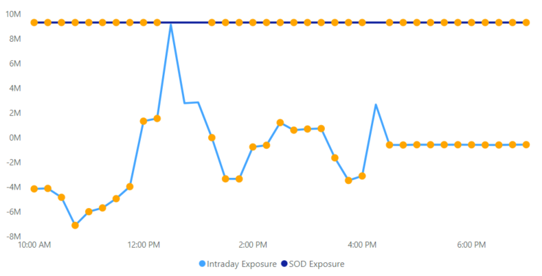
I have a line chart that I have applied conditional formatting to so that I can see dots appear on the line after a field reaches a certain threshold. However, I need to display two lines on this line chart and I only want the dots to show up on one of them. I followed these instructions to create these dots: https://www.biinsight.com/quick-tips-line-chart-and-area-chart-conditional-formatting-in-power-bi/
My measure to create the condition is (I am hoping to apply the conditional formatting to ONLY the Intraday Exposure line - possibly something I can modify here?):
Perc Change Conditional Formatting =
var selection = SELECTEDVALUE('NSCC Intraday'[Intraday Exposure])
return
SWITCH(TRUE()
, ISBLANK([All Account % Change Tooltip]), BLANK()
, [All Account % Change] <= -80, "Orange"
, BLANK()
)
Results right now (Again, I only want the dots on the Intraday Exposure line, NOT the SOD Exposure line):
- Mark as New
- Bookmark
- Subscribe
- Mute
- Subscribe to RSS Feed
- Permalink
- Report Inappropriate Content
Facing similar issue
- Mark as New
- Bookmark
- Subscribe
- Mute
- Subscribe to RSS Feed
- Permalink
- Report Inappropriate Content
Hi @Anonymous
you might consider creating pbix file that will contain some sample data (remove the confidential info), upload the pbix to onedrive for business and share the link to the file. Please do not forget to describe the expected results based on this sample data.
If this post helps, then please consider Accept it as the solution to help the other members find it more
quickly.
Helpful resources

Power BI Monthly Update - April 2026
Check out the April 2026 Power BI update to learn about new features.

Data Days 2026 coming soon!
Sign up to receive a private message when registration opens and key events begin.

New to Fabric Survey
If you have recently started exploring Fabric, we'd love to hear how it's going. Your feedback can help with product improvements.

| User | Count |
|---|---|
| 36 | |
| 33 | |
| 31 | |
| 24 | |
| 18 |
| User | Count |
|---|---|
| 70 | |
| 50 | |
| 33 | |
| 24 | |
| 24 |

