FabCon is coming to Atlanta
Join us at FabCon Atlanta from March 16 - 20, 2026, for the ultimate Fabric, Power BI, AI and SQL community-led event. Save $200 with code FABCOMM.
Register now!- Power BI forums
- Get Help with Power BI
- Desktop
- Service
- Report Server
- Power Query
- Mobile Apps
- Developer
- DAX Commands and Tips
- Custom Visuals Development Discussion
- Health and Life Sciences
- Power BI Spanish forums
- Translated Spanish Desktop
- Training and Consulting
- Instructor Led Training
- Dashboard in a Day for Women, by Women
- Galleries
- Data Stories Gallery
- Themes Gallery
- Contests Gallery
- QuickViz Gallery
- Quick Measures Gallery
- Visual Calculations Gallery
- Notebook Gallery
- Translytical Task Flow Gallery
- TMDL Gallery
- R Script Showcase
- Webinars and Video Gallery
- Ideas
- Custom Visuals Ideas (read-only)
- Issues
- Issues
- Events
- Upcoming Events
Get Fabric Certified for FREE during Fabric Data Days. Don't miss your chance! Request now
- Power BI forums
- Forums
- Get Help with Power BI
- Desktop
- Re: Let visual be ignored by specific filter(s)
- Subscribe to RSS Feed
- Mark Topic as New
- Mark Topic as Read
- Float this Topic for Current User
- Bookmark
- Subscribe
- Printer Friendly Page
- Mark as New
- Bookmark
- Subscribe
- Mute
- Subscribe to RSS Feed
- Permalink
- Report Inappropriate Content
Let visual be ignored by specific filter(s)
Hi all,
We're running into a problem regarding filtering on a visual. The visual uses "Week" for the x axis, throughout the report we are using the filters "Week", "Month" and "Year" to filter visuals using the filter pane (we're not using slicers in our reports). These 3 fields are part of the same table in our dataset.
We want to set up some visuals so that these filters don't affect specific visuals (these visuals need to show all weeks all the time). We've tried using:
CALCULATE ( SUM( [Amount] ) , ALL ( CALENDAR ) )
but without success. The visual continues to change when we use the filters in the filter pane.
What are we missing here?
Thanks!
Solved! Go to Solution.
- Mark as New
- Bookmark
- Subscribe
- Mute
- Subscribe to RSS Feed
- Permalink
- Report Inappropriate Content
Hi @Anonymous ,
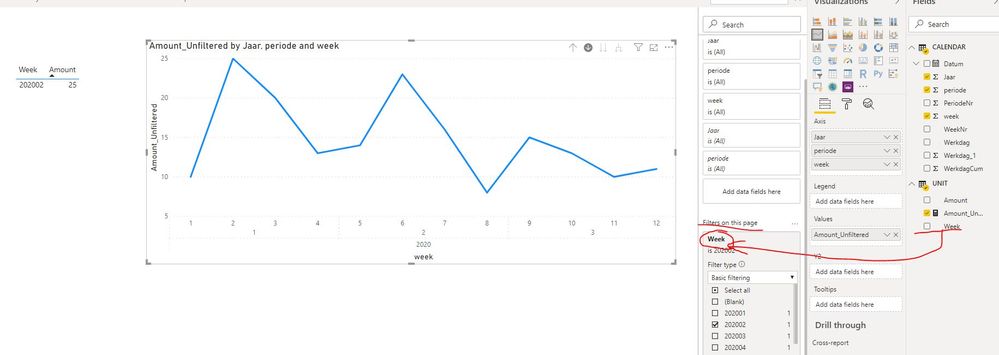
Could you please try to add the field "week" of table "UNIT" into Filters pane instead of the field "WeekNr" of table "CALENDAR"?
Best Regards
Rena
- Mark as New
- Bookmark
- Subscribe
- Mute
- Subscribe to RSS Feed
- Permalink
- Report Inappropriate Content
Hi @Anonymous ,
Which table the field Amount is from? Please try to change the table CALENDAR in the formula to the table where the field amount is:
| CALCULATE ( SUM( [Amount] ) , ALL ( TABLENAME) ) |
Best Regards
Rena
- Mark as New
- Bookmark
- Subscribe
- Mute
- Subscribe to RSS Feed
- Permalink
- Report Inappropriate Content
Hello @Anonymous ,
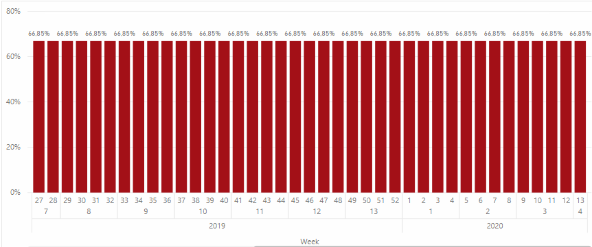
When I do that, the graph shows the total amount for every week. I get a horizontal line, which is not correct.
- Mark as New
- Bookmark
- Subscribe
- Mute
- Subscribe to RSS Feed
- Permalink
- Report Inappropriate Content
Hi @Anonymous ,
Could you please provide the fields which applied to this column chart and some sample data(exclude sensitive data)? Please also provide the formula if applied any measure or calculated column.
Best Regards
Rena
- Mark as New
- Bookmark
- Subscribe
- Mute
- Subscribe to RSS Feed
- Permalink
- Report Inappropriate Content
Of course, the bar chart is made out of two tables:
- CALENDER (ISO based)
- UNIT
X axis: Year, Period, Week hierarchy
Y axis: Amount of units transported
The transport date field of the UNIT table is linked to the date field of the CALENDER table. I've added an example PBI file. The idea is that the table does filter with the week filter, but the graph will always show all weeks. Using slicers are not an option.
Thanks!
- Mark as New
- Bookmark
- Subscribe
- Mute
- Subscribe to RSS Feed
- Permalink
- Report Inappropriate Content
Hi @Anonymous ,
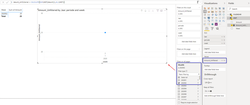
Please check the below screenshot:
Best Regards
Rena
- Mark as New
- Bookmark
- Subscribe
- Mute
- Subscribe to RSS Feed
- Permalink
- Report Inappropriate Content
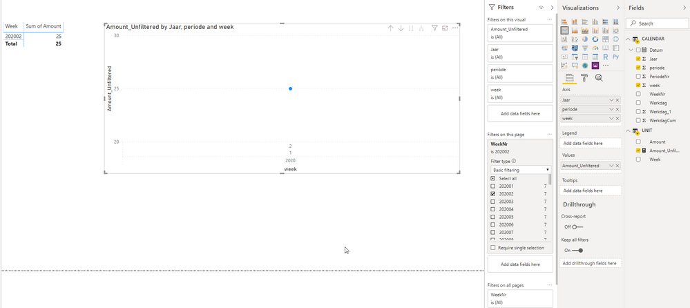
Whoops, I indeed forgot to insert the right data field. However, when I correct this I get the following. For me, it still doesn't work:
- Mark as New
- Bookmark
- Subscribe
- Mute
- Subscribe to RSS Feed
- Permalink
- Report Inappropriate Content
Hi @Anonymous ,
It seems the filter for weeknum be put on report level filter, could you please just put it in page level filter? Then set the filter separately for other report pages one by one...
Best Regards
Rena
- Mark as New
- Bookmark
- Subscribe
- Mute
- Subscribe to RSS Feed
- Permalink
- Report Inappropriate Content
Hello @Anonymous
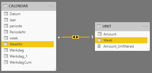
That does not make a difference. Is there maybe something wrong with the relationship between these tables? It's currently a many-to-one with filtering to both directions.
- Mark as New
- Bookmark
- Subscribe
- Mute
- Subscribe to RSS Feed
- Permalink
- Report Inappropriate Content
Hi @Anonymous ,
Whether the filter field applied on page-lvel filter is from the field "Week" in table "Unit"? And the formula of measure "Amount_Unfiltered" as below:
Amount_Unfiltered = CALCULATE(SUM(UNIT[Amount]),ALL('UNIT')) |
Best Regards
Rena
- Mark as New
- Bookmark
- Subscribe
- Mute
- Subscribe to RSS Feed
- Permalink
- Report Inappropriate Content
Hi @Anonymous ,
I am not sure what you mean by that, but the "Week" field on the x axis is from the CALENDER table.
The values on the y axis are from the UNIT table.
The UNIT table does have a "Week" field, but it's not used in the visual, and has a relationship to a "Week" field in the CALENDAR table which is used in the visual.
- Mark as New
- Bookmark
- Subscribe
- Mute
- Subscribe to RSS Feed
- Permalink
- Report Inappropriate Content
Hi @Anonymous ,
Could you please try to add the field "week" of table "UNIT" into Filters pane instead of the field "WeekNr" of table "CALENDAR"?
Best Regards
Rena
- Mark as New
- Bookmark
- Subscribe
- Mute
- Subscribe to RSS Feed
- Permalink
- Report Inappropriate Content
Hi @Anonymous ,
That works, obviously, because the data points are from the same table. I always assumed this worked cross-table as well.
- Mark as New
- Bookmark
- Subscribe
- Mute
- Subscribe to RSS Feed
- Permalink
- Report Inappropriate Content
Hi @Anonymous ,
Is there anything else about this thread that I can assist you? If no, could you please mark the helpful post as Answered? It will be helpful to anyone who might experience the same problem. Thank you.
Best Regards
Rena
- Mark as New
- Bookmark
- Subscribe
- Mute
- Subscribe to RSS Feed
- Permalink
- Report Inappropriate Content
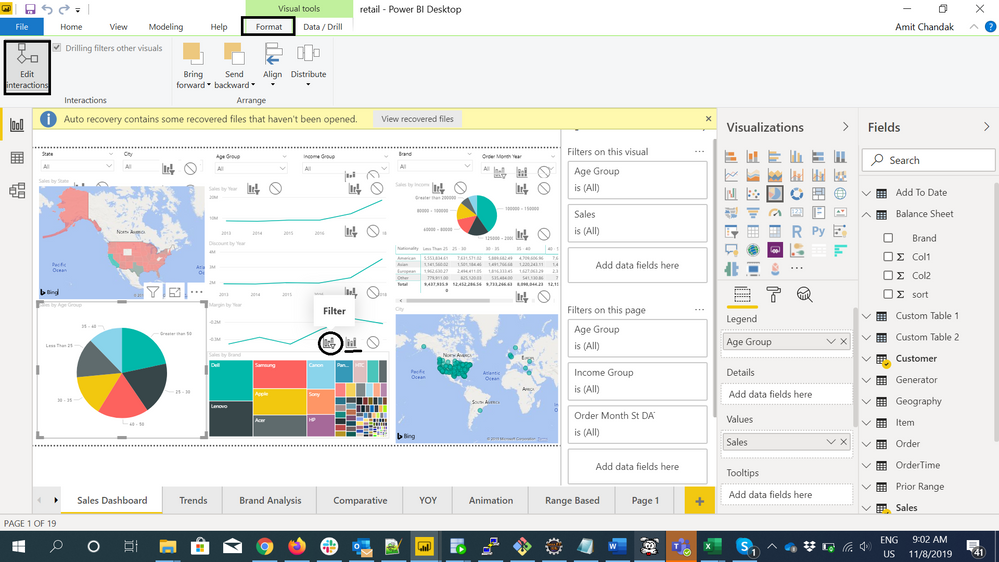
This should have worked. Another option is to use interaction.
https://docs.microsoft.com/en-us/power-bi/service-reports-visual-interactions
Helpful resources

Power BI Monthly Update - November 2025
Check out the November 2025 Power BI update to learn about new features.

Fabric Data Days
Advance your Data & AI career with 50 days of live learning, contests, hands-on challenges, study groups & certifications and more!

