FabCon is coming to Atlanta
Join us at FabCon Atlanta from March 16 - 20, 2026, for the ultimate Fabric, Power BI, AI and SQL community-led event. Save $200 with code FABCOMM.
Register now!- Power BI forums
- Get Help with Power BI
- Desktop
- Service
- Report Server
- Power Query
- Mobile Apps
- Developer
- DAX Commands and Tips
- Custom Visuals Development Discussion
- Health and Life Sciences
- Power BI Spanish forums
- Translated Spanish Desktop
- Training and Consulting
- Instructor Led Training
- Dashboard in a Day for Women, by Women
- Galleries
- Data Stories Gallery
- Themes Gallery
- Contests Gallery
- QuickViz Gallery
- Quick Measures Gallery
- Visual Calculations Gallery
- Notebook Gallery
- Translytical Task Flow Gallery
- TMDL Gallery
- R Script Showcase
- Webinars and Video Gallery
- Ideas
- Custom Visuals Ideas (read-only)
- Issues
- Issues
- Events
- Upcoming Events
The Power BI Data Visualization World Championships is back! Get ahead of the game and start preparing now! Learn more
- Power BI forums
- Forums
- Get Help with Power BI
- Desktop
- Re: Legend not working correctly in stacked column...
- Subscribe to RSS Feed
- Mark Topic as New
- Mark Topic as Read
- Float this Topic for Current User
- Bookmark
- Subscribe
- Printer Friendly Page
- Mark as New
- Bookmark
- Subscribe
- Mute
- Subscribe to RSS Feed
- Permalink
- Report Inappropriate Content
Legend not working correctly in stacked column chart
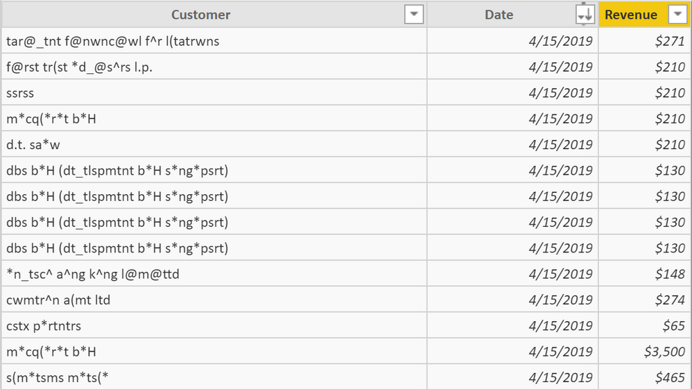
The attached PBIX is a simple Revenue By Customer (anonymized). The data looks like this. I also have a date table.
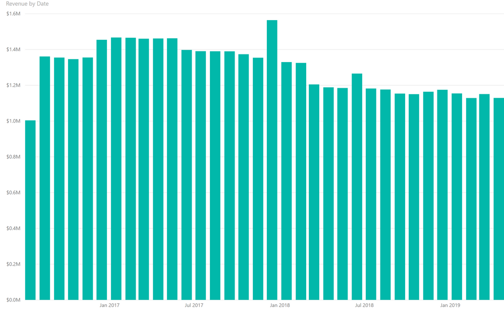
When I do a stacked revenue chart without a Legend, the numbers sum correctly (see first tab).
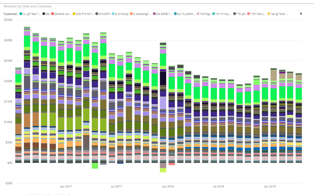
When I do a stacked revenue chart with a Legend, data goes missing and the numbers sum incorrectly.
I've prowled through the support boards and am not finding issues that suggest user error. Is this a bug? It's such a simple table with 1:1 relationships that I'm not seeing the user error here.
Test File Stacked Chart - Revenue By Customer
Thank you
Charlie
Solved! Go to Solution.
- Mark as New
- Bookmark
- Subscribe
- Mute
- Subscribe to RSS Feed
- Permalink
- Report Inappropriate Content
It seems that Power BI simply can not include/calculate all the customers's data.
If you filter data showing the results for a few customers only then the trend will be OK.
- Mark as New
- Bookmark
- Subscribe
- Mute
- Subscribe to RSS Feed
- Permalink
- Report Inappropriate Content
Hi @charleshale
The link to the file you provided is not valid.
I'll try to make a guess of what is happening. I think you have either Customer or Date column sorted by another column. If I am right make it sorted by itself and check the result.
Is my guess correct?
- Mark as New
- Bookmark
- Subscribe
- Mute
- Subscribe to RSS Feed
- Permalink
- Report Inappropriate Content
Apologies for the broken link. Here's it on onedrive: https://1drv.ms/u/s!AkwttVUD7SbrjCLxQ1M6jf0xeryf
Hmmm - is this doing that?
- Mark as New
- Bookmark
- Subscribe
- Mute
- Subscribe to RSS Feed
- Permalink
- Report Inappropriate Content
It seems that Power BI simply can not include/calculate all the customers's data.
If you filter data showing the results for a few customers only then the trend will be OK.
- Mark as New
- Bookmark
- Subscribe
- Mute
- Subscribe to RSS Feed
- Permalink
- Report Inappropriate Content
I agree - seems like a bug, right? I'd expect the stacked chart to be able to handle N customers up to the memory limits, like excel!
- Mark as New
- Bookmark
- Subscribe
- Mute
- Subscribe to RSS Feed
- Permalink
- Report Inappropriate Content
Let's just speculate a bit.
How could a chart represent, for example, 1000 customers, if 200px(for example) is available only.
If 1px is for a customer, then for 1000 customers at least 1000px are needed, but what we have is 200px only.
- Mark as New
- Bookmark
- Subscribe
- Mute
- Subscribe to RSS Feed
- Permalink
- Report Inappropriate Content
@SergiyI agree with you - would be silly to try to cram 1000 customers into 200 px. I like what excel does here:
(i) flip into a clustered column chart instead of a stacked if try a power pivot table, and
(ii) if you then try to go stacked, it will fail, giving a warning of a 255 max series limit.
FWIW - I think something like the foregoing would be a lot better because, at least for me, it was easy in PBIX to get the chart, not see that I was only capturing half my series, and proudly publish the data to my peers, not realizing that the data series was incomplete! Darn! And I was so proud of my work! So, to me the bug is mostly the alerting. This said, charting NIRVANA would be a chart that collapses the smallest n customers in the stack.
Helpful resources

Power BI Monthly Update - November 2025
Check out the November 2025 Power BI update to learn about new features.

Fabric Data Days
Advance your Data & AI career with 50 days of live learning, contests, hands-on challenges, study groups & certifications and more!

| User | Count |
|---|---|
| 58 | |
| 45 | |
| 41 | |
| 20 | |
| 18 |


