FabCon is coming to Atlanta
Join us at FabCon Atlanta from March 16 - 20, 2026, for the ultimate Fabric, Power BI, AI and SQL community-led event. Save $200 with code FABCOMM.
Register now!- Power BI forums
- Get Help with Power BI
- Desktop
- Service
- Report Server
- Power Query
- Mobile Apps
- Developer
- DAX Commands and Tips
- Custom Visuals Development Discussion
- Health and Life Sciences
- Power BI Spanish forums
- Translated Spanish Desktop
- Training and Consulting
- Instructor Led Training
- Dashboard in a Day for Women, by Women
- Galleries
- Data Stories Gallery
- Themes Gallery
- Contests Gallery
- QuickViz Gallery
- Quick Measures Gallery
- Visual Calculations Gallery
- Notebook Gallery
- Translytical Task Flow Gallery
- TMDL Gallery
- R Script Showcase
- Webinars and Video Gallery
- Ideas
- Custom Visuals Ideas (read-only)
- Issues
- Issues
- Events
- Upcoming Events
The Power BI Data Visualization World Championships is back! Get ahead of the game and start preparing now! Learn more
- Power BI forums
- Forums
- Get Help with Power BI
- Desktop
- Re: Legend colors in stacked column chart are not ...
- Subscribe to RSS Feed
- Mark Topic as New
- Mark Topic as Read
- Float this Topic for Current User
- Bookmark
- Subscribe
- Printer Friendly Page
- Mark as New
- Bookmark
- Subscribe
- Mute
- Subscribe to RSS Feed
- Permalink
- Report Inappropriate Content
Legend colors in stacked column chart are not showing up correctly.
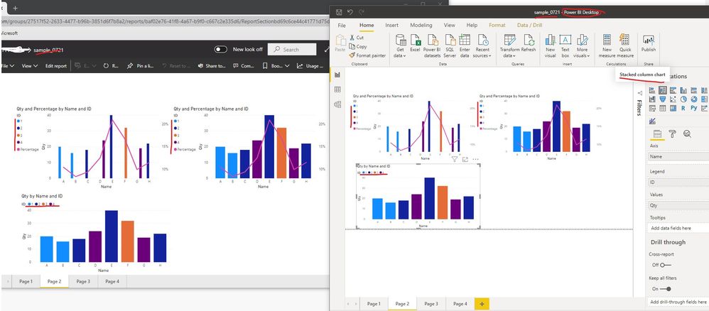
I have a stacked column chart in Desktop, where the legend looks fine.
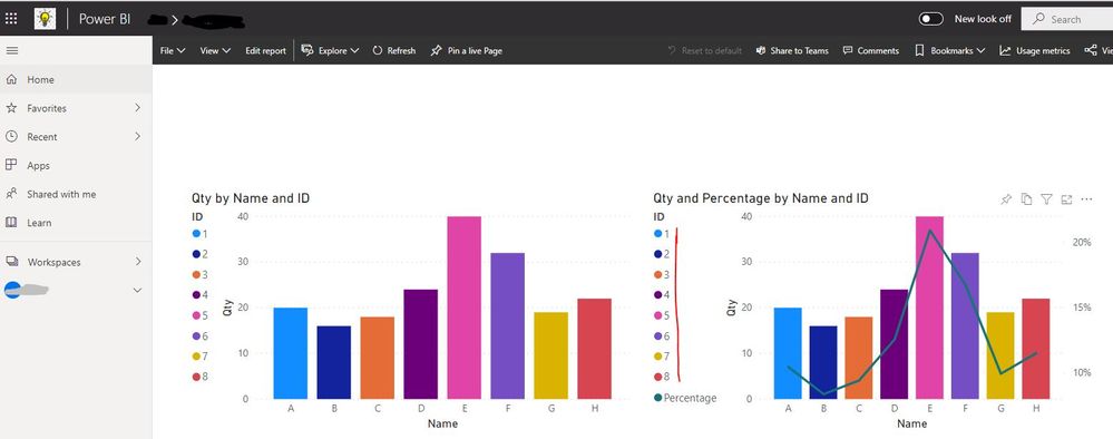
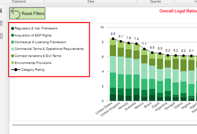
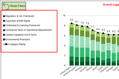
However, in app.powerbi.com, the colors show up as black.
Any suggestions would be greatly appreciated.
Solved! Go to Solution.
- Mark as New
- Bookmark
- Subscribe
- Mute
- Subscribe to RSS Feed
- Permalink
- Report Inappropriate Content
@Anonymous, I can't really see that you're stacking the columns in your charts. Have a look at @paulmorgans charts in the beginning, they are stacked columns. Nevertheless, I've found what causes the error! I can't share images so I'll try to describe in words.
- Use a line/stacked columns chart, just like paulmorgans
- Under Visualizations/Shapes, turn Show marker on
- Everything works fine by default, all colors shows correctly even after publishing to PBI Services
- But if you change the color of the marker (to black in paulmorgans case), the PBI Desktop works fine, but in PBI Service ALL OTHER COLORS WILL ALSO BE BLACK
- Turning back the marker's color to default solves the problem, the different colors will show up again in PBI Service
As I said before, this is a new behaviour, it worked just fine before.
- Mark as New
- Bookmark
- Subscribe
- Mute
- Subscribe to RSS Feed
- Permalink
- Report Inappropriate Content
Thanks @paulmorgan 👍. But it's still a bug that I hope will be resolved asap. I don't want all my markers to be purple!
- Mark as New
- Bookmark
- Subscribe
- Mute
- Subscribe to RSS Feed
- Permalink
- Report Inappropriate Content
@Anonymous, I can't really see that you're stacking the columns in your charts. Have a look at @paulmorgans charts in the beginning, they are stacked columns. Nevertheless, I've found what causes the error! I can't share images so I'll try to describe in words.
- Use a line/stacked columns chart, just like paulmorgans
- Under Visualizations/Shapes, turn Show marker on
- Everything works fine by default, all colors shows correctly even after publishing to PBI Services
- But if you change the color of the marker (to black in paulmorgans case), the PBI Desktop works fine, but in PBI Service ALL OTHER COLORS WILL ALSO BE BLACK
- Turning back the marker's color to default solves the problem, the different colors will show up again in PBI Service
As I said before, this is a new behaviour, it worked just fine before.
- Mark as New
- Bookmark
- Subscribe
- Mute
- Subscribe to RSS Feed
- Permalink
- Report Inappropriate Content
Inge, You are a rock star! Well done! Thank you so much!
- Mark as New
- Bookmark
- Subscribe
- Mute
- Subscribe to RSS Feed
- Permalink
- Report Inappropriate Content
It worked! And I respect the colors put in "Data Colors" 😉
- Mark as New
- Bookmark
- Subscribe
- Mute
- Subscribe to RSS Feed
- Permalink
- Report Inappropriate Content
The thousand separator doesn't work either any more, not only in the line/stacked column chart. Here in Sweden we have space as a separator, and the desktop shows that correctly. But when publishing to Service it translate it to a comma in ALL tables and charts. It didn't do that before. Something must have happened in the latest update of PBI!
- Mark as New
- Bookmark
- Subscribe
- Mute
- Subscribe to RSS Feed
- Permalink
- Report Inappropriate Content
Hello! Today I checked that the filters on this chart also work badly. I have a chart with sales per month, filtered so that it only shows from March to July, and on the web does not respect and takes out January and February as well.
- Mark as New
- Bookmark
- Subscribe
- Mute
- Subscribe to RSS Feed
- Permalink
- Report Inappropriate Content
I have the same problem, just noticed it today, have worked earlier. Yes, it's related to the combo chart "Line and stacked column". The legend colors for the columns will be the same as the color for the line chart. Doesn't help to refresh or re-publish. And it works just fine in PBI Desktop, and it also works fine in PBI Service if only a stacked column chart is used.
Has there been any update of PBI recently?
- Mark as New
- Bookmark
- Subscribe
- Mute
- Subscribe to RSS Feed
- Permalink
- Report Inappropriate Content
I come for the same reason, today I no longer take good colors on the web. It looks like it's something that's going on today, the same thing is fixed for tomorrow!
- Mark as New
- Bookmark
- Subscribe
- Mute
- Subscribe to RSS Feed
- Permalink
- Report Inappropriate Content
- Mark as New
- Bookmark
- Subscribe
- Mute
- Subscribe to RSS Feed
- Permalink
- Report Inappropriate Content
Unfortunately, it didn't work. But thanks for playing!😊
- Mark as New
- Bookmark
- Subscribe
- Mute
- Subscribe to RSS Feed
- Permalink
- Report Inappropriate Content
Hi @paulmorgan ,
Sorry, I can't reproduce your problem. The legend color display in Power BI Service is just same with the ones in Power BI Desktop, you can check the below screen shots for the details. I tested them used different browsers(Chrome, IE and Edge), it works... Which type of browser you are using? And could you please update the version of Power BI Desktop to latest one and republish the report to Power BI Service? Later please check if the problem still exist...


If the problem still persist, you can create a support ticket for asking help if you have a pro license.
Best Regards
Rena
- Mark as New
- Bookmark
- Subscribe
- Mute
- Subscribe to RSS Feed
- Permalink
- Report Inappropriate Content
@Anonymous, you don't use the stacked column chart, that's probably why you can't reproduce it.
- Mark as New
- Bookmark
- Subscribe
- Mute
- Subscribe to RSS Feed
- Permalink
- Report Inappropriate Content
Hi @Inge ,
I just tested Stacked column chart, Line and stacked column chart and Line and clustered column chart, all of them works well in Power BI Service.
Best Regards
Rena
- Mark as New
- Bookmark
- Subscribe
- Mute
- Subscribe to RSS Feed
- Permalink
- Report Inappropriate Content
Figured out it relates to the combo stacked column and line chart. Using just a stacked column chart, it shows up ok.
- Mark as New
- Bookmark
- Subscribe
- Mute
- Subscribe to RSS Feed
- Permalink
- Report Inappropriate Content
Thanks for looking into it.
I'm using the latest version of Power BI.
Wondering if the JSON theme I'm using is messing with it. Seems an unlikely culprit.
I'll check if anyone at our company has a Pro license.
Thanks again.
Helpful resources

Power BI Dataviz World Championships
The Power BI Data Visualization World Championships is back! Get ahead of the game and start preparing now!

| User | Count |
|---|---|
| 41 | |
| 39 | |
| 37 | |
| 29 | |
| 24 |
| User | Count |
|---|---|
| 119 | |
| 100 | |
| 72 | |
| 69 | |
| 65 |


