- Power BI forums
- Updates
- News & Announcements
- Get Help with Power BI
- Desktop
- Service
- Report Server
- Power Query
- Mobile Apps
- Developer
- DAX Commands and Tips
- Custom Visuals Development Discussion
- Health and Life Sciences
- Power BI Spanish forums
- Translated Spanish Desktop
- Power Platform Integration - Better Together!
- Power Platform Integrations (Read-only)
- Power Platform and Dynamics 365 Integrations (Read-only)
- Training and Consulting
- Instructor Led Training
- Dashboard in a Day for Women, by Women
- Galleries
- Community Connections & How-To Videos
- COVID-19 Data Stories Gallery
- Themes Gallery
- Data Stories Gallery
- R Script Showcase
- Webinars and Video Gallery
- Quick Measures Gallery
- 2021 MSBizAppsSummit Gallery
- 2020 MSBizAppsSummit Gallery
- 2019 MSBizAppsSummit Gallery
- Events
- Ideas
- Custom Visuals Ideas
- Issues
- Issues
- Events
- Upcoming Events
- Community Blog
- Power BI Community Blog
- Custom Visuals Community Blog
- Community Support
- Community Accounts & Registration
- Using the Community
- Community Feedback
Earn a 50% discount on the DP-600 certification exam by completing the Fabric 30 Days to Learn It challenge.
- Power BI forums
- Forums
- Get Help with Power BI
- Desktop
- Re: Latest month in X Axis
- Subscribe to RSS Feed
- Mark Topic as New
- Mark Topic as Read
- Float this Topic for Current User
- Bookmark
- Subscribe
- Printer Friendly Page
- Mark as New
- Bookmark
- Subscribe
- Mute
- Subscribe to RSS Feed
- Permalink
- Report Inappropriate Content
Latest month in X Axis
| MONTH | REIGION | SALES |
| DEC-1-2020 | INDIA | 100 |
| DEC-1-2020 | APAC | 245 |
| DEC-1-2020 | ASIA | 345 |
| DEC-1-2020 | NA | 56 |
| DEC-1-2020 | PHIL | 63 |
| DEC-1-2020 | UAE | 345 |
| JAN-1-2021 | INDIA | 563 |
| JAN-1-2021 | APAC | 786 |
| JAN-1-2021 | ASIA | 776 |
| JAN-1-2021 | NA | 866 |
| JAN-1-2021 | PHIL | 875 |
| JAN-1-2021 | UAE | 345 |
As per the above data i have the Month filter.
I need to create a graph (clustered bar chart) which will show the region wise sales.
Criteria - If am selecting all the month then it should show only the latest month data. And if am selecting multiple months then only it should show multiple month data.
i need this is clustered bar chart.
Solved! Go to Solution.
- Mark as New
- Bookmark
- Subscribe
- Mute
- Subscribe to RSS Feed
- Permalink
- Report Inappropriate Content
Hi @unnijoy ,
You can create a calendar table with the below formula:
Calendar =
VAR _mindate =
    MIN ( 'FactTable'[Date] )
VAR _maxdate =
    MAX ( 'FactTable'[Date] )
RETURN
    CALENDAR ( _mindate, _maxdate )
Then create a calculated column as below in this calendar table and drag it on the slicer:
MonthYear = FORMAT('Calendar'[Date],"MMM-YY")Best Regards
If this post helps, then please consider Accept it as the solution to help the other members find it more quickly.
- Mark as New
- Bookmark
- Subscribe
- Mute
- Subscribe to RSS Feed
- Permalink
- Report Inappropriate Content
Hi @unnijoy ,
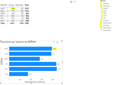
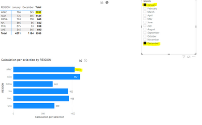
Use the following measure:
Calculation per selection =
IF (
    ISFILTERED ( 'Table'[MONTH].[Month] ),
    SUM ( 'Table'[SALES] ),
    CALCULATE (
        SUM ( 'Table'[SALES] ),
        FILTER ( ALL ( 'Table'[MONTH] ), 'Table'[MONTH] = MAX ( 'Table'[MONTH] ) )
    )
)
Check PBIX File attach.
Regards
Miguel Félix
Did I answer your question? Mark my post as a solution!
Proud to be a Super User!
Check out my blog: Power BI em Português- Mark as New
- Bookmark
- Subscribe
- Mute
- Subscribe to RSS Feed
- Permalink
- Report Inappropriate Content
Hi, @MFelix ,
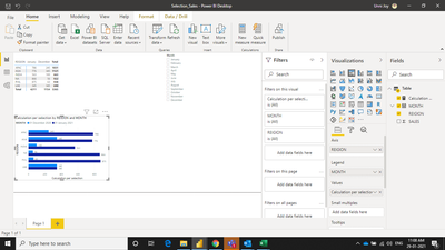
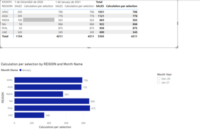
Thanks for your reply. I need to add month to the legend in clustered bar graph. But when i put the month as leend and when i lesect all month insted of showing the latest month it is showing all month. Can you help me to fix this .
I need the month is legend.
And when all months are selected it should show only the latest month. so their will be only one bar. And if i select multiple month manually tnen it shouls show multiple bars based on the selction.
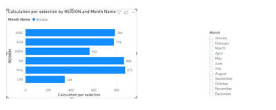
in the above screen shote u can see that all months are selected. currently it is showin multiple months. can we make it only to January. And if i select 2 months then only it shoud show 2 month graph.
Thannks in Advance. 🙂
- Mark as New
- Bookmark
- Subscribe
- Mute
- Subscribe to RSS Feed
- Permalink
- Report Inappropriate Content
Hi @unnijoy ,
For this you need to have a calendar table related with your table and two columns on the Sales with Month and Month name then use the following measure and format:
Calculation per selection =
VAR maximum_date_value =
    MAXX ( ALL ( 'Table'[MONTH] ), 'Table'[MONTH] )
RETURN
    IF (
        ISFILTERED ( 'calendar'[Month] ),
        SUM('Table'[SALES]),
        CALCULATE (
            SUM ( 'Table'[SALES] ),
            FILTER (
                ALL ( 'calendar'[Year], 'calendar'[Monthnº] ),
                'calendar'[Year] = YEAR ( maximum_date_value )
                    && 'calendar'[Monthnº] = MONTH ( maximum_date_value )
            )
        )
    )
Setup of you visualizations:
- Slicer - Month from the calendar table
- Graph:
- Axis Region
- Legend Month Name from the sale table
- Value measure above
PBIX file attach.
Regards
Miguel Félix
Did I answer your question? Mark my post as a solution!
Proud to be a Super User!
Check out my blog: Power BI em Português- Mark as New
- Bookmark
- Subscribe
- Mute
- Subscribe to RSS Feed
- Permalink
- Report Inappropriate Content
Hi @MFelix ,
This work perfect. Only thin i need help is to change the month in the flter to be in Mmm-YY format. And currently it is showing all month. We need that to be based on the month data avilabe in the data. Because we are having other graph in the same page. So we need to use the same month filter.
Please help me to get the month filter in MMM-YY format.
- Mark as New
- Bookmark
- Subscribe
- Mute
- Subscribe to RSS Feed
- Permalink
- Report Inappropriate Content
Hi @unnijoy ,
Not really sure how you have your setup but if ytou add a column with the following code this should do the trick:
Month-Year = Format(Table[Date], "mmm,yy")
Also you will need to add a sorting column for the previous one with the following code:
Month-Year = Format(Table[Date], "yyyymm")
Regards
Miguel Félix
Did I answer your question? Mark my post as a solution!
Proud to be a Super User!
Check out my blog: Power BI em Português- Mark as New
- Bookmark
- Subscribe
- Mute
- Subscribe to RSS Feed
- Permalink
- Report Inappropriate Content
Hi @MFelix ,
Can we customise the Calander table in such a way that it will show the month and year based on the data available in the main Table. so the Calander table will show Only Decemner 2020 and January 2021. When we add moer data in 2021 based on that the mnths whouls add on. In your above set up the filter that we give to clinet will have all month. And even if give the Year filter they will get confused.
Also can we make the month column in Calander Table to MMM-YY. Currently it will show only MMM.
- Mark as New
- Bookmark
- Subscribe
- Mute
- Subscribe to RSS Feed
- Permalink
- Report Inappropriate Content
Hi @unnijoy ,
Sorry for the late response you need to do the following:
- Do your calendar with the following code:
calendar =
ADDCOLUMNS (
    CALENDAR ( MIN ( 'Table'[MONTH] ); MAX ( 'Table'[MONTH] ) );
    "Year"; YEAR ( [Date] );
    "Monthnº"; MONTH ( [Date] );
    "Month"; FORMAT ( [Date]; "mmmm" );
    "Month Year";FORMAT([Date];"mmm-yy");
    "MonthYearSort"; FORMAT([Date];"yyyymm")
)
If your calendar table is done in Advance Editor you just need to make sure that the start date and end date match with the minimum date and maximum date of your data.
- Add the following column to your data table:
MonthYear = FORMAT('Table'[MONTH];"YYYYMM")
- Reajust the measure to the following code:
Calculation per selection =
VAR maximum_date_value =
    MAXX ( ALL ( 'Table'[MonthYear] ); 'Table'[MonthYear] )
RETURN
    IF (
        ISFILTERED ( 'calendar'[Month Year] );
        SUM('Table'[SALES]);
        CALCULATE (
            SUM ( 'Table'[SALES] );
            FILTER (
                ALL ( 'calendar'[MonthYearSort]);
                'calendar'[MonthYearSort] =  maximum_date_value
            )
        )
    )
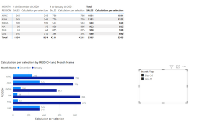
Result below and in attach PBIX file.
Regards
Miguel Félix
Did I answer your question? Mark my post as a solution!
Proud to be a Super User!
Check out my blog: Power BI em Português- Mark as New
- Bookmark
- Subscribe
- Mute
- Subscribe to RSS Feed
- Permalink
- Report Inappropriate Content
Hi @unnijoy ,
You want to have the slicer by the Month Year of the calendar table is that it?
So you oinly show the values that have actuals? Is this correct?
Regards
Miguel Félix
Did I answer your question? Mark my post as a solution!
Proud to be a Super User!
Check out my blog: Power BI em Português- Mark as New
- Bookmark
- Subscribe
- Mute
- Subscribe to RSS Feed
- Permalink
- Report Inappropriate Content
Hi @MFelix ,
You are correct. Lets say currently i have data from December 2020 - January 2021. So the slicer should show only Dec-20 & Jan 21. Next time when i add February 2021 data slicer should show Dec-20, Jan-21 & Feb-21.
So in short the calander table should update the month based on the month available on the main data table. But now in calender table it is showing all month.
How can we make the calander table based on Month data availabe in Main Data Table.
Please note we need the month format in MMM-YY.
Thanks you verymuch for your patience and help.
- Mark as New
- Bookmark
- Subscribe
- Mute
- Subscribe to RSS Feed
- Permalink
- Report Inappropriate Content
Hi @unnijoy ,
You can create a calendar table with the below formula:
Calendar =
VAR _mindate =
    MIN ( 'FactTable'[Date] )
VAR _maxdate =
    MAX ( 'FactTable'[Date] )
RETURN
    CALENDAR ( _mindate, _maxdate )
Then create a calculated column as below in this calendar table and drag it on the slicer:
MonthYear = FORMAT('Calendar'[Date],"MMM-YY")Best Regards
If this post helps, then please consider Accept it as the solution to help the other members find it more quickly.
- Mark as New
- Bookmark
- Subscribe
- Mute
- Subscribe to RSS Feed
- Permalink
- Report Inappropriate Content
hi @v-yiruan-msft ,
Thank for the help. But ho i i make the graph availabe so that if all month is selected then it will show only latest month data. And if multiple months are selected then it should show selected months.
I need the clustered Bar chart.
Helpful resources
| User | Count |
|---|---|
| 107 | |
| 89 | |
| 81 | |
| 76 | |
| 73 |
| User | Count |
|---|---|
| 112 | |
| 104 | |
| 96 | |
| 74 | |
| 66 |

