FabCon is coming to Atlanta
Join us at FabCon Atlanta from March 16 - 20, 2026, for the ultimate Fabric, Power BI, AI and SQL community-led event. Save $200 with code FABCOMM.
Register now!- Power BI forums
- Get Help with Power BI
- Desktop
- Service
- Report Server
- Power Query
- Mobile Apps
- Developer
- DAX Commands and Tips
- Custom Visuals Development Discussion
- Health and Life Sciences
- Power BI Spanish forums
- Translated Spanish Desktop
- Training and Consulting
- Instructor Led Training
- Dashboard in a Day for Women, by Women
- Galleries
- Data Stories Gallery
- Themes Gallery
- Contests Gallery
- QuickViz Gallery
- Quick Measures Gallery
- Visual Calculations Gallery
- Notebook Gallery
- Translytical Task Flow Gallery
- TMDL Gallery
- R Script Showcase
- Webinars and Video Gallery
- Ideas
- Custom Visuals Ideas (read-only)
- Issues
- Issues
- Events
- Upcoming Events
The Power BI Data Visualization World Championships is back! Get ahead of the game and start preparing now! Learn more
- Power BI forums
- Forums
- Get Help with Power BI
- Desktop
- Re: KPI visual conditional formatting on the callo...
- Subscribe to RSS Feed
- Mark Topic as New
- Mark Topic as Read
- Float this Topic for Current User
- Bookmark
- Subscribe
- Printer Friendly Page
- Mark as New
- Bookmark
- Subscribe
- Mute
- Subscribe to RSS Feed
- Permalink
- Report Inappropriate Content
KPI visual conditional formatting on the callout value
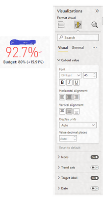
I would like the callout value on the KPI visual (92.7% in the below case) to go green once it exceeds the 80% target value. In the older version of Power BI, this was straightforward. Following the latest update, I cannot find the conditional formatting controls for the callout value. It only gives the option to change text size. I know it can be done because I have lots of KPI visuals and the colours update accordingly, and indeed, the below is stuck on red. The target setting are already on "higher is better". Any guidance would be much appreciated.
- Mark as New
- Bookmark
- Subscribe
- Mute
- Subscribe to RSS Feed
- Permalink
- Report Inappropriate Content
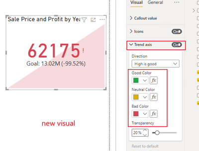
I found a workaround on Microsoft Learn. You have to turn on the Trend Axis and choose your color settings there, then turn it back off and the callout value will maintain the settings.
Key Performance Indicator (KPI) visuals - Power BI | Microsoft Learn
- Mark as New
- Bookmark
- Subscribe
- Mute
- Subscribe to RSS Feed
- Permalink
- Report Inappropriate Content
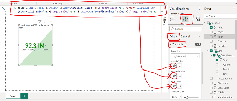
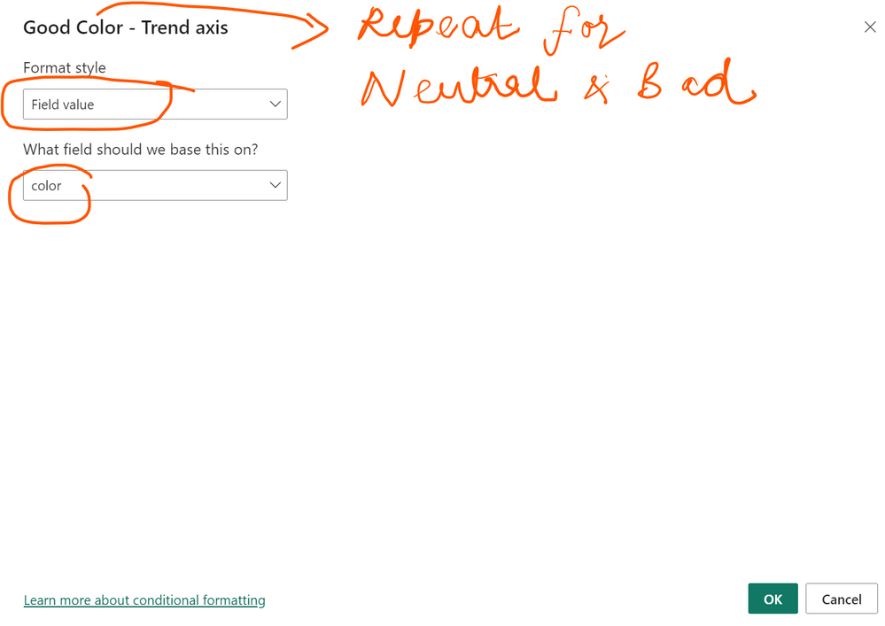
Create a measure as shown below and apply the same measure for conditional formatting of Good, Neutral and Bad
- Mark as New
- Bookmark
- Subscribe
- Mute
- Subscribe to RSS Feed
- Permalink
- Report Inappropriate Content
Padycosmos -
Thank you very much for this response and measure. This solution worked perfectly!
- Mark as New
- Bookmark
- Subscribe
- Mute
- Subscribe to RSS Feed
- Permalink
- Report Inappropriate Content
Hi -
The only way I could resolve this annoying glitch in the recent versions of Power BI desktop was to use the format painter brush to click on an existing card that correctly worked (one I had originally created with an older version of Power BI Desktop) and then applied that format to the card that was not working with the correct colors for icons.
Of course, this interim solution, until Microsoft fixes this issue, only works as long as you had created some KPI visual cards with the correct formatting that you could then apply to new cards you create.
HTH..
- Mark as New
- Bookmark
- Subscribe
- Mute
- Subscribe to RSS Feed
- Permalink
- Report Inappropriate Content
I have the same serious problem!
How can I download to previous version?
Thanks a lot!!
- Mark as New
- Bookmark
- Subscribe
- Mute
- Subscribe to RSS Feed
- Permalink
- Report Inappropriate Content
- Mark as New
- Bookmark
- Subscribe
- Mute
- Subscribe to RSS Feed
- Permalink
- Report Inappropriate Content
Hi, @vpatel55 ;
You can set the color in Trend axis on the KPI visual .
Best Regards,
Community Support Team _ Yalan Wu
If this post helps, then please consider Accept it as the solution to help the other members find it more quickly.
- Mark as New
- Bookmark
- Subscribe
- Mute
- Subscribe to RSS Feed
- Permalink
- Report Inappropriate Content
Hello @v-yalanwu-msft thanks for your response, but this does not seem to work.
I don't want a trend axis, I only want to affect the callout value. But even if I was okay with the trend axis, the logic does not work. Below it is set to show green if the value is above 0.8. The value is above 0.8, but it still shows as red.
I think that this is a bug because the colours appeared properly in the previous formatting pane. The new formatting pane broke this. The only way I can get this to work is by going back to an earlier version of Power BI, and the original colours appear.
I think that we should undo this as 'Mark as solution'.
- Mark as New
- Bookmark
- Subscribe
- Mute
- Subscribe to RSS Feed
- Permalink
- Report Inappropriate Content
Hi. Fwiw, EVERY time I've had this issue, it was self-inflicted by either format painting or inadvertently having the wrong field in the "What field should we base this on?" drop-down.
- Mark as New
- Bookmark
- Subscribe
- Mute
- Subscribe to RSS Feed
- Permalink
- Report Inappropriate Content
Thanks @lbendlin will do, I'm glad I'm not the only one that is having this issue!
- Mark as New
- Bookmark
- Subscribe
- Mute
- Subscribe to RSS Feed
- Permalink
- Report Inappropriate Content
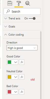
1. switch back to the legacy formatting pane
2. You can raise an issue at https://issues.powerbi.com to add to the multitude of issues with the new formatting pane.
Helpful resources

Power BI Dataviz World Championships
The Power BI Data Visualization World Championships is back! Get ahead of the game and start preparing now!

| User | Count |
|---|---|
| 40 | |
| 38 | |
| 36 | |
| 29 | |
| 28 |
| User | Count |
|---|---|
| 127 | |
| 88 | |
| 78 | |
| 66 | |
| 65 |
