FabCon is coming to Atlanta
Join us at FabCon Atlanta from March 16 - 20, 2026, for the ultimate Fabric, Power BI, AI and SQL community-led event. Save $200 with code FABCOMM.
Register now!- Power BI forums
- Get Help with Power BI
- Desktop
- Service
- Report Server
- Power Query
- Mobile Apps
- Developer
- DAX Commands and Tips
- Custom Visuals Development Discussion
- Health and Life Sciences
- Power BI Spanish forums
- Translated Spanish Desktop
- Training and Consulting
- Instructor Led Training
- Dashboard in a Day for Women, by Women
- Galleries
- Data Stories Gallery
- Themes Gallery
- Contests Gallery
- Quick Measures Gallery
- Notebook Gallery
- Translytical Task Flow Gallery
- TMDL Gallery
- R Script Showcase
- Webinars and Video Gallery
- Ideas
- Custom Visuals Ideas (read-only)
- Issues
- Issues
- Events
- Upcoming Events
To celebrate FabCon Vienna, we are offering 50% off select exams. Ends October 3rd. Request your discount now.
- Power BI forums
- Forums
- Get Help with Power BI
- Desktop
- Re: KPI card displays different value to card and ...
- Subscribe to RSS Feed
- Mark Topic as New
- Mark Topic as Read
- Float this Topic for Current User
- Bookmark
- Subscribe
- Printer Friendly Page
- Mark as New
- Bookmark
- Subscribe
- Mute
- Subscribe to RSS Feed
- Permalink
- Report Inappropriate Content
KPI card displays different value to card and table - any way to show same value as other visuals?
Hi,
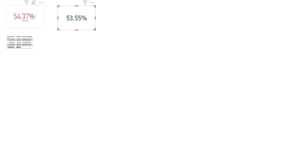
Noticed in a report where we have the ability to show a range of weeks, that the kpi visual only shows the latest value e.g last week rather than the average as illustrated below.
Looking at some posts, saw some other people have had issues with this.
Is there a way to enusre kpi card shows same value as other visuals by default rather than just showing last value
https://community.powerbi.com/t5/Desktop/KPI-Visual-shows-different-value-than-card/td-p/278187
https://community.powerbi.com/t5/Desktop/KPI-card-displays-incorrect-value/m-p/114835#M48410
Thanks
Solved! Go to Solution.
- Mark as New
- Bookmark
- Subscribe
- Mute
- Subscribe to RSS Feed
- Permalink
- Report Inappropriate Content
HI, @po
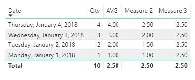
After my research, you could create a measure with ALL/ALLEXCEPT Function and use it Indicator Value.
like this:
AVG = AVERAGE(Table1[Qty])
Measure 2 = CALCULATE([AVG],FILTER(ALL(Table1),Table1[Date]<=MAX(Table1[Date])))
Measure 3 = CALCULATE(AVERAGE(Table1[Qty]),ALL(Table1[Date]))
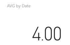
Result:

Best Regards,
Lin
If this post helps, then please consider Accept it as the solution to help the other members find it more quickly.
- Mark as New
- Bookmark
- Subscribe
- Mute
- Subscribe to RSS Feed
- Permalink
- Report Inappropriate Content
HI, @po
After my research, you could create a measure with ALL/ALLEXCEPT Function and use it Indicator Value.
like this:
AVG = AVERAGE(Table1[Qty])
Measure 2 = CALCULATE([AVG],FILTER(ALL(Table1),Table1[Date]<=MAX(Table1[Date])))
Measure 3 = CALCULATE(AVERAGE(Table1[Qty]),ALL(Table1[Date]))
Result:


Best Regards,
Lin
If this post helps, then please consider Accept it as the solution to help the other members find it more quickly.
- Mark as New
- Bookmark
- Subscribe
- Mute
- Subscribe to RSS Feed
- Permalink
- Report Inappropriate Content
Thansk for update


