Get Fabric certified for FREE!
Don't miss your chance to take the Fabric Data Engineer (DP-600) exam for FREE! Find out how by watching the DP-600 session on-demand now through April 28th.
Learn more- Power BI forums
- Get Help with Power BI
- Desktop
- Service
- Report Server
- Power Query
- Mobile Apps
- Developer
- DAX Commands and Tips
- Custom Visuals Development Discussion
- Health and Life Sciences
- Power BI Spanish forums
- Translated Spanish Desktop
- Training and Consulting
- Instructor Led Training
- Dashboard in a Day for Women, by Women
- Galleries
- Data Stories Gallery
- Themes Gallery
- Contests Gallery
- QuickViz Gallery
- Quick Measures Gallery
- Visual Calculations Gallery
- Notebook Gallery
- Translytical Task Flow Gallery
- TMDL Gallery
- R Script Showcase
- Webinars and Video Gallery
- Ideas
- Custom Visuals Ideas (read-only)
- Issues
- Issues
- Events
- Upcoming Events
Join the FabCon + SQLCon recap series. Up next: Power BI, Real-Time Intelligence, IQ and AI, and Data Factory take center stage. All sessions are available on-demand after the live show. Register now
- Power BI forums
- Forums
- Get Help with Power BI
- Desktop
- Re: KPI Visualisation
- Subscribe to RSS Feed
- Mark Topic as New
- Mark Topic as Read
- Float this Topic for Current User
- Bookmark
- Subscribe
- Printer Friendly Page
- Mark as New
- Bookmark
- Subscribe
- Mute
- Subscribe to RSS Feed
- Permalink
- Report Inappropriate Content
KPI Visualisation
Hi All,
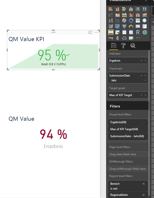
I have some Problems or misunderstanding with the KPI Visual.
I created a Measure which calculates the average of ratings in my table. What I don't understand is, why the value is different between KPI Visual and Card Visual??
See the screenshot please,
Regards and Thnx a lot,
Taher
Solved! Go to Solution.
- Mark as New
- Bookmark
- Subscribe
- Mute
- Subscribe to RSS Feed
- Permalink
- Report Inappropriate Content
Hi All,
thank you all for help. I just solved my Problem using Card with States Visual. Because what I from KPI needed is the automatic color changing when the value 90% or more. Fortunately, It works with Card with States and gives me correct values.
Best Regards
- Mark as New
- Bookmark
- Subscribe
- Mute
- Subscribe to RSS Feed
- Permalink
- Report Inappropriate Content
Hi,
Pls check if the measures 'QM value KPI' and 'QM value' are computed using same formula..
- Mark as New
- Bookmark
- Subscribe
- Mute
- Subscribe to RSS Feed
- Permalink
- Report Inappropriate Content
- Mark as New
- Bookmark
- Subscribe
- Mute
- Subscribe to RSS Feed
- Permalink
- Report Inappropriate Content
Can you display the value as a decimal number to see if they match? Perhaps both visuals deal differently with rounding?
- Mark as New
- Bookmark
- Subscribe
- Mute
- Subscribe to RSS Feed
- Permalink
- Report Inappropriate Content
hello @bmalfait,
I have already tried that, the values are too much different.
For example, there are values where the difference 5% is !!
Regards,
Taher
- Mark as New
- Bookmark
- Subscribe
- Mute
- Subscribe to RSS Feed
- Permalink
- Report Inappropriate Content
Hi @taher,
And if you calculate the value yourself, which one is correct? I would think that at least one of the 2 is incorrect?
Or if you create some other (easy to calculate) measure, does the same difference occur?
Best regards,
Bart
- Mark as New
- Bookmark
- Subscribe
- Mute
- Subscribe to RSS Feed
- Permalink
- Report Inappropriate Content
Hi @bmalfait,
The Card Visual works good so its values are right. KPI is not working good.
I tried to create a separate Measure which does exactly the same and it has the same problem. So I am sure the problem is, the KPI Visual must be initialized in some way to work successfully.
Regards,
Taher
- Mark as New
- Bookmark
- Subscribe
- Mute
- Subscribe to RSS Feed
- Permalink
- Report Inappropriate Content
I just tested this in one of my reports on a measure which calculates an average rate for services, and both visuals give me the same value, both in percentage or decimal view.
I am however working on the latest PBI Desktop release (installed from the app store).
I'm out of options now 🙂
Time to contact support perhaps?
Best regards,
Bart
Helpful resources

Power BI Monthly Update - April 2026
Check out the April 2026 Power BI update to learn about new features.

New to Fabric Survey
If you have recently started exploring Fabric, we'd love to hear how it's going. Your feedback can help with product improvements.

Power BI DataViz World Championships - June 2026
A new Power BI DataViz World Championship is coming this June! Don't miss out on submitting your entry.

| User | Count |
|---|---|
| 41 | |
| 38 | |
| 32 | |
| 20 | |
| 15 |
| User | Count |
|---|---|
| 65 | |
| 59 | |
| 31 | |
| 26 | |
| 25 |

