Become a Certified Power BI Data Analyst!
Join us for an expert-led overview of the tools and concepts you'll need to pass exam PL-300. The first session starts on June 11th. See you there!
Get registered- Power BI forums
- Get Help with Power BI
- Desktop
- Service
- Report Server
- Power Query
- Mobile Apps
- Developer
- DAX Commands and Tips
- Custom Visuals Development Discussion
- Health and Life Sciences
- Power BI Spanish forums
- Translated Spanish Desktop
- Training and Consulting
- Instructor Led Training
- Dashboard in a Day for Women, by Women
- Galleries
- Webinars and Video Gallery
- Data Stories Gallery
- Themes Gallery
- Contests Gallery
- Quick Measures Gallery
- Notebook Gallery
- Translytical Task Flow Gallery
- R Script Showcase
- Ideas
- Custom Visuals Ideas (read-only)
- Issues
- Issues
- Events
- Upcoming Events
Power BI is turning 10! Let’s celebrate together with dataviz contests, interactive sessions, and giveaways. Register now.
- Power BI forums
- Forums
- Get Help with Power BI
- Desktop
- Join 3 sliced visuals into one combo chart
- Subscribe to RSS Feed
- Mark Topic as New
- Mark Topic as Read
- Float this Topic for Current User
- Bookmark
- Subscribe
- Printer Friendly Page
- Mark as New
- Bookmark
- Subscribe
- Mute
- Subscribe to RSS Feed
- Permalink
- Report Inappropriate Content
Join 3 sliced visuals into one combo chart
I have a dataset of dates and amounts which are classified by 1) location, 2) market and 3) brand. A given location may belong to 1+ markets and 1+ brands.
I have one slicer on the location field; when user selects a location, I want a combo chart to display 1) the average location amount per month as bars, and also to display 2) the average market amount per month as a line, and 3) the average brand amount per month as a second line.
I can only have a location slicer - it is not possible to have a location slicer, a market slicer and a brand slicer as I would normally prefer.
I've gotten partway there using the following steps:
1) Renamed the dataset as Data - Location, and copied it over to Data - Market and also Data - Brand using DAX
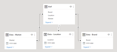
2) Added dataset Xref containing the distinct list of Location, Market and Brand fields
3) In data model I connected Xref to Data - Location (using the Location field), and to Data - Market (using the Market field), and to Data - Brand (using the Brand field)
4) Added a slicer with field Xref[Location]
5) Added a bar chart using the date and amount from Data - Location
6) Added a line chart using the date and amount from Data - Market
7) Added a line chart using the date and amount from Data - Brand
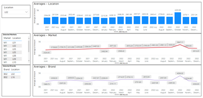
Now when I select a location from the slicer, all 3 charts automatically update accordingly - this is close to what I want.
However, I want all 3 amounts to show up in one combo chart with a bar and 2 lines - and nothing I do seems to work. In the above scenario, everything is aggregated by date (x axis) and amount (y axis), so it looks like it should be doable, but as far as I know you can't build off of visuals, so I need to find a way to do this with creative table relationships and DAX statements.
Please let me know how I can accomplish this.
Fig 1 - Data Model:
Fig 2 - What I've accomplished so far:
Fig 3 - What I'm trying to accomplish:
-sme12345
- Mark as New
- Bookmark
- Subscribe
- Mute
- Subscribe to RSS Feed
- Permalink
- Report Inappropriate Content
Also, super imposing the 3 charts over one another is not an option here - all 3 amounts (location, market and brand) must appear in the same combo chart.
- Mark as New
- Bookmark
- Subscribe
- Mute
- Subscribe to RSS Feed
- Permalink
- Report Inappropriate Content
Hi @sme12345 ,
As your third picture shows, isn't this exactly the result you were hoping for? It seems you have achieved it.
Best regards,
Community Support Team_Binbin Yu
- Mark as New
- Bookmark
- Subscribe
- Mute
- Subscribe to RSS Feed
- Permalink
- Report Inappropriate Content
No, the third picture is a mock-up showing how i *want* it to look:
"Now when I select a location from the slicer, all 3 charts automatically update accordingly - this is close to what I want.
However, I want all 3 amounts to show up in one combo chart with a bar and 2 lines - and nothing I do seems to work. "
Apologies if this was unclear.
Helpful resources

Join our Fabric User Panel
This is your chance to engage directly with the engineering team behind Fabric and Power BI. Share your experiences and shape the future.

Power BI Monthly Update - June 2025
Check out the June 2025 Power BI update to learn about new features.

| User | Count |
|---|---|
| 76 | |
| 76 | |
| 56 | |
| 38 | |
| 34 |
| User | Count |
|---|---|
| 99 | |
| 56 | |
| 51 | |
| 44 | |
| 40 |


