This is best Fabric, Power BI, SQL and AI community event. How do we know? The last event sold out! Save €200 with code FABCMTY200.
Register nowA new Data Days event is coming soon! This time we’re going bigger than ever. Fabric, Power BI, SQL, AI and more. Don't miss out.
Dear Community,
I am trying to create the JSON theme.
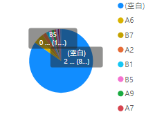
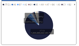
My theme is accepted and works, except the chart's label background.
How can I do?
"pieChart": {
"*": {
"general": [{
"responsive": true,
"keepLayerOrder": true
}],
"background": [{
"show": true,
"color": { "solid": { "color": "#FFFFFF"}},
"transparency": 0
}],
"border": [{
"color": { "solid": { "color": "#000000"}},
"show": true,
"radius": 10
}],
"title": [{
"show": true,
"fontColor": { "solid": { "color": "#000000" } },
"background": { "solid": { "color": "#FFFFFF" } },
"alignment": "center",
"fontSize": 14
}],
"legend": [{
"show": true,
"position": "Top",
"showTitle": true,
"titleText": "",
"legendColor": { "solid": { "color": "#01B8AA"}},
"fontFamily": "Segoe UI",
"fontSize": 12
}],
"labels": [{
"show": true,
"labelStyle": "Category, data value, percent of total",
"color": { "solid": { "color": "#605E5C"}},
"labelDisplayUnits": "0",
"labelPrecision": 0,
"fontSize": 9,
"fontFamily": "Arial Black",
"position": "inside",
"enableBackground": true,
"backgroundColor": { "solid": { "color": "#FFFFFF" }},
"backgroundTransparency":30
}]
}
}
default theme
My theme(It can't see clearly)
Regards,
Betty
Solved! Go to Solution.
Hi @Betty12111 ,
It seems that the background color doesn't work in pie chart. It still use the default color. Here I suggest you to change the data label to other bright colors instead of #605E5C which looks like grey.
Here is a example of Pie chart theme code.
https://github.com/deldersveld/PowerBI-ThemeTemplates/blob/master/Pie.json
Best Regards,
Rico Zhou
If this post helps, then please consider Accept it as the solution to help the other members find it more quickly.
Hi @Betty12111 ,
It seems that the background color doesn't work in pie chart. It still use the default color. Here I suggest you to change the data label to other bright colors instead of #605E5C which looks like grey.
Here is a example of Pie chart theme code.
https://github.com/deldersveld/PowerBI-ThemeTemplates/blob/master/Pie.json
Best Regards,
Rico Zhou
If this post helps, then please consider Accept it as the solution to help the other members find it more quickly.
Many Thanks Rico Zhou.
Check out the May 2026 Power BI update to learn about new features.
Sign up to receive a private message when registration opens and key events begin.
If you have recently started exploring Fabric, we'd love to hear how it's going. Your feedback can help with product improvements.
| User | Count |
|---|---|
| 27 | |
| 25 | |
| 22 | |
| 20 | |
| 14 |
| User | Count |
|---|---|
| 50 | |
| 47 | |
| 23 | |
| 18 | |
| 18 |