FabCon is coming to Atlanta
Join us at FabCon Atlanta from March 16 - 20, 2026, for the ultimate Fabric, Power BI, AI and SQL community-led event. Save $200 with code FABCOMM.
Register now!- Power BI forums
- Get Help with Power BI
- Desktop
- Service
- Report Server
- Power Query
- Mobile Apps
- Developer
- DAX Commands and Tips
- Custom Visuals Development Discussion
- Health and Life Sciences
- Power BI Spanish forums
- Translated Spanish Desktop
- Training and Consulting
- Instructor Led Training
- Dashboard in a Day for Women, by Women
- Galleries
- Data Stories Gallery
- Themes Gallery
- Contests Gallery
- QuickViz Gallery
- Quick Measures Gallery
- Visual Calculations Gallery
- Notebook Gallery
- Translytical Task Flow Gallery
- TMDL Gallery
- R Script Showcase
- Webinars and Video Gallery
- Ideas
- Custom Visuals Ideas (read-only)
- Issues
- Issues
- Events
- Upcoming Events
Vote for your favorite vizzies from the Power BI Dataviz World Championship submissions. Vote now!
- Power BI forums
- Forums
- Get Help with Power BI
- Desktop
- JSON Theme Help (label colours)
- Subscribe to RSS Feed
- Mark Topic as New
- Mark Topic as Read
- Float this Topic for Current User
- Bookmark
- Subscribe
- Printer Friendly Page
- Mark as New
- Bookmark
- Subscribe
- Mute
- Subscribe to RSS Feed
- Permalink
- Report Inappropriate Content
JSON Theme Help (label colours)
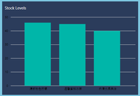
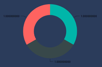
I'm struggling to recolour the data labels in donut charts and bar charts. Here's what it currently looks like:


And here's what I've currently got for the colours of the labels after several attempts, as per the documentation (unless I'm misunderstanding it, which is highly likely):
    "visualStyles":{
        "*":{
            "*":{
                "*":[{
                    "color":{
                        "solid":{
                            "color":"#FFFFFF"
                            }
                        }
                },{
                    "labelColor":{
                        "solid":{
                            "color":"#FFFFFF"
                        }
                    }
                }],
                "categoryAxis":[{
                    "showAxisTitle":false,
			"labelColor": {
                        "solid": {
                            "color": "#ffffff"
                        }
                    }
                }],
                "valueAxis":[{
                    "showAxisTitle":false,
			"labelColor": {
                        "solid": {
                            "color": "#FFFFFF"
                        }
                    }
                }],
		"labels":[{
                    "color": {
                        "solid": {
                            "color": "#FF0000"
                        }
                    }
                },{
                    "labelPrecision":9
                }]
            }
        }
    }
Can anyone point out what I'm doing wrong, please?
- Mark as New
- Bookmark
- Subscribe
- Mute
- Subscribe to RSS Feed
- Permalink
- Report Inappropriate Content
Hi @harrisonhg ,
Hope Report Theme Generator V3 could help you.
Regards,
Frank
If this post helps, then please consider Accept it as the solution to help the others find it more quickly.
Helpful resources

Power BI Dataviz World Championships
Vote for your favorite vizzies from the Power BI World Championship submissions!

Join our Community Sticker Challenge 2026
If you love stickers, then you will definitely want to check out our Community Sticker Challenge!

Power BI Monthly Update - January 2026
Check out the January 2026 Power BI update to learn about new features.

| User | Count |
|---|---|
| 64 | |
| 53 | |
| 42 | |
| 20 | |
| 17 |
| User | Count |
|---|---|
| 121 | |
| 103 | |
| 47 | |
| 30 | |
| 24 |
