Fabric Data Days starts November 4th!
Advance your Data & AI career with 50 days of live learning, dataviz contests, hands-on challenges, study groups & certifications and more!
Get registered- Power BI forums
- Get Help with Power BI
- Desktop
- Service
- Report Server
- Power Query
- Mobile Apps
- Developer
- DAX Commands and Tips
- Custom Visuals Development Discussion
- Health and Life Sciences
- Power BI Spanish forums
- Translated Spanish Desktop
- Training and Consulting
- Instructor Led Training
- Dashboard in a Day for Women, by Women
- Galleries
- Data Stories Gallery
- Themes Gallery
- Contests Gallery
- Quick Measures Gallery
- Visual Calculations Gallery
- Notebook Gallery
- Translytical Task Flow Gallery
- TMDL Gallery
- R Script Showcase
- Webinars and Video Gallery
- Ideas
- Custom Visuals Ideas (read-only)
- Issues
- Issues
- Events
- Upcoming Events
Get Fabric Certified for FREE during Fabric Data Days. Don't miss your chance! Learn more
- Power BI forums
- Forums
- Get Help with Power BI
- Desktop
- Re: Issues creating stacked column chart for count...
- Subscribe to RSS Feed
- Mark Topic as New
- Mark Topic as Read
- Float this Topic for Current User
- Bookmark
- Subscribe
- Printer Friendly Page
- Mark as New
- Bookmark
- Subscribe
- Mute
- Subscribe to RSS Feed
- Permalink
- Report Inappropriate Content
Issues creating stacked column chart for counting created vs. resolved tickets
Hi Everyone,
I'm hoping this great community will be able to help me out with a stacked column chart that I am looking to create. I feel like I have tried everything and still am not getting what I am looking for.
The data that I have is data that comes from JIRA and it tracks software tickets. I am looking to create a stacked column chart that will show the count of the number of created tickets and the number of resolved tickets that are created monthly/year(weekly would be great too). I would also love to add a trend line if possible to show whether the created tickets are growing faster then we are able to resolve them. Any help would be greatly appreciated.
I have created some mock data to illustrate what I am looking for.
| ID | Created Date | Resolved Date | Assignee |
| 123 | 1/2/2018 | 5/23/2018 | James |
| 345 | 1/8/2018 | 3/23/2018 | Mike |
| 678 | 2/4/2018 | 4/30/2018 | Juan |
| 909 | 2/23/2018 | 3/21/2018 | James |
| 876 | 2/24/2018 | 7/21/2018 | Andrew |
| 543 | 3/5/2018 | 5/23/2018 | Jon |
| 212 | 4/9/2018 | 6/2/2018 | Jon |
| 456 | 5/2/2018 | 8/3/2018 | Andrew |
| 754 | 5/30/2018 | 10/3/2018 | James |
| 346 | 6/22/2018 | 7/21/2018 | Juan |
| 675 | 7/3/2018 | 9/30/2018 | Mike |
| 258 | 8/14/2018 | 11/23/2018 | Mike |
| 354 | 9/23/2018 | 12/24/2018 | James |
| 136 | 10/14/2018 | 1/3/2019 | Jon |
| 842 | 11/12/2018 | 2/1/2019 | Sara |
| 269 | 11/15/2018 | 4/2/2019 | James |
| 426 | 12/2/2018 | 2/23/2018 | Mark |
| 841 | 1/5/2019 | 3/2/2019 | Chris |
| 800 | 1/18/2019 | 4/3/2019 | James |
| 500 | 2/3/2019 | ||
| 601 | 2/13/2019 | ||
| 378 | 2/14/2019 | ||
| 491 | 3/25/2019 | 4/1/2019 | Andrew |
| 203 | 4/29/2019 | ||
| 491 | 5/2/2019 |
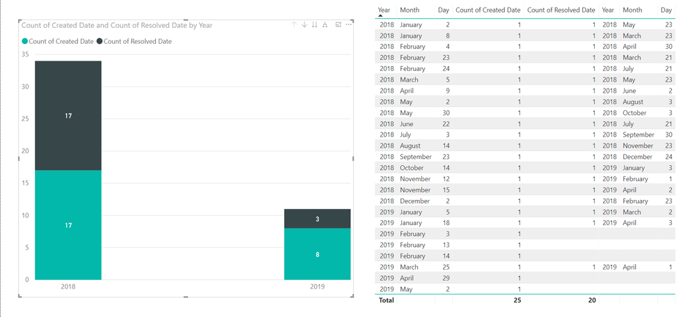
The following is an idea of what I am looking for however the stack columns do not have accurate data(shown in the table). I would love to see a years worth of trends broken down by month/year.
Thanks, Josh
- Mark as New
- Bookmark
- Subscribe
- Mute
- Subscribe to RSS Feed
- Permalink
- Report Inappropriate Content
Hi @jbristol ,
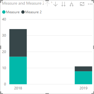
In your scenario, we cna create two measure using the following DAX query:
Measure = CALCULATE(COUNTROWS(Table1))
Measure 2 = CALCULATE(COUNTROWS(Table1),FILTER(Table1,Table1[Resolved Date] <> BLANK()))
Then drag these two measures and Created Date column to the visual, then we will see the count of a year:
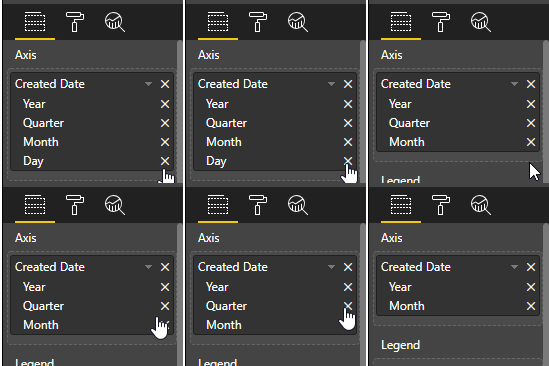
Don't be afraid of it, then we can expand the data of Created Date column, remove the day and quarter.
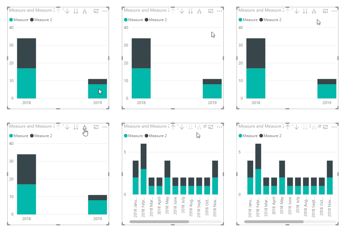
Then click the following button:
The result will like below:
Best Regards,
Teige
- Mark as New
- Bookmark
- Subscribe
- Mute
- Subscribe to RSS Feed
- Permalink
- Report Inappropriate Content
Thanks Teige!
Just a questions about the results, In April 2019 there were 3 resolved tickets. How do I get them to show up on the chart?
Thanks,
Josh
- Mark as New
- Bookmark
- Subscribe
- Mute
- Subscribe to RSS Feed
- Permalink
- Report Inappropriate Content
HI @jbristol ,
I think I have misunderstanded your logic on the resolved tickets, based on my understanding, there is no solved ticket on April.
Best Regards,
Tiege
- Mark as New
- Bookmark
- Subscribe
- Mute
- Subscribe to RSS Feed
- Permalink
- Report Inappropriate Content
You need to create a calendar table and relate each of your date columns to it. What it's showing now is there's 17 resolved and 3 resolved that were created in 2018 and 2019 respectively
Helpful resources

Fabric Data Days
Advance your Data & AI career with 50 days of live learning, contests, hands-on challenges, study groups & certifications and more!

Power BI Monthly Update - October 2025
Check out the October 2025 Power BI update to learn about new features.

| User | Count |
|---|---|
| 84 | |
| 49 | |
| 35 | |
| 31 | |
| 30 |


