FabCon is coming to Atlanta
Join us at FabCon Atlanta from March 16 - 20, 2026, for the ultimate Fabric, Power BI, AI and SQL community-led event. Save $200 with code FABCOMM.
Register now!- Power BI forums
- Get Help with Power BI
- Desktop
- Service
- Report Server
- Power Query
- Mobile Apps
- Developer
- DAX Commands and Tips
- Custom Visuals Development Discussion
- Health and Life Sciences
- Power BI Spanish forums
- Translated Spanish Desktop
- Training and Consulting
- Instructor Led Training
- Dashboard in a Day for Women, by Women
- Galleries
- Data Stories Gallery
- Themes Gallery
- Contests Gallery
- QuickViz Gallery
- Quick Measures Gallery
- Visual Calculations Gallery
- Notebook Gallery
- Translytical Task Flow Gallery
- TMDL Gallery
- R Script Showcase
- Webinars and Video Gallery
- Ideas
- Custom Visuals Ideas (read-only)
- Issues
- Issues
- Events
- Upcoming Events
The Power BI Data Visualization World Championships is back! Get ahead of the game and start preparing now! Learn more
- Power BI forums
- Forums
- Get Help with Power BI
- Desktop
- Re: Issue with visual - the second bar
- Subscribe to RSS Feed
- Mark Topic as New
- Mark Topic as Read
- Float this Topic for Current User
- Bookmark
- Subscribe
- Printer Friendly Page
- Mark as New
- Bookmark
- Subscribe
- Mute
- Subscribe to RSS Feed
- Permalink
- Report Inappropriate Content
Issue with visual - the second bar
Hello,
I have an issue. I need to show:
- Maturity for groups
- Implemented and Missing value for groups
Calculation: - Existing Low (Maturity): count if column Maturity = "Low"
- Existing Medium (Maturity): count if coulumn Maturity = "Medium"
- Existing High (Maturity): count if column Maturity = "High"
- Missing/ Planned = Count if column Status = "Planned"
- Implemented = Count if Status = "Implemented"
I want to show all calculation as below:
The first bar: Implemented + Planned
The second bar: High + Medium + Low
This is very important but I have no idea how to do this. Could you help me?
Solved! Go to Solution.
- Mark as New
- Bookmark
- Subscribe
- Mute
- Subscribe to RSS Feed
- Permalink
- Report Inappropriate Content
Hi @Anonymous ,
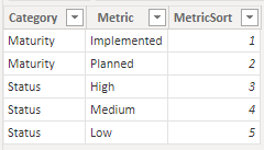
Create a table with the following format:
Add the following measure:
Values for chart = SWITCH(SELECTEDVALUE('Type'[MetricSort]),
                        1, [Implemented],
                        2, [Planned],
                        3, [High],
                        4, [Medium],
                        5, [Low])
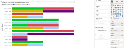
Setup your char wiht the following setup:
- Y-Axis: Group + Category
- X-Axis: Value for chart
- Legend: Metric
Drill down to the lowest level and sort axis by group category:
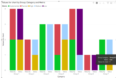
If you want to wrap the name you need to use the Stacked column chart:
See file attach.
Regards
Miguel Félix
Did I answer your question? Mark my post as a solution!
Proud to be a Super User!
Check out my blog: Power BI em Português- Mark as New
- Bookmark
- Subscribe
- Mute
- Subscribe to RSS Feed
- Permalink
- Report Inappropriate Content
- Mark as New
- Bookmark
- Subscribe
- Mute
- Subscribe to RSS Feed
- Permalink
- Report Inappropriate Content
Hi @Anonymous ,
Create a table with the following format:
Add the following measure:
Values for chart = SWITCH(SELECTEDVALUE('Type'[MetricSort]),
                        1, [Implemented],
                        2, [Planned],
                        3, [High],
                        4, [Medium],
                        5, [Low])
Setup your char wiht the following setup:
- Y-Axis: Group + Category
- X-Axis: Value for chart
- Legend: Metric
Drill down to the lowest level and sort axis by group category:
If you want to wrap the name you need to use the Stacked column chart:
See file attach.
Regards
Miguel Félix
Did I answer your question? Mark my post as a solution!
Proud to be a Super User!
Check out my blog: Power BI em PortuguêsHelpful resources

Power BI Monthly Update - November 2025
Check out the November 2025 Power BI update to learn about new features.

Fabric Data Days
Advance your Data & AI career with 50 days of live learning, contests, hands-on challenges, study groups & certifications and more!


