Fabric Data Days starts November 4th!
Advance your Data & AI career with 50 days of live learning, dataviz contests, hands-on challenges, study groups & certifications and more!
Get registered- Power BI forums
- Get Help with Power BI
- Desktop
- Service
- Report Server
- Power Query
- Mobile Apps
- Developer
- DAX Commands and Tips
- Custom Visuals Development Discussion
- Health and Life Sciences
- Power BI Spanish forums
- Translated Spanish Desktop
- Training and Consulting
- Instructor Led Training
- Dashboard in a Day for Women, by Women
- Galleries
- Data Stories Gallery
- Themes Gallery
- Contests Gallery
- QuickViz Gallery
- Quick Measures Gallery
- Visual Calculations Gallery
- Notebook Gallery
- Translytical Task Flow Gallery
- TMDL Gallery
- R Script Showcase
- Webinars and Video Gallery
- Ideas
- Custom Visuals Ideas (read-only)
- Issues
- Issues
- Events
- Upcoming Events
Get Fabric Certified for FREE during Fabric Data Days. Don't miss your chance! Request now
- Power BI forums
- Forums
- Get Help with Power BI
- Desktop
- Re: Issue with Graphic not showing correct number ...
- Subscribe to RSS Feed
- Mark Topic as New
- Mark Topic as Read
- Float this Topic for Current User
- Bookmark
- Subscribe
- Printer Friendly Page
- Mark as New
- Bookmark
- Subscribe
- Mute
- Subscribe to RSS Feed
- Permalink
- Report Inappropriate Content
Issue with Graphic not showing correct number from table
Help!!!!
I am not new to Power BI, but I am new to DAX. I have a KPI table that is broken down by counties and organization. One KPI is 50% of each counties trainings needs to result in a credential. Then the overall organizational credential rate is also 50%. That means on the dashboard I can't just total and use the maximum for the default graphic. I need the default to be the organizational total, then I have a slicer to show the individual counties. I can not get the default to show the organizational total. What am I missing? This is the graphic showing, it is currently showing whichever county has the highest credential rate.
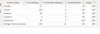
This is the table with the data. I want the graphic to show the Michigan Works Southeast credential rate as a default no matter what the rate is. Any assistance would be most helpful. I have tried many different things and nothing has worked. As of right now, I have had to include the Michigan Works Southeast as an option in the slicer but I don't want to have it there.
Solved! Go to Solution.
- Mark as New
- Bookmark
- Subscribe
- Mute
- Subscribe to RSS Feed
- Permalink
- Report Inappropriate Content
Hi @venriquez ,
I created a sample pbix file(see attachment) for you, please check whether that is what you want.
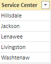
1. Create a service center dimension table as below and apply the field [Service Center] on the slicer
Service Centers =
CALCULATETABLE (
    VALUES ( 'Table'[Service Center] ),
    FILTER ( 'Table', 'Table'[Service Center] <> "Michigan Works Southeast" )
)
2. Create a measure as below to get the credential rate base on slicer selection
Rate =
VAR _selmwkscrate =
    CALCULATE (
        MAX ( 'Table'[Credential Rate] ),
        FILTER ( 'Table', 'Table'[Service Center] = "Michigan Works Southeast" )
    )
RETURN
    IF (
        ISFILTERED ( 'Service Centers'[Service Center] ),
        CALCULATE (
            SUM ( 'Table'[Credential Rate] ),
            FILTER (
                'Table',
                'Table'[Service Center] IN ALLSELECTED ( 'Service Centers'[Service Center] )
            )
        ),
        _selmwkscrate
    )
If the above one can't help you get the desired result, please provide more raw data in your tables (exclude sensitive data) with Text format and your expected result base on your provided data. It is better if you can share a simplified pbix file. You can refer the following link to upload the file to the community. Thank you.
How to upload PBI in Community
Best Regards
- Mark as New
- Bookmark
- Subscribe
- Mute
- Subscribe to RSS Feed
- Permalink
- Report Inappropriate Content
- Mark as New
- Bookmark
- Subscribe
- Mute
- Subscribe to RSS Feed
- Permalink
- Report Inappropriate Content
Thank you so much this works perfectly.
- Mark as New
- Bookmark
- Subscribe
- Mute
- Subscribe to RSS Feed
- Permalink
- Report Inappropriate Content
Hi @venriquez ,
I created a sample pbix file(see attachment) for you, please check whether that is what you want.
1. Create a service center dimension table as below and apply the field [Service Center] on the slicer
Service Centers =
CALCULATETABLE (
    VALUES ( 'Table'[Service Center] ),
    FILTER ( 'Table', 'Table'[Service Center] <> "Michigan Works Southeast" )
)
2. Create a measure as below to get the credential rate base on slicer selection
Rate =
VAR _selmwkscrate =
    CALCULATE (
        MAX ( 'Table'[Credential Rate] ),
        FILTER ( 'Table', 'Table'[Service Center] = "Michigan Works Southeast" )
    )
RETURN
    IF (
        ISFILTERED ( 'Service Centers'[Service Center] ),
        CALCULATE (
            SUM ( 'Table'[Credential Rate] ),
            FILTER (
                'Table',
                'Table'[Service Center] IN ALLSELECTED ( 'Service Centers'[Service Center] )
            )
        ),
        _selmwkscrate
    )
If the above one can't help you get the desired result, please provide more raw data in your tables (exclude sensitive data) with Text format and your expected result base on your provided data. It is better if you can share a simplified pbix file. You can refer the following link to upload the file to the community. Thank you.
How to upload PBI in Community
Best Regards
- Mark as New
- Bookmark
- Subscribe
- Mute
- Subscribe to RSS Feed
- Permalink
- Report Inappropriate Content
Thank you this works perfectly!
- Mark as New
- Bookmark
- Subscribe
- Mute
- Subscribe to RSS Feed
- Permalink
- Report Inappropriate Content
In the measure that drives your visual you can include a REMOVEFILTERS([Service Centers]) filter context modifier.
Helpful resources

Fabric Data Days
Advance your Data & AI career with 50 days of live learning, contests, hands-on challenges, study groups & certifications and more!

Power BI Monthly Update - October 2025
Check out the October 2025 Power BI update to learn about new features.


