FabCon is coming to Atlanta
Join us at FabCon Atlanta from March 16 - 20, 2026, for the ultimate Fabric, Power BI, AI and SQL community-led event. Save $200 with code FABCOMM.
Register now!- Power BI forums
- Get Help with Power BI
- Desktop
- Service
- Report Server
- Power Query
- Mobile Apps
- Developer
- DAX Commands and Tips
- Custom Visuals Development Discussion
- Health and Life Sciences
- Power BI Spanish forums
- Translated Spanish Desktop
- Training and Consulting
- Instructor Led Training
- Dashboard in a Day for Women, by Women
- Galleries
- Data Stories Gallery
- Themes Gallery
- Contests Gallery
- QuickViz Gallery
- Quick Measures Gallery
- Visual Calculations Gallery
- Notebook Gallery
- Translytical Task Flow Gallery
- TMDL Gallery
- R Script Showcase
- Webinars and Video Gallery
- Ideas
- Custom Visuals Ideas (read-only)
- Issues
- Issues
- Events
- Upcoming Events
The Power BI Data Visualization World Championships is back! Get ahead of the game and start preparing now! Learn more
- Power BI forums
- Forums
- Get Help with Power BI
- Desktop
- Is there a way to set the card callout value colou...
- Subscribe to RSS Feed
- Mark Topic as New
- Mark Topic as Read
- Float this Topic for Current User
- Bookmark
- Subscribe
- Printer Friendly Page
- Mark as New
- Bookmark
- Subscribe
- Mute
- Subscribe to RSS Feed
- Permalink
- Report Inappropriate Content
Is there a way to set the card callout value colour by category?
I'm working on a report, that has two categories for an alarm, and on the charts one is as a light blue and the other a dark blue. I have made a donut chart with the card inside to show the total count of each, and a slicer to select which one the user wants to focus on.
The issue is on the card, as I click on the dark blue category, all charts display dark blue, which is right, but the callout card doesn't so it looks a bit off and can be confusing. I looked at the conditional formatting in the card, but there is no way for me to select the colour by category, only by value range. Is there a way I can set up the callout value colour by category? So it would change the colour accordingly to the category?
Solved! Go to Solution.
- Mark as New
- Bookmark
- Subscribe
- Mute
- Subscribe to RSS Feed
- Permalink
- Report Inappropriate Content
Hi @Amazing_Random ,
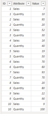
This is my test table:
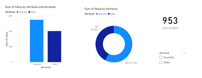
The charts I created:
Please create a measure:
Measure = SWITCH(
    TRUE(),
    SELECTEDVALUE('Table'[Attribute]) = BLANK(),"black",
    SELECTEDVALUE('Table'[Attribute]) = "Sales","#12239E",
    SELECTEDVALUE('Table'[Attribute]) = "Quantity","#118dff"
    )
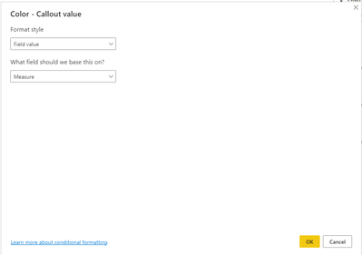
Conditional formatting for callout value:
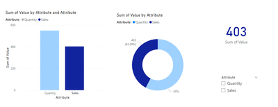
When you click on the dark blue category:
When you click on the light blue category:
IIf you don't click any category, the default color for callout value is black:
The effect is the same if you choose a slicer.
Best regards,
Yadong Fang
If this post helps, then please consider Accept it as the solution to help the other members find it more quickly.
Helpful resources

Power BI Dataviz World Championships
The Power BI Data Visualization World Championships is back! Get ahead of the game and start preparing now!

| User | Count |
|---|---|
| 38 | |
| 38 | |
| 37 | |
| 28 | |
| 28 |
| User | Count |
|---|---|
| 124 | |
| 89 | |
| 73 | |
| 66 | |
| 65 |


