FabCon is coming to Atlanta
Join us at FabCon Atlanta from March 16 - 20, 2026, for the ultimate Fabric, Power BI, AI and SQL community-led event. Save $200 with code FABCOMM.
Register now!- Power BI forums
- Get Help with Power BI
- Desktop
- Service
- Report Server
- Power Query
- Mobile Apps
- Developer
- DAX Commands and Tips
- Custom Visuals Development Discussion
- Health and Life Sciences
- Power BI Spanish forums
- Translated Spanish Desktop
- Training and Consulting
- Instructor Led Training
- Dashboard in a Day for Women, by Women
- Galleries
- Data Stories Gallery
- Themes Gallery
- Contests Gallery
- QuickViz Gallery
- Quick Measures Gallery
- Visual Calculations Gallery
- Notebook Gallery
- Translytical Task Flow Gallery
- TMDL Gallery
- R Script Showcase
- Webinars and Video Gallery
- Ideas
- Custom Visuals Ideas (read-only)
- Issues
- Issues
- Events
- Upcoming Events
Get Fabric Certified for FREE during Fabric Data Days. Don't miss your chance! Request now
- Power BI forums
- Forums
- Get Help with Power BI
- Desktop
- Re: Is there a way to create a slicer that decides...
- Subscribe to RSS Feed
- Mark Topic as New
- Mark Topic as Read
- Float this Topic for Current User
- Bookmark
- Subscribe
- Printer Friendly Page
- Mark as New
- Bookmark
- Subscribe
- Mute
- Subscribe to RSS Feed
- Permalink
- Report Inappropriate Content
Is there a way to create a slicer that decides whoch fields are shown on a line chart?
Hi,
I'd like to solve the following problem:
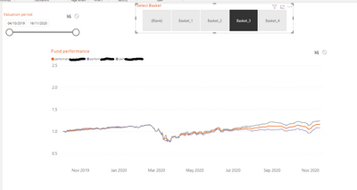
I need to show a line chart that shows 3-7 number of lines and the number of lines shown should depend on which option you choose from the slicer on the top (Basket). If you choose BASKET_3, then I should see the 3 lines as in the picture. But if I pick BASKET_1, I should see 4 different lines representing other 4 different fields in the data. Is there a way to get this work? I've been struggling with it for so long....
Thank you!!
- Mark as New
- Bookmark
- Subscribe
- Mute
- Subscribe to RSS Feed
- Permalink
- Report Inappropriate Content
Hi @Anonymous ,
Please provide a sample .pbix file and I'll try to realize the idea.
Best regards,
Lionel Chen
If this post helps, then please consider Accept it as the solution to help the other members find it more quickly.
- Mark as New
- Bookmark
- Subscribe
- Mute
- Subscribe to RSS Feed
- Permalink
- Report Inappropriate Content
The trick is to have the new table include rows for Fund Performance (Line Type) because that is the Legend breakdown in the line chart.
Proud to be a Super User! |  |
- Mark as New
- Bookmark
- Subscribe
- Mute
- Subscribe to RSS Feed
- Permalink
- Report Inappropriate Content
Yes you are right! But I have 2 fields to put into the chart: one is the fund performance and the other one is the basket performance. I need to put these 2 measures into the chart and also a legend (line type). And I cannot put a legend into the chart if I have 2 variables in the Values. So having the basket performance in the chart does not allow to use legend. What I did so far is creating 2 seperate chart and making them overlap each other but it is not perfect.
- Mark as New
- Bookmark
- Subscribe
- Mute
- Subscribe to RSS Feed
- Permalink
- Report Inappropriate Content
@Anonymous , are you trying to change the legend. If so refer if this can
Dynamically change chart axis in Power BI
https://www.youtube.com/watch?v=6jeSIRpjv0M
https://datamonkeysite.com/2020/10/22/change-dimension-dynamically-using-parameter-in-powerbi/
or use bookmarks
https://radacad.com/bookmarks-and-buttons-making-power-bi-charts-even-more-interactive
- Mark as New
- Bookmark
- Subscribe
- Mute
- Subscribe to RSS Feed
- Permalink
- Report Inappropriate Content
Thank you, I think the bookmarks will help!
- Mark as New
- Bookmark
- Subscribe
- Mute
- Subscribe to RSS Feed
- Permalink
- Report Inappropriate Content
Try this:
Create a new table (Enter Data) with two columns: Basket and Line. Have one row for each Line, and assign each Line to a Basket. Now relate this table to your data table on Line Type. Next, add a slicer to the page on Basket.
By selecting a single Basket, you will effectively filter the data table for only those Lines that are in that Basket.
Hope that helps.
Proud to be a Super User! |  |
- Mark as New
- Bookmark
- Subscribe
- Mute
- Subscribe to RSS Feed
- Permalink
- Report Inappropriate Content
Thank you, but then I would have all the possible lines in the labels, even though they would not appear in the chart, am I right?
Helpful resources

Power BI Monthly Update - November 2025
Check out the November 2025 Power BI update to learn about new features.

Fabric Data Days
Advance your Data & AI career with 50 days of live learning, contests, hands-on challenges, study groups & certifications and more!


