Join us at the 2025 Microsoft Fabric Community Conference
Microsoft Fabric Community Conference 2025, March 31 - April 2, Las Vegas, Nevada. Use code FABINSIDER for a $400 discount.
Register now- Power BI forums
- Get Help with Power BI
- Desktop
- Service
- Report Server
- Power Query
- Mobile Apps
- Developer
- DAX Commands and Tips
- Custom Visuals Development Discussion
- Health and Life Sciences
- Power BI Spanish forums
- Translated Spanish Desktop
- Training and Consulting
- Instructor Led Training
- Dashboard in a Day for Women, by Women
- Galleries
- Webinars and Video Gallery
- Data Stories Gallery
- Themes Gallery
- Power BI DataViz World Championships Gallery
- Quick Measures Gallery
- R Script Showcase
- COVID-19 Data Stories Gallery
- Community Connections & How-To Videos
- 2021 MSBizAppsSummit Gallery
- 2020 MSBizAppsSummit Gallery
- 2019 MSBizAppsSummit Gallery
- Events
- Ideas
- Custom Visuals Ideas (read-only)
- Issues
- Issues
- Events
- Upcoming Events
The Power BI DataViz World Championships are on! With four chances to enter, you could win a spot in the LIVE Grand Finale in Las Vegas. Show off your skills.
- Power BI forums
- Forums
- Get Help with Power BI
- Desktop
- Re: Is it possible to have certain rows in a matri...
- Subscribe to RSS Feed
- Mark Topic as New
- Mark Topic as Read
- Float this Topic for Current User
- Bookmark
- Subscribe
- Printer Friendly Page
- Mark as New
- Bookmark
- Subscribe
- Mute
- Subscribe to RSS Feed
- Permalink
- Report Inappropriate Content
Is it possible to have certain rows in a matrix visualization to be color coded?
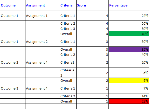
I have a Matrix visualization like below-
| Outcome | Assignment | Criteria | Score | Percentage |
| Outcome 1 | Assignemnt 1 | Criteria 1 | 4 | 22% |
| Criteria 2 | 4 | 50% | ||
| Criteria 3 | 4 | 80% | ||
| Overall | 4 | 40% | ||
| Outcome 1 | Assignment 2 | Criteria 1 | 3 | 30% |
| Overall | 3 | 35% | ||
| Criteria 2 | 3 | 40% | ||
| Outcome 2 | Assignment 4 | Criteria1 | 2 | 20% |
| Critearia2 | 2 | 5% | ||
| Overall | 2 | 6% | ||
| Outcome 3 | Assignment 4 | Criteria 1 | 1 | 7% |
| Criteria 2 | 1 | 14% | ||
| Overall | 1 | 28% | ||
Outcome, assignment, Criteria are in "rows" and score, percentage are in "Values" of Matrix visualization.
The rows that have Overall in "Criteria" column, I am hoping for "Percentage" in those rows to be color coded.
For rows having Score =4, "Percentage" should be Green,
rows having Score =3, "Percentage" should be Purple,
rows having Score =2, "Percentage" should be Yellow,
rows having Score =1, "Percentage" should be Red.
The final outcome that I am hoping for is shown below-
Can I get any help on this issue?
Solved! Go to Solution.
- Mark as New
- Bookmark
- Subscribe
- Mute
- Subscribe to RSS Feed
- Permalink
- Report Inappropriate Content
Hi @rohanazad94 ,
Please try below steps:
1. below is my test table
Table:
2. create a measure with below dax formula
Measure =
VAR cur_ct =
    SELECTEDVALUE ( 'Table'[Criteria] )
VAR cur_score =
    SELECTEDVALUE ( 'Table'[Score] )
RETURN
    SWITCH (
        TRUE (),
        cur_score = 4
            && cur_ct = "Overall", "Green",
        cur_score = 3
            && cur_ct = "Overall", "Yellow"
    )
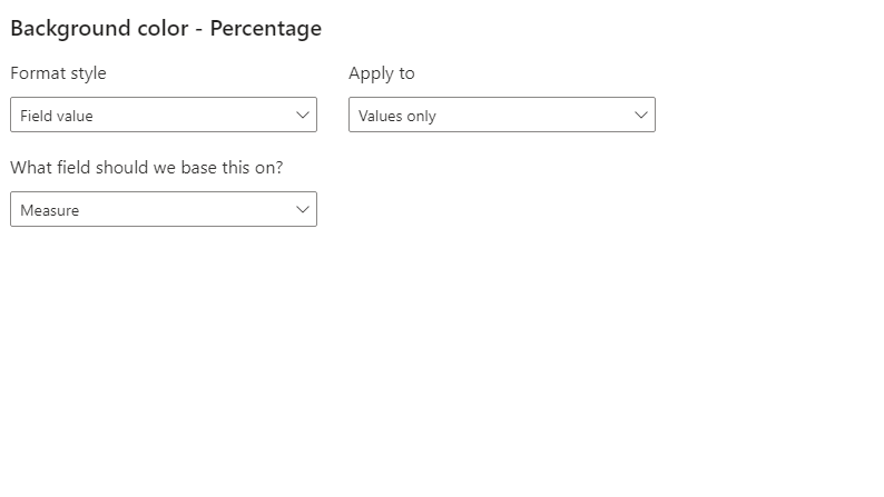
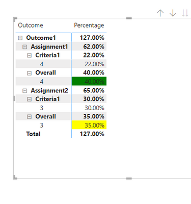
3. add a matrix visual with fields, and set condition format for "Score" field
Output:
For more details about conditional format, you can read related document: Apply conditional table formatting in Power BI - Power BI | Microsoft Learn
Please refer the attached .pbix file.
Best regards,
Community Support Team_ Binbin Yu
If this post helps, then please consider Accept it as the solution to help the other members find it more quickly.
- Mark as New
- Bookmark
- Subscribe
- Mute
- Subscribe to RSS Feed
- Permalink
- Report Inappropriate Content
Thank you so much @Anonymous . The solution that you provided worked.
- Mark as New
- Bookmark
- Subscribe
- Mute
- Subscribe to RSS Feed
- Permalink
- Report Inappropriate Content
Hi @rohanazad94 ,
Please try below steps:
1. below is my test table
Table:
2. create a measure with below dax formula
Measure =
VAR cur_ct =
    SELECTEDVALUE ( 'Table'[Criteria] )
VAR cur_score =
    SELECTEDVALUE ( 'Table'[Score] )
RETURN
    SWITCH (
        TRUE (),
        cur_score = 4
            && cur_ct = "Overall", "Green",
        cur_score = 3
            && cur_ct = "Overall", "Yellow"
    )
3. add a matrix visual with fields, and set condition format for "Score" field
Output:
For more details about conditional format, you can read related document: Apply conditional table formatting in Power BI - Power BI | Microsoft Learn
Please refer the attached .pbix file.
Best regards,
Community Support Team_ Binbin Yu
If this post helps, then please consider Accept it as the solution to help the other members find it more quickly.
Helpful resources

Join us at the Microsoft Fabric Community Conference
March 31 - April 2, 2025, in Las Vegas, Nevada. Use code MSCUST for a $150 discount!

Power BI Monthly Update - February 2025
Check out the February 2025 Power BI update to learn about new features.

| User | Count |
|---|---|
| 86 | |
| 78 | |
| 54 | |
| 39 | |
| 35 |
| User | Count |
|---|---|
| 102 | |
| 84 | |
| 48 | |
| 48 | |
| 48 |


