FabCon is coming to Atlanta
Join us at FabCon Atlanta from March 16 - 20, 2026, for the ultimate Fabric, Power BI, AI and SQL community-led event. Save $200 with code FABCOMM.
Register now!- Power BI forums
- Get Help with Power BI
- Desktop
- Service
- Report Server
- Power Query
- Mobile Apps
- Developer
- DAX Commands and Tips
- Custom Visuals Development Discussion
- Health and Life Sciences
- Power BI Spanish forums
- Translated Spanish Desktop
- Training and Consulting
- Instructor Led Training
- Dashboard in a Day for Women, by Women
- Galleries
- Data Stories Gallery
- Themes Gallery
- Contests Gallery
- QuickViz Gallery
- Quick Measures Gallery
- Visual Calculations Gallery
- Notebook Gallery
- Translytical Task Flow Gallery
- TMDL Gallery
- R Script Showcase
- Webinars and Video Gallery
- Ideas
- Custom Visuals Ideas (read-only)
- Issues
- Issues
- Events
- Upcoming Events
Get Fabric Certified for FREE during Fabric Data Days. Don't miss your chance! Request now
- Power BI forums
- Forums
- Get Help with Power BI
- Desktop
- Irrespective of filter x-axis should be in same li...
- Subscribe to RSS Feed
- Mark Topic as New
- Mark Topic as Read
- Float this Topic for Current User
- Bookmark
- Subscribe
- Printer Friendly Page
- Mark as New
- Bookmark
- Subscribe
- Mute
- Subscribe to RSS Feed
- Permalink
- Report Inappropriate Content
Irrespective of filter x-axis should be in same line for all visuals.
@PBCommunity
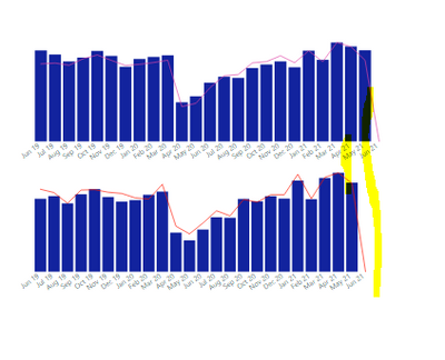
I have created 2 visuals and arrange in top and bottom with the Same height, X axis and Width. When i am trying to apply the filter for these two visuals (for two visuals i am applying visual level filter) x axis alignment is changing like below.
Is there any way to give fixed alignment for x-axis irrespective of filters?
More info:
Different filters are applied for these two visuals example: First visual is showing for one division and another visual is showing for one division.
If i remove the filter for second visual x-axis alignment will be same however if i apply filter on it showing wrong alignment.
Solved! Go to Solution.
- Mark as New
- Bookmark
- Subscribe
- Mute
- Subscribe to RSS Feed
- Permalink
- Report Inappropriate Content
Hi @Mounika09 ,
Your issue is that you don't have values for april in the bottom chart that is why the two visualizations are not matching you can do one of two options:
- On the X-axis turn on the options show items with no data
- If you are using a measure try to use coalescence to return 0 instead of blank
Measure = COALESCE (SUM(Table[Column]), 0)Regards
Miguel Félix
Did I answer your question? Mark my post as a solution!
Proud to be a Super User!
Check out my blog: Power BI em Português- Mark as New
- Bookmark
- Subscribe
- Mute
- Subscribe to RSS Feed
- Permalink
- Report Inappropriate Content
Hi, @Mounika09 ;
Have MFelix’s reply helped you to find the solution to this problem?
If so, would you like to mark your own reply as a solution so that others can learn from it and close this topic?
If not,could you share file without any sesentive information.
Thanks in advance!
- Mark as New
- Bookmark
- Subscribe
- Mute
- Subscribe to RSS Feed
- Permalink
- Report Inappropriate Content
Hi @Mounika09 ,
Your issue is that you don't have values for april in the bottom chart that is why the two visualizations are not matching you can do one of two options:
- On the X-axis turn on the options show items with no data
- If you are using a measure try to use coalescence to return 0 instead of blank
Measure = COALESCE (SUM(Table[Column]), 0)Regards
Miguel Félix
Did I answer your question? Mark my post as a solution!
Proud to be a Super User!
Check out my blog: Power BI em Português- Mark as New
- Bookmark
- Subscribe
- Mute
- Subscribe to RSS Feed
- Permalink
- Report Inappropriate Content
Hello MFelix,
I do have data for all months except June in both visuals. I tried with your suggested measure as well however i am getting same issue.
- Mark as New
- Bookmark
- Subscribe
- Mute
- Subscribe to RSS Feed
- Permalink
- Report Inappropriate Content
Can you please share a mockup data or sample of your PBIX file. You can use a onedrive, google drive, we transfer or similar link to upload your files.
If the information is sensitive please share it trough private message.
Regards
Miguel Félix
Did I answer your question? Mark my post as a solution!
Proud to be a Super User!
Check out my blog: Power BI em Português- Mark as New
- Bookmark
- Subscribe
- Mute
- Subscribe to RSS Feed
- Permalink
- Report Inappropriate Content
Hello MFelix,
I will send Sample data to you
Helpful resources

Power BI Monthly Update - November 2025
Check out the November 2025 Power BI update to learn about new features.

Fabric Data Days
Advance your Data & AI career with 50 days of live learning, contests, hands-on challenges, study groups & certifications and more!


