Get certified for free when you join Fabric Data Days 2026 and dive into Fabric, Power BI, SQL, AI, and other essential data skills.
Join nowJuly 7 - July 17 | Round 2 of the Power BI Dataviz World Championships. Don't miss your chance! Learn more
Hey everyone!
I have a column that has a type of TRUE and FALSE (Boolean) and I am trying to make a measure that just outputs all the true values
I have a a column like so;
Time tracked | IsBillable
3 TRUE
6 TRUE
4 False
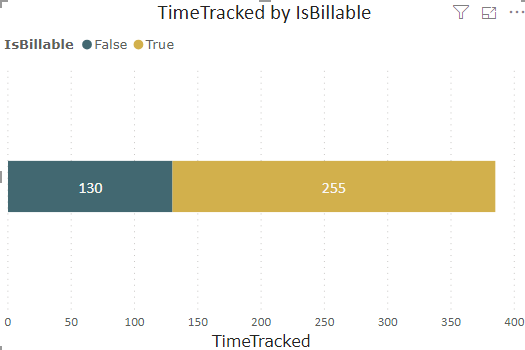
And I want a measure that only selects all the TRUE so I can eventually have a graph that compares Billable vs non-billable like so:
Can anyone help me to make this measure or advice on another way to do so? So far I have come up with:
@Anonymous why not create stacked bar chart and put Is Billable column on Legend and Time Tracked on values, it will do it.
Subscribe to the @PowerBIHowTo YT channel for an upcoming video on List and Record functions in Power Query!!
Learn Power BI and Fabric - subscribe to our YT channel - Click here: @PowerBIHowTo
If my solution proved useful, I'd be delighted to receive Kudos. When you put effort into asking a question, it's equally thoughtful to acknowledge and give Kudos to the individual who helped you solve the problem. It's a small gesture that shows appreciation and encouragement! ❤
Did I answer your question? Mark my post as a solution. Proud to be a Super User! Appreciate your Kudos 🙂
Feel free to email me with any of your BI needs.
I see that did the job! Is there a way to change the legend labels from True and False to Billable and Non-billable?
@Anonymous add a custom column in your model to get that label and use that on legend
Legend =
IF ( Table[Is Billable], "Billable", "Non-Billable" )
Would appreciate if you give Kudos if my solution helped.
Subscribe to the @PowerBIHowTo YT channel for an upcoming video on List and Record functions in Power Query!!
Learn Power BI and Fabric - subscribe to our YT channel - Click here: @PowerBIHowTo
If my solution proved useful, I'd be delighted to receive Kudos. When you put effort into asking a question, it's equally thoughtful to acknowledge and give Kudos to the individual who helped you solve the problem. It's a small gesture that shows appreciation and encouragement! ❤
Did I answer your question? Mark my post as a solution. Proud to be a Super User! Appreciate your Kudos 🙂
Feel free to email me with any of your BI needs.
Absolute genius!
So what if i wanted to display the different amounts on cards? Like 285 hours billable
@Anonymous you can create a measure or put visual level filter and select value "Billable"
Subscribe to the @PowerBIHowTo YT channel for an upcoming video on List and Record functions in Power Query!!
Learn Power BI and Fabric - subscribe to our YT channel - Click here: @PowerBIHowTo
If my solution proved useful, I'd be delighted to receive Kudos. When you put effort into asking a question, it's equally thoughtful to acknowledge and give Kudos to the individual who helped you solve the problem. It's a small gesture that shows appreciation and encouragement! ❤
Did I answer your question? Mark my post as a solution. Proud to be a Super User! Appreciate your Kudos 🙂
Feel free to email me with any of your BI needs.
Join us in Barcelona for FabCon and SQLCon, the Fabric, Power BI, SQL, and AI community event. Save €200 with code FABCMTY200.
Join Fabric Data Days 2026: 60 days of free live/on-demand sessions, challenges, study groups, and certification opportunities.
| User | Count |
|---|---|
| 27 | |
| 24 | |
| 18 | |
| 14 | |
| 14 |
| User | Count |
|---|---|
| 65 | |
| 41 | |
| 40 | |
| 39 | |
| 39 |