- Subscribe to RSS Feed
- Mark Topic as New
- Mark Topic as Read
- Float this Topic for Current User
- Bookmark
- Subscribe
- Printer Friendly Page
- Mark as New
- Bookmark
- Subscribe
- Mute
- Subscribe to RSS Feed
- Permalink
- Report Inappropriate Content

Icons Conditional Formatting
This works great for the gauges for the conditional formatting of gauges. But I want to do something very similar for the icons in my table, just like this but to say red/green circles and I can't figure it out.
eNPS color = if('Employee NPS'[Employee NPS]<sum('Targets'[Employee NPS target]),"#Dc3912",if('Employee NPS'[Employee NPS]>sum('Targets'[Employee NPS target]),"#109618"))
Solved! Go to Solution.
- Mark as New
- Bookmark
- Subscribe
- Mute
- Subscribe to RSS Feed
- Permalink
- Report Inappropriate Content

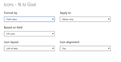
@Anonymous choose cpi color 2 on based on the field, and then put the rules for 0 to show red circle or whatever you want to show..you are not sharing full rule screen, I don't know how you expect me to understand what you are doing from half of the screenshot. I have no magical way to figure out the rules
Subscribe to the @PowerBIHowTo YT channel for an upcoming video on List and Record functions in Power Query!!
Learn Power BI and Fabric - subscribe to our YT channel - Click here: @PowerBIHowTo
If my solution proved useful, I'd be delighted to receive Kudos. When you put effort into asking a question, it's equally thoughtful to acknowledge and give Kudos to the individual who helped you solve the problem. It's a small gesture that shows appreciation and encouragement! ❤
Did I answer your question? Mark my post as a solution. Proud to be a Super User! Appreciate your Kudos 🙂
Feel free to email me with any of your BI needs.
- Mark as New
- Bookmark
- Subscribe
- Mute
- Subscribe to RSS Feed
- Permalink
- Report Inappropriate Content

Hi @Anonymous ,
Could you tell me if your problem has been solved?
If it is, kindly Accept it as the solution. More people will benefit from it.
Or you are still confused about it, please provide me with more details about your table and your problem or share me with your pbix file from your Onedrive for Business.
Best Regards,
Stephen Tao
- Mark as New
- Bookmark
- Subscribe
- Mute
- Subscribe to RSS Feed
- Permalink
- Report Inappropriate Content

Hi @Anonymous ,
About icons color conditional formatting, there's a similar post you can refer to:
About icon names, you can refer to:
Best Regards,
Stephen Tao
If this post helps, then please consider Accept it as the solution to help the other members find it more quickly.
- Mark as New
- Bookmark
- Subscribe
- Mute
- Subscribe to RSS Feed
- Permalink
- Report Inappropriate Content

@Anonymous choose cpi color 2 on based on the field, and then put the rules for 0 to show red circle or whatever you want to show..you are not sharing full rule screen, I don't know how you expect me to understand what you are doing from half of the screenshot. I have no magical way to figure out the rules
Subscribe to the @PowerBIHowTo YT channel for an upcoming video on List and Record functions in Power Query!!
Learn Power BI and Fabric - subscribe to our YT channel - Click here: @PowerBIHowTo
If my solution proved useful, I'd be delighted to receive Kudos. When you put effort into asking a question, it's equally thoughtful to acknowledge and give Kudos to the individual who helped you solve the problem. It's a small gesture that shows appreciation and encouragement! ❤
Did I answer your question? Mark my post as a solution. Proud to be a Super User! Appreciate your Kudos 🙂
Feel free to email me with any of your BI needs.
- Mark as New
- Bookmark
- Subscribe
- Mute
- Subscribe to RSS Feed
- Permalink
- Report Inappropriate Content

@Anonymous keep that color measure as it is, but add a new measure to return 0 and 1 and in the table visual, use conditional formatting for icon set and then use this measure to set the red or green color, check this post how to add icon set
Subscribe to the @PowerBIHowTo YT channel for an upcoming video on List and Record functions in Power Query!!
Learn Power BI and Fabric - subscribe to our YT channel - Click here: @PowerBIHowTo
If my solution proved useful, I'd be delighted to receive Kudos. When you put effort into asking a question, it's equally thoughtful to acknowledge and give Kudos to the individual who helped you solve the problem. It's a small gesture that shows appreciation and encouragement! ❤
Did I answer your question? Mark my post as a solution. Proud to be a Super User! Appreciate your Kudos 🙂
Feel free to email me with any of your BI needs.
- Mark as New
- Bookmark
- Subscribe
- Mute
- Subscribe to RSS Feed
- Permalink
- Report Inappropriate Content

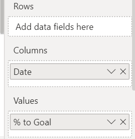
This is what I currently have that is not working.
Matrix
% to goal conditional formatting, icons.
CPI color = if(sum('CPI'[% to goal])<sum('Targets'[CPI target]),"#Dc3912",if(sum('CPI'[% to goal])>sum('Targets'[CPI target]),"#109618"))
CPI color2 = if(sum('CPI'[% to goal])<sum('Targets'[CPI target]),1,if(sum('CPI'[% to goal])>sum('Targets'[CPI target]),0))
- Mark as New
- Bookmark
- Subscribe
- Mute
- Subscribe to RSS Feed
- Permalink
- Report Inappropriate Content

@Anonymous hmmm circle are icons conditional formatting, so based on the value you choose what icon to show, instead of color, return value 0 or 1 and on 0 let's say show green circle and on 1 show red circle.
eNPS color = if('Employee NPS'[Employee NPS]<sum('Targets'[Employee NPS target]),0,if('Employee NPS'[Employee NPS]>sum('Targets'[Employee NPS target]),1))
Check my latest blog post Compare Budgeted Scenarios vs. Actuals to get a summary of my favourite Power BI feature releases in 2020
I would ❤ Kudos if my solution helped. 👉 If you can spend time posting the question, you can also make efforts to give Kudos to whoever helped to solve your problem. It is a token of appreciation!
⚡Visit us at https://perytus.com, your one-stop-shop for Power BI-related projects/training/consultancy.⚡
Subscribe to the @PowerBIHowTo YT channel for an upcoming video on List and Record functions in Power Query!!
Learn Power BI and Fabric - subscribe to our YT channel - Click here: @PowerBIHowTo
If my solution proved useful, I'd be delighted to receive Kudos. When you put effort into asking a question, it's equally thoughtful to acknowledge and give Kudos to the individual who helped you solve the problem. It's a small gesture that shows appreciation and encouragement! ❤
Did I answer your question? Mark my post as a solution. Proud to be a Super User! Appreciate your Kudos 🙂
Feel free to email me with any of your BI needs.
- Mark as New
- Bookmark
- Subscribe
- Mute
- Subscribe to RSS Feed
- Permalink
- Report Inappropriate Content

In the gauges i am using conditional formatting, format by field color, using this value. How do i apply this? Where are 1 and 0 defined?
Helpful resources
| Subject | Author | Posted | |
|---|---|---|---|
| 11-19-2024 12:30 PM | |||
| 02-09-2025 02:16 AM | |||
| 02-08-2025 06:38 AM | |||
| 10-03-2024 06:58 AM | |||
| 10-06-2023 12:07 AM |
| User | Count |
|---|---|
| 122 | |
| 107 | |
| 85 | |
| 52 | |
| 46 |


