FabCon is coming to Atlanta
Join us at FabCon Atlanta from March 16 - 20, 2026, for the ultimate Fabric, Power BI, AI and SQL community-led event. Save $200 with code FABCOMM.
Register now!- Power BI forums
- Get Help with Power BI
- Desktop
- Service
- Report Server
- Power Query
- Mobile Apps
- Developer
- DAX Commands and Tips
- Custom Visuals Development Discussion
- Health and Life Sciences
- Power BI Spanish forums
- Translated Spanish Desktop
- Training and Consulting
- Instructor Led Training
- Dashboard in a Day for Women, by Women
- Galleries
- Data Stories Gallery
- Themes Gallery
- Contests Gallery
- QuickViz Gallery
- Quick Measures Gallery
- Visual Calculations Gallery
- Notebook Gallery
- Translytical Task Flow Gallery
- TMDL Gallery
- R Script Showcase
- Webinars and Video Gallery
- Ideas
- Custom Visuals Ideas (read-only)
- Issues
- Issues
- Events
- Upcoming Events
Learn from the best! Meet the four finalists headed to the FINALS of the Power BI Dataviz World Championships! Register now
- Power BI forums
- Forums
- Get Help with Power BI
- Desktop
- I need help
- Subscribe to RSS Feed
- Mark Topic as New
- Mark Topic as Read
- Float this Topic for Current User
- Bookmark
- Subscribe
- Printer Friendly Page
- Mark as New
- Bookmark
- Subscribe
- Mute
- Subscribe to RSS Feed
- Permalink
- Report Inappropriate Content
I need help
Hello!
I have a database containing student enrolments, the dates of which range from June to October 2021 and May to July 2022.
To do this, I need to calculate the accumulated of these registrations per year and also make a graph of lines to compare the accumulated of both years.
I have tried every possible formula, but nothing is working for me.
I would appreciate your help!!
Best regards
Solved! Go to Solution.
- Mark as New
- Bookmark
- Subscribe
- Mute
- Subscribe to RSS Feed
- Permalink
- Report Inappropriate Content
Hi @Syndicate_Admin ,
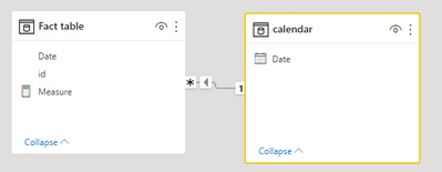
1 create a model like the following( add a calendar table for the fact table):
2 create a measure via:
Measure =
calculate(DISTINCTCOUNT('Fact table'[id]),  DATESYTD('calendar'[Date]))
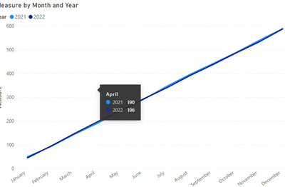
Result:
Pbix in the end you can refer.
Best Regards
Community Support Team _ chenwu zhu
If this post helps, then please consider Accept it as the solution to help the other members find it more quickly.
- Mark as New
- Bookmark
- Subscribe
- Mute
- Subscribe to RSS Feed
- Permalink
- Report Inappropriate Content
Hello,
As long as you have a unique ID per enrolment and the enrolment date column, marked as data type 'date' and in a relationship with your date table, it should be straightforward to aggregate your enrolments as a measure in DAX;
Number of enrolments = DISTINCTCOUNTNOBLANK(Table[EnrolmentID]),
Then with your date hierarchy - I would drag Year, then month, then date of your date table into the X axis of a line chart so that you can toggle up to Year to compare years. Drag Number of enrolments into the Y axis.
- Mark as New
- Bookmark
- Subscribe
- Mute
- Subscribe to RSS Feed
- Permalink
- Report Inappropriate Content
Thank you.
I did as he told me, but my problem persists.
When graphing, the gross and non-accumulated valoes appear as I need.
Also, I need the lines from both years to appear on the same chart.
Helpful resources

Join our Fabric User Panel
Share feedback directly with Fabric product managers, participate in targeted research studies and influence the Fabric roadmap.

Power BI Monthly Update - February 2026
Check out the February 2026 Power BI update to learn about new features.

| User | Count |
|---|---|
| 52 | |
| 51 | |
| 35 | |
| 15 | |
| 14 |
| User | Count |
|---|---|
| 92 | |
| 75 | |
| 41 | |
| 26 | |
| 25 |


