Party with Power BI’s own Guy in a Cube
Power BI is turning 10! Tune in for a special live episode on July 24 with behind-the-scenes stories, product evolution highlights, and a sneak peek at what’s in store for the future.
Save the date- Power BI forums
- Get Help with Power BI
- Desktop
- Service
- Report Server
- Power Query
- Mobile Apps
- Developer
- DAX Commands and Tips
- Custom Visuals Development Discussion
- Health and Life Sciences
- Power BI Spanish forums
- Translated Spanish Desktop
- Training and Consulting
- Instructor Led Training
- Dashboard in a Day for Women, by Women
- Galleries
- Data Stories Gallery
- Themes Gallery
- Contests Gallery
- Quick Measures Gallery
- Notebook Gallery
- Translytical Task Flow Gallery
- TMDL Gallery
- R Script Showcase
- Webinars and Video Gallery
- Ideas
- Custom Visuals Ideas (read-only)
- Issues
- Issues
- Events
- Upcoming Events
Enhance your career with this limited time 50% discount on Fabric and Power BI exams. Ends August 31st. Request your voucher.
- Power BI forums
- Forums
- Get Help with Power BI
- Desktop
- How use the secondary axis not for a series but fo...
- Subscribe to RSS Feed
- Mark Topic as New
- Mark Topic as Read
- Float this Topic for Current User
- Bookmark
- Subscribe
- Printer Friendly Page
- Mark as New
- Bookmark
- Subscribe
- Mute
- Subscribe to RSS Feed
- Permalink
- Report Inappropriate Content
How use the secondary axis not for a series but for a conversion of the main series
Hi,
I searched this problem in others topics but I didn't find it.
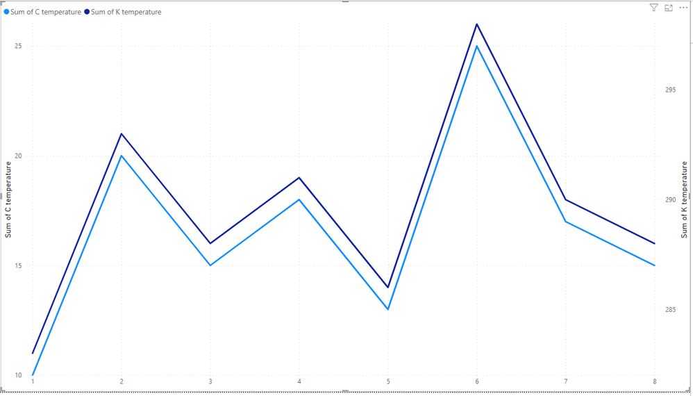
I have a series of data and I would like to use the secondary axis to show its values "converted" to another scale.
For example, let say I have a serie of measurements of a temperature in Celsius, but I would like to show their conversion to Kelvin on the right axis: can I do it?
Every topic I found about the "right axis" is always about the standard use of secondary axis (so, about another serie to show).
I tried creating a new column with the values in Kelvin and to show it as secondary axis, but in this way the two y axis are not linked (or syncronized), and the two series doesn't overlap.
I would like to have just one serie in my graphic, and be able to see on the left the value in Celsius and on the right the value in Kelvin.
As last notice: my question is "general" and the Celsius/Kelvin is just an example, so I cannot simply foce the minimum and the maximum of the axis to some fixed value matching between Celsius and Kelvin.
Thank you very much !
Solved! Go to Solution.
- Mark as New
- Bookmark
- Subscribe
- Mute
- Subscribe to RSS Feed
- Permalink
- Report Inappropriate Content
Hi @FP
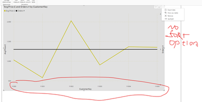
In the standard situation, we can sort the graph by all axes.
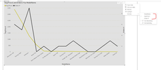
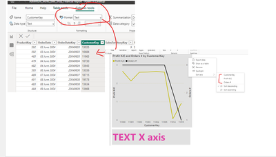
In your example, the problem is that the X-axis is numeric too.
Change this column's data type to text, this will give you an option to sort:
Link to the file with an example
If this post helps, then please consider Accepting it as the solution to help the other members find it more quickly
Rita Fainshtein | Microsoft MVP
https://www.linkedin.com/in/rita-fainshtein/
Blog : https://www.madeiradata.com/profile/ritaf/profile
- Mark as New
- Bookmark
- Subscribe
- Mute
- Subscribe to RSS Feed
- Permalink
- Report Inappropriate Content
Hi @FP
Okay, sorry for the misunderstanding.
Now I see that your problem is a proportion.
1 Celsius isn't equal to 1 Kelvin degree, so this just can't be on the same height of axes.
You need to split this graph into 2 separate graphs.
If this post helps, then please consider Accepting it as the solution to help the other members find it more quickly
Rita Fainshtein | Microsoft MVP
https://www.linkedin.com/in/rita-fainshtein/
Blog : https://www.madeiradata.com/profile/ritaf/profile
- Mark as New
- Bookmark
- Subscribe
- Mute
- Subscribe to RSS Feed
- Permalink
- Report Inappropriate Content
Unfortunately there is no something to do if you need it dynamically and responisive.
If it static you can preper second axis on power point or others and paste in the needed place
Rita Fainshtein | Microsoft MVP
https://www.linkedin.com/in/rita-fainshtein/
Blog : https://www.madeiradata.com/profile/ritaf/profile
- Mark as New
- Bookmark
- Subscribe
- Mute
- Subscribe to RSS Feed
- Permalink
- Report Inappropriate Content
Hi @FP
In the standard situation, we can sort the graph by all axes.
In your example, the problem is that the X-axis is numeric too.
Change this column's data type to text, this will give you an option to sort:
Link to the file with an example
If this post helps, then please consider Accepting it as the solution to help the other members find it more quickly
Rita Fainshtein | Microsoft MVP
https://www.linkedin.com/in/rita-fainshtein/
Blog : https://www.madeiradata.com/profile/ritaf/profile
- Mark as New
- Bookmark
- Subscribe
- Mute
- Subscribe to RSS Feed
- Permalink
- Report Inappropriate Content
Hi Ritaf1983,
and thank you for your answer.
Unfortunately, I'm not understanding the link between my problem and sorting axis : my issue is not about sorting the X axis, but about showing on the right y axis a conversion of the values in the left y axis (on the left I have the Celsius temperature, on the right I would like the temperature converted in Kelvin degree), without adding a second series.
Probably I havan't explained myself, sorry for that.
Kind regards
Francesco
- Mark as New
- Bookmark
- Subscribe
- Mute
- Subscribe to RSS Feed
- Permalink
- Report Inappropriate Content
Hi @FP
Okay, sorry for the misunderstanding.
Now I see that your problem is a proportion.
1 Celsius isn't equal to 1 Kelvin degree, so this just can't be on the same height of axes.
You need to split this graph into 2 separate graphs.
If this post helps, then please consider Accepting it as the solution to help the other members find it more quickly
Rita Fainshtein | Microsoft MVP
https://www.linkedin.com/in/rita-fainshtein/
Blog : https://www.madeiradata.com/profile/ritaf/profile
- Mark as New
- Bookmark
- Subscribe
- Mute
- Subscribe to RSS Feed
- Permalink
- Report Inappropriate Content
Celsius aren't LKelvin, but for any Celsius there is the corresponding value in Kelvin, so I was hoping it would be possible to graph the conversion of the left y axis on the right y axis (not only for Celsius/Kelvin, also for meters/yards, kg/lb...).
I will wait to see if someelse has some ideas/trick 🙂
Thank you for your answer and your time
- Mark as New
- Bookmark
- Subscribe
- Mute
- Subscribe to RSS Feed
- Permalink
- Report Inappropriate Content
Unfortunately there is no something to do if you need it dynamically and responisive.
If it static you can preper second axis on power point or others and paste in the needed place
Rita Fainshtein | Microsoft MVP
https://www.linkedin.com/in/rita-fainshtein/
Blog : https://www.madeiradata.com/profile/ritaf/profile
Helpful resources
| User | Count |
|---|---|
| 76 | |
| 75 | |
| 46 | |
| 31 | |
| 27 |
| User | Count |
|---|---|
| 99 | |
| 91 | |
| 51 | |
| 48 | |
| 47 |


