Fabric Data Days starts November 4th!
Advance your Data & AI career with 50 days of live learning, dataviz contests, hands-on challenges, study groups & certifications and more!
Get registered- Power BI forums
- Get Help with Power BI
- Desktop
- Service
- Report Server
- Power Query
- Mobile Apps
- Developer
- DAX Commands and Tips
- Custom Visuals Development Discussion
- Health and Life Sciences
- Power BI Spanish forums
- Translated Spanish Desktop
- Training and Consulting
- Instructor Led Training
- Dashboard in a Day for Women, by Women
- Galleries
- Data Stories Gallery
- Themes Gallery
- Contests Gallery
- Quick Measures Gallery
- Visual Calculations Gallery
- Notebook Gallery
- Translytical Task Flow Gallery
- TMDL Gallery
- R Script Showcase
- Webinars and Video Gallery
- Ideas
- Custom Visuals Ideas (read-only)
- Issues
- Issues
- Events
- Upcoming Events
Get Fabric Certified for FREE during Fabric Data Days. Don't miss your chance! Learn more
- Power BI forums
- Forums
- Get Help with Power BI
- Desktop
- Re: How to visualize data from a long term plan co...
- Subscribe to RSS Feed
- Mark Topic as New
- Mark Topic as Read
- Float this Topic for Current User
- Bookmark
- Subscribe
- Printer Friendly Page
- Mark as New
- Bookmark
- Subscribe
- Mute
- Subscribe to RSS Feed
- Permalink
- Report Inappropriate Content
How to visualize data from a long term plan consisting of multiple spreadsheets
Hi,
I am new to both Power BI and this forum, so I apologize in advance if I am asking something obvious.
Suppose I have 4 spreadsheet tabs all looking like this:
Asset 2019 2020 2021
A $ $ $
B $ $ $
C $ $ $
The first tab contains Labor Costs, second contains Material Costs, third contains Admin Costs, and fourth contains EBITDA. The current relationships among the tables are linked only by Asset as the key.
Questions:
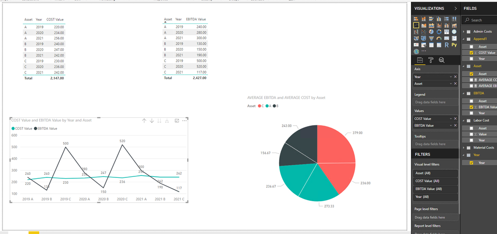
- How could I display in the first chart the trend of the Sum (Labor, Material, Admin) by Asset by year (x-axis), and the trend of EBITDA by Asset by year (x-axis)? [NTD: The objective is to see if Costs are rising faster than EBITDA.]
- How could I display in a second chart the 2019-2021 Average (Labor, Material, Admin) by Asset in a pie-chart? And a third chart the 2019-2021 Average EBITDA by Asset in a pie-chart? [NTD: The objective is to see if a certain Asset is responsible for an out-sized Cost or EBITDA.]
Thanks very much in advance for your time.
- Mark as New
- Bookmark
- Subscribe
- Mute
- Subscribe to RSS Feed
- Permalink
- Report Inappropriate Content
@vchan,
You would need to unpivot columns in each table, and append cost tables in a single table, then create relationship between the appended table and the EBITDA table. For more details about how to create the two charts, please review attached PBIX file.
Regards,
Lydia
- Mark as New
- Bookmark
- Subscribe
- Mute
- Subscribe to RSS Feed
- Permalink
- Report Inappropriate Content
Hi Lydia,
Thank you so much for taking the time to respond to my questions. I was hoping there would be a solution that does not involve "unpivoting" or normalization of the costs tables, and still would allow me to visualize the data in ways similar to the following:
where the Costs and EBITDA are the average Costs and average EBITDA of each Asset over 2019-2021. So far, I could only do this by first calculating the 2019-2021 averages into a table. Any instructions that could show me how I could save this first step, perhaps by joining the Costs tables in some ways, would be greatly appreciated. Thanks much in advance.
- Mark as New
- Bookmark
- Subscribe
- Mute
- Subscribe to RSS Feed
- Permalink
- Report Inappropriate Content
- Mark as New
- Bookmark
- Subscribe
- Mute
- Subscribe to RSS Feed
- Permalink
- Report Inappropriate Content
@vchan,
Do you need to add Year to X-Axis in your bar chart? Could you please share me your current PBIX file?
Regards,
Lydia
- Mark as New
- Bookmark
- Subscribe
- Mute
- Subscribe to RSS Feed
- Permalink
- Report Inappropriate Content
Hi Lydia,
Adding "Year" to the x-axis would be informative, but I could live with only being able to see one year at a time (or the average of a few years) like the graphs I have included on Oct 11. Having said that, the bigger challenge for me is how I could avoid the process of normalizing the data supplied to me in the format as per attached every time the forecasts are updated. (Please see attached Excel documents.) I apologize I do not have authority to share the pbix file which contain commercially confidential projections. Thanks much in advance.
Regards,
Victor
- Mark as New
- Bookmark
- Subscribe
- Mute
- Subscribe to RSS Feed
- Permalink
- Report Inappropriate Content
@vchan,
I am unable to access the above link. You can share dummy data of your table here and post expected result based on sample data. And you can upload Excel file to OneDrive and then post shared link of Excel file here.
Regards,
Lydia
Helpful resources

Fabric Data Days
Advance your Data & AI career with 50 days of live learning, contests, hands-on challenges, study groups & certifications and more!

Power BI Monthly Update - October 2025
Check out the October 2025 Power BI update to learn about new features.


