A new Data Days event is coming soon!
This time we’re going bigger than ever. Fabric, Power BI, SQL, AI and more. We're covering it all. You won't want to miss it.
Learn more- Power BI forums
- Get Help with Power BI
- Desktop
- Service
- Report Server
- Power Query
- Mobile Apps
- Developer
- DAX Commands and Tips
- Custom Visuals Development Discussion
- Health and Life Sciences
- Power BI Spanish forums
- Translated Spanish Desktop
- Training and Consulting
- Instructor Led Training
- Dashboard in a Day for Women, by Women
- Galleries
- Data Stories Gallery
- Themes Gallery
- Contests Gallery
- QuickViz Gallery
- Quick Measures Gallery
- Visual Calculations Gallery
- Notebook Gallery
- Translytical Task Flow Gallery
- TMDL Gallery
- R Script Showcase
- Webinars and Video Gallery
- Ideas
- Custom Visuals Ideas (read-only)
- Issues
- Issues
- Events
- Upcoming Events
Level up your Power BI skills this month - build one visual each week and tell better stories with data! Get started
- Power BI forums
- Forums
- Get Help with Power BI
- Desktop
- How to use colourmap or colour gradient on scatter...
- Subscribe to RSS Feed
- Mark Topic as New
- Mark Topic as Read
- Float this Topic for Current User
- Bookmark
- Subscribe
- Printer Friendly Page
- Mark as New
- Bookmark
- Subscribe
- Mute
- Subscribe to RSS Feed
- Permalink
- Report Inappropriate Content
How to use colourmap or colour gradient on scatterplot based on third column
Hello community,
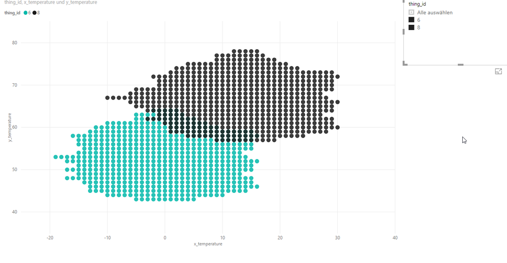
I need to create a scatter plot in Power BI, where I have two or three different groups with different colours.
The colour of each group should be a colourmap, or follow a colour gradient with only one hue (for example from lime green to dark green) based on the value of another column provided in the table.
So lets say I have for example a scatter plot with green and blue dots, and the underlying table contains a column x which has not been used so far in the plot.
I need the colour of the green dots be darker if the value of x is high, and brighter, if the value of x is low.
Likewise the colour of the blue dots should be darker for high x, and brighter for low x.
I would apreciate any help, thank you in advance!
Best regards
- Mark as New
- Bookmark
- Subscribe
- Mute
- Subscribe to RSS Feed
- Permalink
- Report Inappropriate Content
Hi @DonWampone ,
Kindly share your sample data and excepted result to me if you don't have any Confidential Information. Please upload your files to One Drive and share the link here.
If this post helps, then please consider Accept it as the solution to help the others find it more quickly.
- Mark as New
- Bookmark
- Subscribe
- Mute
- Subscribe to RSS Feed
- Permalink
- Report Inappropriate Content
Hi,
@v-frfei-msft , here is the one drive link with the data.
https://1drv.ms/f/s!AqlBeIoiUeZNdNa7b7R1mvEiM-A
What I need, is that the gradient or the intensity of the colour of the dots depends on the value of the column 'running_time'.
For example, if the value of 'running_time' is high, the dots should be in a darker colour.
Best regards
Helpful resources

Power BI Monthly Update - April 2026
Check out the April 2026 Power BI update to learn about new features.

Data Days 2026 coming soon!
Sign up to receive a private message when registration opens and key events begin.

New to Fabric Survey
If you have recently started exploring Fabric, we'd love to hear how it's going. Your feedback can help with product improvements.

| User | Count |
|---|---|
| 36 | |
| 33 | |
| 31 | |
| 24 | |
| 18 |
| User | Count |
|---|---|
| 68 | |
| 50 | |
| 33 | |
| 24 | |
| 24 |

