- Subscribe to RSS Feed
- Mark Topic as New
- Mark Topic as Read
- Float this Topic for Current User
- Bookmark
- Subscribe
- Printer Friendly Page
- Mark as New
- Bookmark
- Subscribe
- Mute
- Subscribe to RSS Feed
- Permalink
- Report Inappropriate Content

How to use Power BI Sparkline like excel
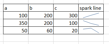
Is it possible to create a sparkline in power bi desktop without using date. for example I have 3 columns which have their own values. I want to show these values in a column which is a sparkline exactly like spark line in excel. I need something like this in power bi:
How can I create it? What should be in x-axis and y-axis? Thanks
- Mark as New
- Bookmark
- Subscribe
- Mute
- Subscribe to RSS Feed
- Permalink
- Report Inappropriate Content

Hi @Shg !
A quick solution would be to split the columns up in different measures to get the required result.
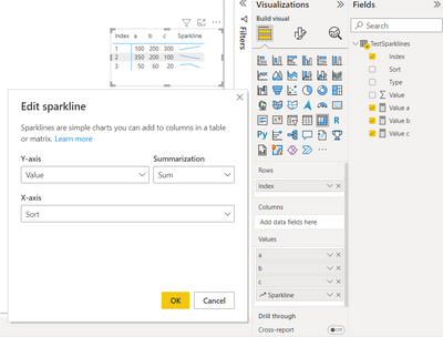
Your sparkline would be your total measure in this case and a,b,c filtered measures.
Create a sorting column for a, b, c and apply it to your y-axis in your sparkline. (e.g. a=1, b=2, c=3)
Value a = CALCULATE(SUM([Value]),FILTER(TestSparklines,TestSparklines[Type] = "a"))
Hope it helps!
Kind regards,
OD
- Mark as New
- Bookmark
- Subscribe
- Mute
- Subscribe to RSS Feed
- Permalink
- Report Inappropriate Content

Many thanks, Could you explain how did you create "Type", "Value" and index and sort based on the sample data? because "Type" and "Value" for instance is used in the formula below:
Value a = CALCULATE(SUM([Value]),FILTER(TestSparklines,TestSparklines[Type] = "a"))
Helpful resources
| Subject | Author | Posted | |
|---|---|---|---|
| 08-31-2024 01:37 AM | |||
| 05-02-2024 12:50 AM | |||
| 09-05-2024 10:12 AM | |||
| 03-26-2024 04:25 AM | |||
| 08-30-2024 02:58 AM |
| User | Count |
|---|---|
| 132 | |
| 105 | |
| 86 | |
| 55 | |
| 46 |


