FabCon is coming to Atlanta
Join us at FabCon Atlanta from March 16 - 20, 2026, for the ultimate Fabric, Power BI, AI and SQL community-led event. Save $200 with code FABCOMM.
Register now!- Power BI forums
- Get Help with Power BI
- Desktop
- Service
- Report Server
- Power Query
- Mobile Apps
- Developer
- DAX Commands and Tips
- Custom Visuals Development Discussion
- Health and Life Sciences
- Power BI Spanish forums
- Translated Spanish Desktop
- Training and Consulting
- Instructor Led Training
- Dashboard in a Day for Women, by Women
- Galleries
- Data Stories Gallery
- Themes Gallery
- Contests Gallery
- Quick Measures Gallery
- Notebook Gallery
- Translytical Task Flow Gallery
- TMDL Gallery
- R Script Showcase
- Webinars and Video Gallery
- Ideas
- Custom Visuals Ideas (read-only)
- Issues
- Issues
- Events
- Upcoming Events
Join the Fabric FabCon Global Hackathon—running virtually through Nov 3. Open to all skill levels. $10,000 in prizes! Register now.
- Power BI forums
- Forums
- Get Help with Power BI
- Desktop
- Re: How to use 100% stacked column chart on catego...
- Subscribe to RSS Feed
- Mark Topic as New
- Mark Topic as Read
- Float this Topic for Current User
- Bookmark
- Subscribe
- Printer Friendly Page
- Mark as New
- Bookmark
- Subscribe
- Mute
- Subscribe to RSS Feed
- Permalink
- Report Inappropriate Content
How to use 100% stacked column chart on categorical data?
I got a survey data set that I'd like to visuallise with a 100% stacked bar chart. However I can't seem to figure out how to visualise it on a 100% stacked bar charts. The data set is something like this:
QuestionA: T, T, F, F, NA
QuestionB: F, F, NA, T, F
QuestionC: NA, NA, F, T, T
I wanted to put my questions as x axis, and percentage as y axis on a 100% stacked bar chart. Do I need to write something on DAX? Or are there anything that I've completely overlooked?
Thank you.
- Mark as New
- Bookmark
- Subscribe
- Mute
- Subscribe to RSS Feed
- Permalink
- Report Inappropriate Content
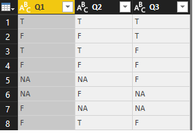
I have created a table like this :
And then used different measures to count the percentages of the TRUE or FALSE or NA for each question:
CountTrueQ1 = CALCULATE(COUNTROWS(FILTER('Q&A','Q&A'[Q1]="T")))/COUNTROWS('Q&A')*100
CountFalseQ1 = CALCULATE(COUNTROWS(FILTER('Q&A','Q&A'[Q1]="F")))/COUNTROWS('Q&A')*100
CountNAQ1 = CALCULATE(COUNTROWS(FILTER('Q&A','Q&A'[Q1]="NA")))/COUNTROWS('Q&A')*100
But I couldn't plot in the 100% stacked column chart, so now it is a challenge for me too ![]()
I hope others can help
- Mark as New
- Bookmark
- Subscribe
- Mute
- Subscribe to RSS Feed
- Permalink
- Report Inappropriate Content
Hi Daeglsy,
Could you share some sample data for further analysis?
Regards,
Jimmy Tao


