FabCon is coming to Atlanta
Join us at FabCon Atlanta from March 16 - 20, 2026, for the ultimate Fabric, Power BI, AI and SQL community-led event. Save $200 with code FABCOMM.
Register now!- Power BI forums
- Get Help with Power BI
- Desktop
- Service
- Report Server
- Power Query
- Mobile Apps
- Developer
- DAX Commands and Tips
- Custom Visuals Development Discussion
- Health and Life Sciences
- Power BI Spanish forums
- Translated Spanish Desktop
- Training and Consulting
- Instructor Led Training
- Dashboard in a Day for Women, by Women
- Galleries
- Data Stories Gallery
- Themes Gallery
- Contests Gallery
- QuickViz Gallery
- Quick Measures Gallery
- Visual Calculations Gallery
- Notebook Gallery
- Translytical Task Flow Gallery
- TMDL Gallery
- R Script Showcase
- Webinars and Video Gallery
- Ideas
- Custom Visuals Ideas (read-only)
- Issues
- Issues
- Events
- Upcoming Events
The Power BI Data Visualization World Championships is back! Get ahead of the game and start preparing now! Learn more
- Power BI forums
- Forums
- Get Help with Power BI
- Desktop
- Re: How to show Name of Day on X-Axis
- Subscribe to RSS Feed
- Mark Topic as New
- Mark Topic as Read
- Float this Topic for Current User
- Bookmark
- Subscribe
- Printer Friendly Page
- Mark as New
- Bookmark
- Subscribe
- Mute
- Subscribe to RSS Feed
- Permalink
- Report Inappropriate Content
How to show Name of Day on X-Axis
Newbie here, so excuse me if the question is stupid. I import an Excel file that contais a date column in a 'long date' format, meaning that the name of the day is already there.
When making a simple visualization of 'Sales by Day', the date on the X-Axis is in the format 'Date-Month'. I can't seem to find a way to show the name of day which is important to me.
Solved! Go to Solution.
- Mark as New
- Bookmark
- Subscribe
- Mute
- Subscribe to RSS Feed
- Permalink
- Report Inappropriate Content
Hi @Anonymous
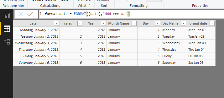
Open Edit queries, select the "Date" column, then select "Add column"->add year, add month name, add day, add day name
then close&&apply, create a calcuated column
format date = FORMAT([date],"ddd mmm dd")
Then you could create two kinds of visuals
Best Regards
Maggie
Community Support Team _ Maggie Li
If this post helps, then please consider Accept it as the solution to help the other members find it more quickly.
- Mark as New
- Bookmark
- Subscribe
- Mute
- Subscribe to RSS Feed
- Permalink
- Report Inappropriate Content
Hi @Anonymous
I make a simple test.
Please find which is different from yours.
| data in excel | |
| date | sales |
| Monday, January 1, 2018 | 1 |
| Tuesday, January 2, 2018 | 2 |
| Wednesday, January 3, 2018 | 3 |
| Thursday, January 4, 2018 | 4 |
| Friday, January 5, 2018 | 5 |
| Saturday, January 6, 2018 | 6 |
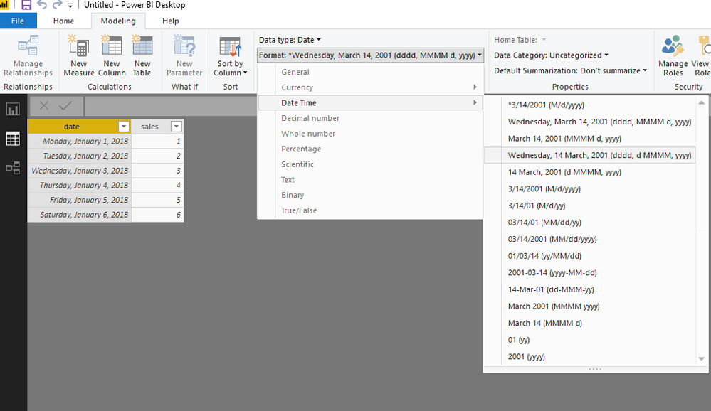
When importing to Power BI Desktop, if the date format isn't as you expected, you could change the date type as below.
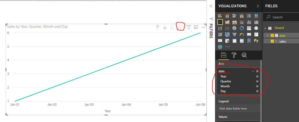
Then in the visual
Keep the "date" hierarchy (or no "date" hierarchy is also ok) and click on the icon circled by me.
Please look at my demo.
If you have any problem, please let me know.
Best Reagrds
Maggie
Community Support Team _ Maggie Li
If this post helps, then please consider Accept it as the solution to help the other members find it more quickly.
- Mark as New
- Bookmark
- Subscribe
- Mute
- Subscribe to RSS Feed
- Permalink
- Report Inappropriate Content
Hi Maggie,
Thanks for your answer.
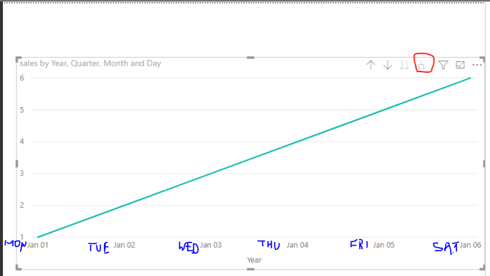
What I need to do is have the name of each day shown on X-Axis like marked below:
- Mark as New
- Bookmark
- Subscribe
- Mute
- Subscribe to RSS Feed
- Permalink
- Report Inappropriate Content
Hi @Anonymous
Open Edit queries, select the "Date" column, then select "Add column"->add year, add month name, add day, add day name
then close&&apply, create a calcuated column
format date = FORMAT([date],"ddd mmm dd")
Then you could create two kinds of visuals
Best Regards
Maggie
Community Support Team _ Maggie Li
If this post helps, then please consider Accept it as the solution to help the other members find it more quickly.
- Mark as New
- Bookmark
- Subscribe
- Mute
- Subscribe to RSS Feed
- Permalink
- Report Inappropriate Content
Hi @Anonymous
You could work with a workaround using DAX function "FORMAT".
Create columns with this funnction and add them to the Axis.
Best Regards
Maggie
Helpful resources

Power BI Dataviz World Championships
The Power BI Data Visualization World Championships is back! Get ahead of the game and start preparing now!

| User | Count |
|---|---|
| 40 | |
| 38 | |
| 36 | |
| 29 | |
| 28 |
| User | Count |
|---|---|
| 127 | |
| 88 | |
| 78 | |
| 66 | |
| 64 |


