Huge last-minute discounts for FabCon Vienna from September 15-18, 2025
Supplies are limited. Contact info@espc.tech right away to save your spot before the conference sells out.
Get your discount- Power BI forums
- Get Help with Power BI
- Desktop
- Service
- Report Server
- Power Query
- Mobile Apps
- Developer
- DAX Commands and Tips
- Custom Visuals Development Discussion
- Health and Life Sciences
- Power BI Spanish forums
- Translated Spanish Desktop
- Training and Consulting
- Instructor Led Training
- Dashboard in a Day for Women, by Women
- Galleries
- Data Stories Gallery
- Themes Gallery
- Contests Gallery
- Quick Measures Gallery
- Notebook Gallery
- Translytical Task Flow Gallery
- TMDL Gallery
- R Script Showcase
- Webinars and Video Gallery
- Ideas
- Custom Visuals Ideas (read-only)
- Issues
- Issues
- Events
- Upcoming Events
Score big with last-minute savings on the final tickets to FabCon Vienna. Secure your discount
- Power BI forums
- Forums
- Get Help with Power BI
- Desktop
- How to show Forecast values in line and clustered ...
- Subscribe to RSS Feed
- Mark Topic as New
- Mark Topic as Read
- Float this Topic for Current User
- Bookmark
- Subscribe
- Printer Friendly Page
- Mark as New
- Bookmark
- Subscribe
- Mute
- Subscribe to RSS Feed
- Permalink
- Report Inappropriate Content
How to show Forecast values in line and clustered column chart
Hello,
I have a below chart
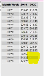
I would like to show the Forecast(predicted) values for 2020 for the upcoming weeks(example 05-W3, 05-W4, 05-W5 and so on).
I would like to show the predicted (AVG_RAW_CONS_MGD)value, the Raw variance% for 2020 based on the values of previous years(2017, 2018, 2019).
When I click on Analytics tab in Visualization pane to display Forecast values, It is showing me as "Analytics features aren't available for this visual".
Please let me know if there is any way to do this.
Thank you!
Regards,
Aswini
- Mark as New
- Bookmark
- Subscribe
- Mute
- Subscribe to RSS Feed
- Permalink
- Report Inappropriate Content
Hi @Anonymous ,
There's no data in your table about 05-w3,w4,w5 in 2020, as you see below:
if the data shown in the pic is from your data source not from a calculated column,you can create a column like:
_2020=IF(ISBLANK('Table[2020]),CALCULATE('Table[2020],DATEADD('Table'[date],-1,year),'Table'[2020])
Kelly
- Mark as New
- Bookmark
- Subscribe
- Mute
- Subscribe to RSS Feed
- Permalink
- Report Inappropriate Content
Hi @v-kelly-msft ,
Thank you for your response!
Below is the some of the Source data. My week Column Starts from 2016-01-W1 and ends with 2020-05-W2
I would like to show the forecasted data for 2020-05-W3 to 2020-12-W5.
In some the blogs it says power Bi line and clustered column chart doesn't support Analytics(forecast) option.
Please let me know if there is any other way to do this.
Thank you!
Regards,
Aswini C S.
- Mark as New
- Bookmark
- Subscribe
- Mute
- Subscribe to RSS Feed
- Permalink
- Report Inappropriate Content
Hi @Anonymous ,
Lastly, you can't currently apply any dynamic lines to many visuals, including (but not limited to):
- Funnel
- Line and clustered column chart
- Line and stacked column chart
- Ribbon chart
- Non-Cartesian visuals, such as Donut chart, Gauge, Matrix, Pie chart, and Table
Here is the reference:
https://docs.microsoft.com/en-us/power-bi/transform-model/desktop-analytics-pane
So can you change your visual to clustered column chart which has a trend line.
Kelly
Helpful resources
| User | Count |
|---|---|
| 64 | |
| 59 | |
| 47 | |
| 32 | |
| 31 |
| User | Count |
|---|---|
| 84 | |
| 73 | |
| 52 | |
| 50 | |
| 44 |


