Become a Certified Power BI Data Analyst!
Join us for an expert-led overview of the tools and concepts you'll need to pass exam PL-300. The first session starts on June 11th. See you there!
Get registered- Power BI forums
- Get Help with Power BI
- Desktop
- Service
- Report Server
- Power Query
- Mobile Apps
- Developer
- DAX Commands and Tips
- Custom Visuals Development Discussion
- Health and Life Sciences
- Power BI Spanish forums
- Translated Spanish Desktop
- Training and Consulting
- Instructor Led Training
- Dashboard in a Day for Women, by Women
- Galleries
- Webinars and Video Gallery
- Data Stories Gallery
- Themes Gallery
- Contests Gallery
- Quick Measures Gallery
- Notebook Gallery
- Translytical Task Flow Gallery
- R Script Showcase
- Ideas
- Custom Visuals Ideas (read-only)
- Issues
- Issues
- Events
- Upcoming Events
Power BI is turning 10! Let’s celebrate together with dataviz contests, interactive sessions, and giveaways. Register now.
- Power BI forums
- Forums
- Get Help with Power BI
- Desktop
- How to set y-axis of data visualization to be a va...
- Subscribe to RSS Feed
- Mark Topic as New
- Mark Topic as Read
- Float this Topic for Current User
- Bookmark
- Subscribe
- Printer Friendly Page
- Mark as New
- Bookmark
- Subscribe
- Mute
- Subscribe to RSS Feed
- Permalink
- Report Inappropriate Content
How to set y-axis of data visualization to be a variable?
I have a excel file contains two columns, Date Revenue. I have done a graph with Date as x-axis and Revenue as y-axis.
However, I have the other excel file with two columns, Date Profit, and I want to do the same graph for this file without creating this graph again.
I know how to set a new parameter to direct the data source, but how to set a new parameter to replace the Revenue with Profit or whatever it called?
Solved! Go to Solution.
- Mark as New
- Bookmark
- Subscribe
- Mute
- Subscribe to RSS Feed
- Permalink
- Report Inappropriate Content
To achieve your requirement, you can refer to following steps:
1. Go to Edit Queries. Choose Merge Queries and expand the second table to make Profit and Revenue in one sample source table.
2. Unpivot the source table make Revenue and Profit as column values:
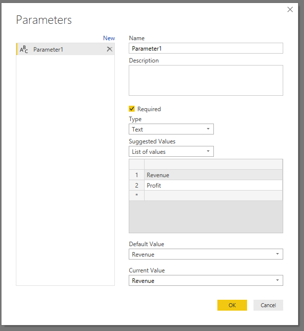
3. Create a parameter to filter Revenue and Profit:
4. Close & Apply. Then you can use parameter to filter the chart.
Thanks,
Xi Jin.
Helpful resources

Join our Fabric User Panel
This is your chance to engage directly with the engineering team behind Fabric and Power BI. Share your experiences and shape the future.

Power BI Monthly Update - June 2025
Check out the June 2025 Power BI update to learn about new features.

| User | Count |
|---|---|
| 84 | |
| 75 | |
| 68 | |
| 41 | |
| 35 |
| User | Count |
|---|---|
| 102 | |
| 56 | |
| 52 | |
| 46 | |
| 40 |


