FabCon is coming to Atlanta
Join us at FabCon Atlanta from March 16 - 20, 2026, for the ultimate Fabric, Power BI, AI and SQL community-led event. Save $200 with code FABCOMM.
Register now!- Power BI forums
- Get Help with Power BI
- Desktop
- Service
- Report Server
- Power Query
- Mobile Apps
- Developer
- DAX Commands and Tips
- Custom Visuals Development Discussion
- Health and Life Sciences
- Power BI Spanish forums
- Translated Spanish Desktop
- Training and Consulting
- Instructor Led Training
- Dashboard in a Day for Women, by Women
- Galleries
- Data Stories Gallery
- Themes Gallery
- Contests Gallery
- QuickViz Gallery
- Quick Measures Gallery
- Visual Calculations Gallery
- Notebook Gallery
- Translytical Task Flow Gallery
- TMDL Gallery
- R Script Showcase
- Webinars and Video Gallery
- Ideas
- Custom Visuals Ideas (read-only)
- Issues
- Issues
- Events
- Upcoming Events
View all the Fabric Data Days sessions on demand. View schedule
- Power BI forums
- Forums
- Get Help with Power BI
- Desktop
- Re: How to set separate Y-Axis ranges for single-c...
- Subscribe to RSS Feed
- Mark Topic as New
- Mark Topic as Read
- Float this Topic for Current User
- Bookmark
- Subscribe
- Printer Friendly Page
- Mark as New
- Bookmark
- Subscribe
- Mute
- Subscribe to RSS Feed
- Permalink
- Report Inappropriate Content
How to set separate Y-Axis ranges for single-column small multiples chart?
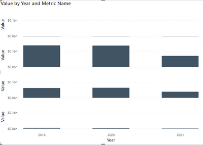
I am looking to make a small multiples chart across four sales categories that have very different ranges. I'd like to avoid breaking these into separate charts, but I can't figure out a way to make the Y-axis relative to the range for each dimension.
I've created a measure that accurately returns the MAX value along year for each of these categories, but that does not return the correct axis result. The formula is of the format:
Max Across Years = CALCULATE( MAXX( SUMMARIZE( 'Table', 'Table'[Date].[Year], "Annual Amount", SUM( 'Table'[Value] )), [Annual Amount] ), ALLEXCEPT('Table', 'Table'[Metric Name]) )
- Mark as New
- Bookmark
- Subscribe
- Mute
- Subscribe to RSS Feed
- Permalink
- Report Inappropriate Content
@Anonymous , You can try small multiple for this , with setting 1 column and 3 rows
https://docs.microsoft.com/en-us/power-bi/visuals/power-bi-visualization-small-multiples
- Mark as New
- Bookmark
- Subscribe
- Mute
- Subscribe to RSS Feed
- Permalink
- Report Inappropriate Content
Thanks @amitchandak. I am using that visual with that configuration, but each Y-axis is set to the same range. Should this automatically set independent axis ranges for each dimension used for small multiples?
If that is not automatic, do you know how I can use a formula to properly set the end of the axis to be relative to the max value along each row in the chart image I pasted above?
- Mark as New
- Bookmark
- Subscribe
- Mute
- Subscribe to RSS Feed
- Permalink
- Report Inappropriate Content
Hi @Anonymous ,
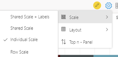
You could click the setting button on the right upper corner>scale>choose "Individual Scale":
And you will see the different Y-axis range:
Check below link for reference:
https://xviz.com/blogs/advanced-trellis-small-multiples-key-features-power-bi-visual/
Best Regards,
Kelly
Did I answer your question? Mark my reply as a solution!
- Mark as New
- Bookmark
- Subscribe
- Mute
- Subscribe to RSS Feed
- Permalink
- Report Inappropriate Content
Hi @v-kelly-msft, thank you!
I should have specified that I am using the Small Multiples option for the stacked column chart visual. Is this possible using this visual?
I do plan to use this with PowerBI Service and would like to be able to configure this dynamic axis without paying for the specific visual.
- Mark as New
- Bookmark
- Subscribe
- Mute
- Subscribe to RSS Feed
- Permalink
- Report Inappropriate Content
Hi @Anonymous ,
Yes,based on my test,it can.For more details ,you could check the reference I show.
Best Regards,
Kelly
Did I answer your question? Mark my reply as a solution!
- Mark as New
- Bookmark
- Subscribe
- Mute
- Subscribe to RSS Feed
- Permalink
- Report Inappropriate Content
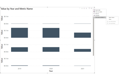
Thank you! I don't see that same menu that you show in PowerBI desktop.
And the reference you posted is from the specific xViz Advanced Trellis chart, which is not the default PowerBI stacked column chart.
These are the only options I have for the default stacked column visual.
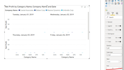
I do have an option to make a formula-based start and end to the axis, but my formula that I shared above does not work when I set that as the End of the axis:
- Mark as New
- Bookmark
- Subscribe
- Mute
- Subscribe to RSS Feed
- Permalink
- Report Inappropriate Content
Hi @Anonymous ,
Sorry for misunderstanding.
Function for small multiples in clustered column chart is very limited, all the settings for Y-axis can only be synchronized.
How about using the visual I recommended before?
Best Regards,
Kelly
Did I answer your question? Mark my reply as a solution!
- Mark as New
- Bookmark
- Subscribe
- Mute
- Subscribe to RSS Feed
- Permalink
- Report Inappropriate Content
Hi Kelly,
Thanks! Using the xViz option could work, but I do plan to use this in the PowerBI Service, which is an additional cost.
This is helpful, as this seems like a pretty basic requirement for small multiples and should be added to the column charts where small multiples is an option. To expect every partition of the small multiples to have similar data ranges seems strange to me, though I get that having a uniform axis may be desirable for many data profiling scenarios.
- Mark as New
- Bookmark
- Subscribe
- Mute
- Subscribe to RSS Feed
- Permalink
- Report Inappropriate Content
Hi @Anonymous ,
Maybe that's why xViz Advanced Trellis chart is created,clustered column chart is more forcused on vertical visualization which is compared to bar chart,and small multiples is not its key feature.
Best Regards,
Kelly
Did I answer your question? Mark my raeply as a solution!
Helpful resources

Power BI Monthly Update - November 2025
Check out the November 2025 Power BI update to learn about new features.

Fabric Data Days
Advance your Data & AI career with 50 days of live learning, contests, hands-on challenges, study groups & certifications and more!


