Fabric Data Days starts November 4th!
Advance your Data & AI career with 50 days of live learning, dataviz contests, hands-on challenges, study groups & certifications and more!
Get registered- Power BI forums
- Get Help with Power BI
- Desktop
- Service
- Report Server
- Power Query
- Mobile Apps
- Developer
- DAX Commands and Tips
- Custom Visuals Development Discussion
- Health and Life Sciences
- Power BI Spanish forums
- Translated Spanish Desktop
- Training and Consulting
- Instructor Led Training
- Dashboard in a Day for Women, by Women
- Galleries
- Data Stories Gallery
- Themes Gallery
- Contests Gallery
- Quick Measures Gallery
- Visual Calculations Gallery
- Notebook Gallery
- Translytical Task Flow Gallery
- TMDL Gallery
- R Script Showcase
- Webinars and Video Gallery
- Ideas
- Custom Visuals Ideas (read-only)
- Issues
- Issues
- Events
- Upcoming Events
Get Fabric Certified for FREE during Fabric Data Days. Don't miss your chance! Learn more
- Power BI forums
- Forums
- Get Help with Power BI
- Desktop
- How to set dynamic conditional formatting on color...
- Subscribe to RSS Feed
- Mark Topic as New
- Mark Topic as Read
- Float this Topic for Current User
- Bookmark
- Subscribe
- Printer Friendly Page
- Mark as New
- Bookmark
- Subscribe
- Mute
- Subscribe to RSS Feed
- Permalink
- Report Inappropriate Content
How to set dynamic conditional formatting on color of gauge chart?
In my PowerBi report, I have added a guage chart, and applied conditional formatting, based upon 2 values:
- Target
- Actual Value
If the actual value is more than target, then the gauge chart will be green otherwise red. Now, based upon the data selected in a multi select drop down, the values of both 'Target' and 'Actual value' changes. Therefore, I want to have a dynamic conditional formatting for the guage chart where the conditional formatting for color is applied correctly according to different targets and their respective actual values.
For example:
| Target; | Actual Value; | Color of Chart |
| 85 | 84 | Red |
| 77 | 79 | Green |
| 65 | 71 | Green |
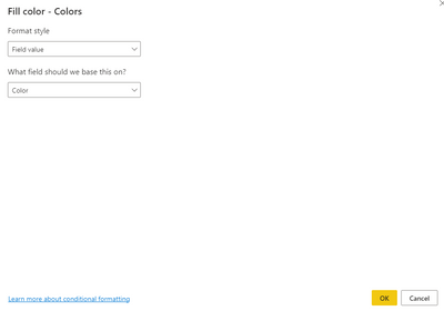
However, as displayed in the attached screenshot, the highlighted box expects a hardcoded numeric value. Please advise how to achieve this. Thanks in advance.
Solved! Go to Solution.
- Mark as New
- Bookmark
- Subscribe
- Mute
- Subscribe to RSS Feed
- Permalink
- Report Inappropriate Content
Hi @v-ankitgupta ,
Please try:
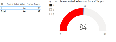
Color = IF(SUM('Table'[Actual Value;])>SUM('Table'[Target;]),"Green","Red")Final output:
Best Regards,
Jianbo Li
If this post helps, then please consider Accept it as the solution to help the other members find it more quickly.
- Mark as New
- Bookmark
- Subscribe
- Mute
- Subscribe to RSS Feed
- Permalink
- Report Inappropriate Content
A very belated thank you for posting this, works like a dream!
- Mark as New
- Bookmark
- Subscribe
- Mute
- Subscribe to RSS Feed
- Permalink
- Report Inappropriate Content
It worked Jianbo, Thank you very much.
Helpful resources

Fabric Data Days
Advance your Data & AI career with 50 days of live learning, contests, hands-on challenges, study groups & certifications and more!

Power BI Monthly Update - October 2025
Check out the October 2025 Power BI update to learn about new features.

| User | Count |
|---|---|
| 84 | |
| 48 | |
| 36 | |
| 31 | |
| 29 |


