Fabric Data Days starts November 4th!
Advance your Data & AI career with 50 days of live learning, dataviz contests, hands-on challenges, study groups & certifications and more!
Get registered- Power BI forums
- Get Help with Power BI
- Desktop
- Service
- Report Server
- Power Query
- Mobile Apps
- Developer
- DAX Commands and Tips
- Custom Visuals Development Discussion
- Health and Life Sciences
- Power BI Spanish forums
- Translated Spanish Desktop
- Training and Consulting
- Instructor Led Training
- Dashboard in a Day for Women, by Women
- Galleries
- Data Stories Gallery
- Themes Gallery
- Contests Gallery
- QuickViz Gallery
- Quick Measures Gallery
- Visual Calculations Gallery
- Notebook Gallery
- Translytical Task Flow Gallery
- TMDL Gallery
- R Script Showcase
- Webinars and Video Gallery
- Ideas
- Custom Visuals Ideas (read-only)
- Issues
- Issues
- Events
- Upcoming Events
Get Fabric Certified for FREE during Fabric Data Days. Don't miss your chance! Request now
- Power BI forums
- Forums
- Get Help with Power BI
- Desktop
- Re: How to represent the different data after you ...
- Subscribe to RSS Feed
- Mark Topic as New
- Mark Topic as Read
- Float this Topic for Current User
- Bookmark
- Subscribe
- Printer Friendly Page
- Mark as New
- Bookmark
- Subscribe
- Mute
- Subscribe to RSS Feed
- Permalink
- Report Inappropriate Content
How to represent the different data after you click in the scatter chart
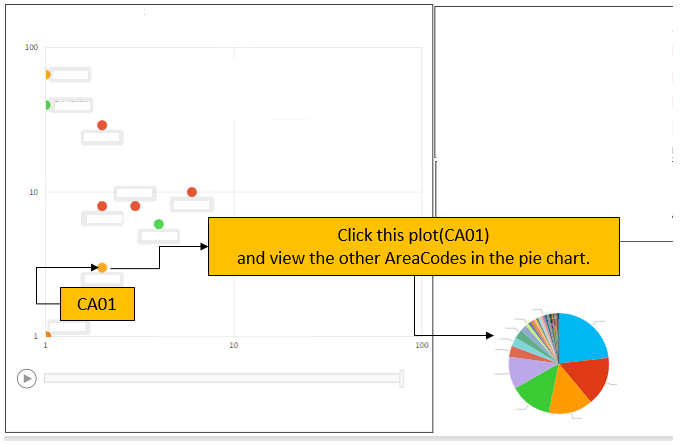
I'm correlating data using four data points, product No., product ID, area code, and date of incident.
I have 2 data points represented in the scatter chart.
In the pie chart I have gathered cases in which the product No., Product ID and date were the same but the area code is different.
I want to be able to represent the different area code data in a pie chart for summarization.
Any advice?
Thank you for your cooperation and regards,
Solved! Go to Solution.
- Mark as New
- Bookmark
- Subscribe
- Mute
- Subscribe to RSS Feed
- Permalink
- Report Inappropriate Content
Hi @SH_Ishikawa
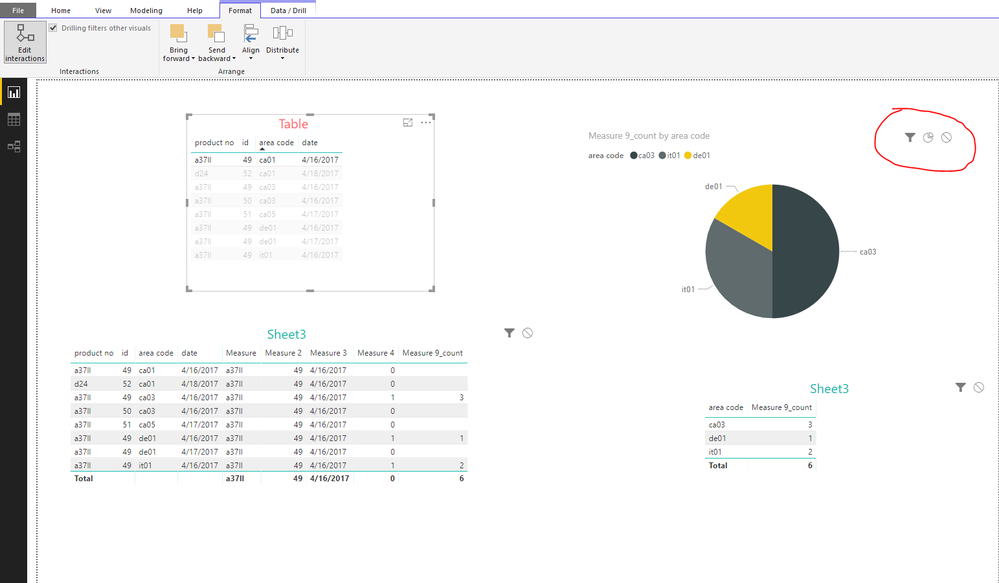
Create a new measure
Measure 9_count = CALCULATE(COUNT(Sheet3[area code]),FILTER(Sheet3,[Measure 4]=1))
add Sheet3[area code] in the "Legend" and Sheet3[Measure 9_count] in the "Value" field of the Pie Chart.
don't add [measure4] in the Visual Level filter.
set the interaction among "table1" and "pie chart" as below
Please refer to my pbix->Page2
Best Reagrds
Maggie
- Mark as New
- Bookmark
- Subscribe
- Mute
- Subscribe to RSS Feed
- Permalink
- Report Inappropriate Content
Hi @SH_Ishikawa
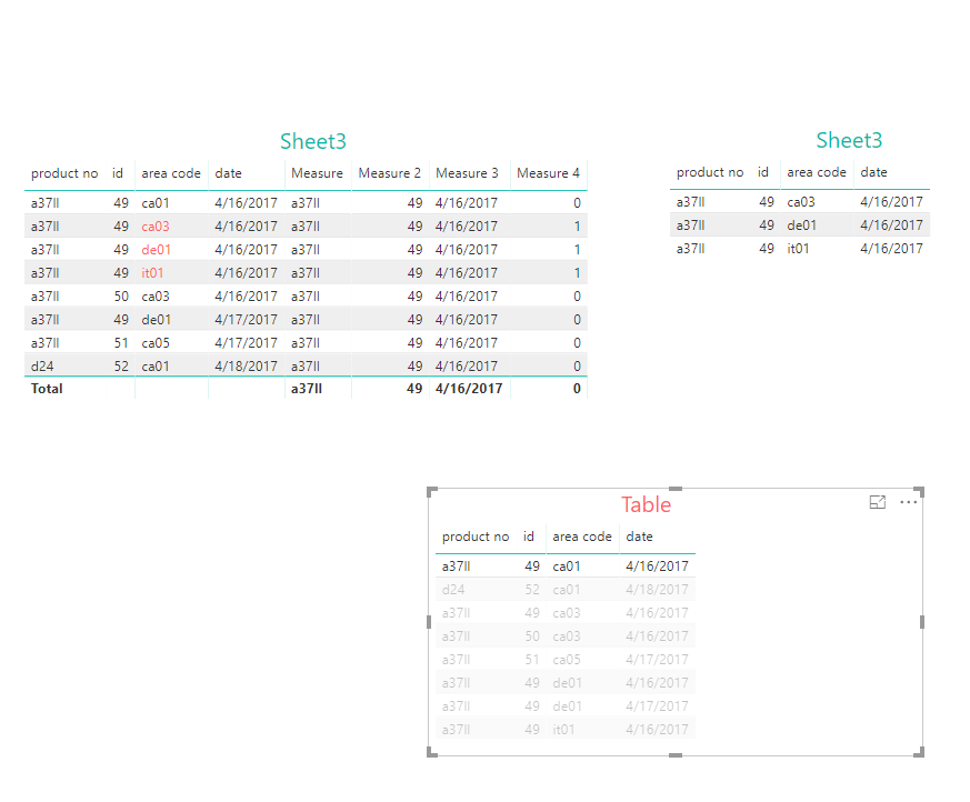
Assume you table is caleed "Sheet3",
Then create a new table by "Home->New Table", entering formula below
Table = Sheet3
Measure = SELECTEDVALUE('Table'[product no])

Measure 2 = SELECTEDVALUE('Table'[id])

Measure 3 = SELECTEDVALUE('Table'[date])

Measure 4 = IF(MAX([product no])=[Measure]&&MAX([id])=[Measure 2]&&MAX([date])=[Measure 3]&&MAX([area code])<>SELECTEDVALUE('Table'[area code]),1,0)

- Mark as New
- Bookmark
- Subscribe
- Mute
- Subscribe to RSS Feed
- Permalink
- Report Inappropriate Content
Thank you for your answer. Now I can create Sheet 3 myself.
I want to be able to summarize the different area code data as well.
Looking at Measure 4, represented by a 1 in lines 2, 3 and 4,
I want to represent that in a pie chart, but it will not dsiplay properly.
Please help me with a solution.
Regards,
- Mark as New
- Bookmark
- Subscribe
- Mute
- Subscribe to RSS Feed
- Permalink
- Report Inappropriate Content
Hi @SH_Ishikawa
can you explain what is not being displayed properly? looking at Maggie exemple, all you need to do is set a visual level filter on your pie chart to not display 0 in measure 4,
unless i understood what you want wrong
- Mark as New
- Bookmark
- Subscribe
- Mute
- Subscribe to RSS Feed
- Permalink
- Report Inappropriate Content
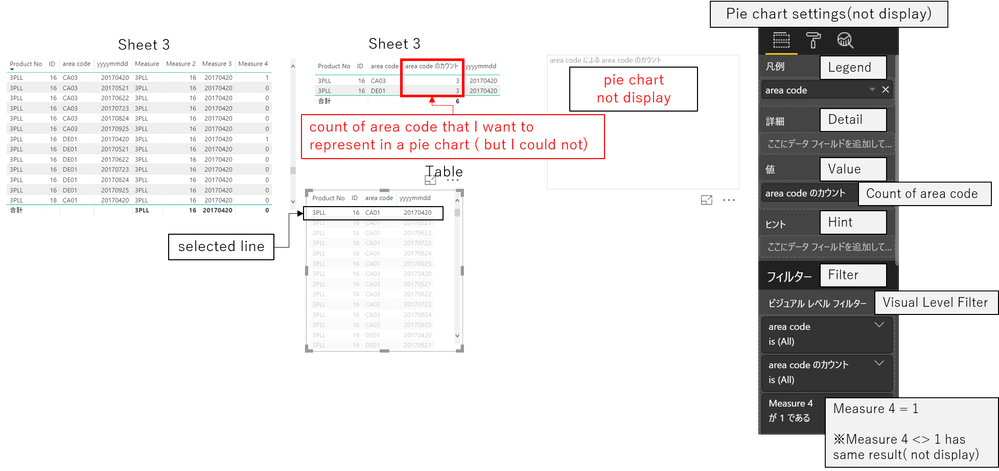
I added a count of area code to the Table you created.
(Because of the Japanese version, please understand that some words are different from the English version.)
I want to display this count in a pie chart when I click a line in the Table.
I set the pie chart to:
・Legend: area code
・Value: COUNT of area code
・Visual level filter: Measure 4 represented by a 1
However, the pie chart will not display.
It is not displayed even if you select a line of the Table you created.
I'm not sure what went wrong with my pie chart settings. Any advices?
Please attach an image if possible and explain.
Thanks again,
- Mark as New
- Bookmark
- Subscribe
- Mute
- Subscribe to RSS Feed
- Permalink
- Report Inappropriate Content
Hi @SH_Ishikawa
Create a new measure
Measure 9_count = CALCULATE(COUNT(Sheet3[area code]),FILTER(Sheet3,[Measure 4]=1))
add Sheet3[area code] in the "Legend" and Sheet3[Measure 9_count] in the "Value" field of the Pie Chart.
don't add [measure4] in the Visual Level filter.
set the interaction among "table1" and "pie chart" as below
Please refer to my pbix->Page2
Best Reagrds
Maggie
- Mark as New
- Bookmark
- Subscribe
- Mute
- Subscribe to RSS Feed
- Permalink
- Report Inappropriate Content
Thank you for all your helpful advice.
Thanks to all, I was able to solve all the problems.
Helpful resources

Fabric Data Days
Advance your Data & AI career with 50 days of live learning, contests, hands-on challenges, study groups & certifications and more!

Power BI Monthly Update - October 2025
Check out the October 2025 Power BI update to learn about new features.


