Join us at FabCon Vienna from September 15-18, 2025
The ultimate Fabric, Power BI, SQL, and AI community-led learning event. Save €200 with code FABCOMM.
Get registered- Power BI forums
- Get Help with Power BI
- Desktop
- Service
- Report Server
- Power Query
- Mobile Apps
- Developer
- DAX Commands and Tips
- Custom Visuals Development Discussion
- Health and Life Sciences
- Power BI Spanish forums
- Translated Spanish Desktop
- Training and Consulting
- Instructor Led Training
- Dashboard in a Day for Women, by Women
- Galleries
- Data Stories Gallery
- Themes Gallery
- Contests Gallery
- Quick Measures Gallery
- Notebook Gallery
- Translytical Task Flow Gallery
- TMDL Gallery
- R Script Showcase
- Webinars and Video Gallery
- Ideas
- Custom Visuals Ideas (read-only)
- Issues
- Issues
- Events
- Upcoming Events
Enhance your career with this limited time 50% discount on Fabric and Power BI exams. Ends August 31st. Request your voucher.
- Power BI forums
- Forums
- Get Help with Power BI
- Desktop
- How to remove/disable the horizontal scroll bar on...
- Subscribe to RSS Feed
- Mark Topic as New
- Mark Topic as Read
- Float this Topic for Current User
- Bookmark
- Subscribe
- Printer Friendly Page
- Mark as New
- Bookmark
- Subscribe
- Mute
- Subscribe to RSS Feed
- Permalink
- Report Inappropriate Content
How to remove/disable the horizontal scroll bar on the clustered column chart with date hierarchy
Hi Everyone,
Could someone please let me know if it is possible to somehow remove/disable the horizontal scroll bar on the clustered column chart in Power BI Desktop and fit all the content (data points) within the visual?
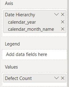
I have a clustered column chart visual that displays totals over the timeline from 2011 --> 2021 with the date hierarchy of Year --> Month Name, please see the screenshot below.
X axis settings:

This how the visual looks at the Year level, it displays the complete timeline.
And this is how it looks when I click the Expand all one level down in the hierarchy option.
As you can see, the horizontal scrollbar appeared and the content doesn't "shrink" to fit the visual.
Is there any option to sort of "collapse" first 5 years of data points to the Year-Month level, and leave the rest of data expanded, something like this?
I use Power BI Desktop version 2.93.981.0 64-bit (May 2021).
Many thanks in advance 🤗.
Regards,
Mikhail
Solved! Go to Solution.
- Mark as New
- Bookmark
- Subscribe
- Mute
- Subscribe to RSS Feed
- Permalink
- Report Inappropriate Content
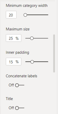
@Anonymous , I doubt an option for that. Play with font size, inner padding, Min Category width and Maximum size
- Mark as New
- Bookmark
- Subscribe
- Mute
- Subscribe to RSS Feed
- Permalink
- Report Inappropriate Content
I don't know if this will do exactly what you want without removing other features you want, but here we go:
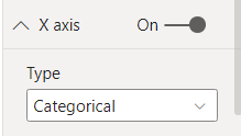
Default type is Categorical. Try changing to Continuous as shown in screenshot
- Mark as New
- Bookmark
- Subscribe
- Mute
- Subscribe to RSS Feed
- Permalink
- Report Inappropriate Content
- Mark as New
- Bookmark
- Subscribe
- Mute
- Subscribe to RSS Feed
- Permalink
- Report Inappropriate Content
@amitchandak , thanks for the reply, yes, looks like this is the only option, well, nothing is perfect I quess :).
Thanks again!
Regards,
Mikhail
- Mark as New
- Bookmark
- Subscribe
- Mute
- Subscribe to RSS Feed
- Permalink
- Report Inappropriate Content
HI @Anonymous,
It sounds like you want to auto-scale your chart to show all graphs, right?
AFAIK, current power bi does not support this. Maybe you can refer to amitchandak 's suggestion or try to submit an idea or improve this.
Regards,
Xiaoxin Sheng
- Mark as New
- Bookmark
- Subscribe
- Mute
- Subscribe to RSS Feed
- Permalink
- Report Inappropriate Content
Hi Xiaoxin Sheng,
Yes, you are correct, I thought that it is possible in Power BI to kind of auto-scale the series of data points, but it looks like it is not there yet, although I've heard rumours that Tableau can do that :).
Never mind, thanks for the reply :).


