Huge last-minute discounts for FabCon Vienna from September 15-18, 2025
Supplies are limited. Contact info@espc.tech right away to save your spot before the conference sells out.
Get your discount- Power BI forums
- Get Help with Power BI
- Desktop
- Service
- Report Server
- Power Query
- Mobile Apps
- Developer
- DAX Commands and Tips
- Custom Visuals Development Discussion
- Health and Life Sciences
- Power BI Spanish forums
- Translated Spanish Desktop
- Training and Consulting
- Instructor Led Training
- Dashboard in a Day for Women, by Women
- Galleries
- Data Stories Gallery
- Themes Gallery
- Contests Gallery
- Quick Measures Gallery
- Notebook Gallery
- Translytical Task Flow Gallery
- TMDL Gallery
- R Script Showcase
- Webinars and Video Gallery
- Ideas
- Custom Visuals Ideas (read-only)
- Issues
- Issues
- Events
- Upcoming Events
Score big with last-minute savings on the final tickets to FabCon Vienna. Secure your discount
- Power BI forums
- Forums
- Get Help with Power BI
- Desktop
- How to recreate the below visual in Power Bi ?
- Subscribe to RSS Feed
- Mark Topic as New
- Mark Topic as Read
- Float this Topic for Current User
- Bookmark
- Subscribe
- Printer Friendly Page
- Mark as New
- Bookmark
- Subscribe
- Mute
- Subscribe to RSS Feed
- Permalink
- Report Inappropriate Content
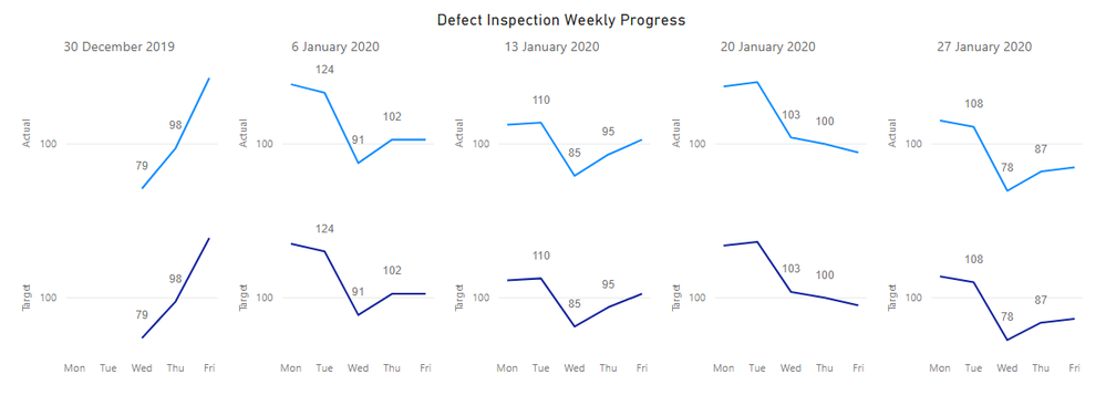
How to recreate the below visual in Power Bi ?
Target and Actual are two different column values , Date is the start of week date from individual dates.
Solved! Go to Solution.
- Mark as New
- Bookmark
- Subscribe
- Mute
- Subscribe to RSS Feed
- Permalink
- Report Inappropriate Content
Hi @Anonymous,
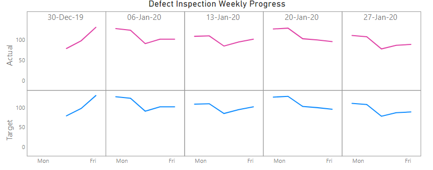
If you want to have it as close as possible to your screenshot, the only way I have been able to manage it is with layering two custom visuals that manage line charts as small multiples. The closest fit is using the Line Chart by Akvelon custom visual:
If you need the y-axis values, this visual will display them on each small multiple. There doesn't seem to be a property to manage this.
I personally produce a Small Multiple Line Chart visual and the same technique can be used, but I can't quite get it as close - for instance, I can keep a shared axis, but my visual currently doesn't support data labels, e.g.:
I've attached a sample workbook with my attempts for you to see how you get on with.
If you want it to be very specific then you can try using Charticulator to reproduce the layout.
Hopefully this will give you some ideas to explore. Good luck!
Daniel
Did I answer your question? Mark my post as a solution!
Proud to be a Super User!
On how to ask a technical question, if you really want an answer (courtesy of SQLBI)
- Mark as New
- Bookmark
- Subscribe
- Mute
- Subscribe to RSS Feed
- Permalink
- Report Inappropriate Content
Nothing I can think of in terms of default visuals. You can look in the gallery of extra visuals. Or, you could try SVG or R or Python visuals.
Follow on LinkedIn
@ me in replies or I'll lose your thread!!!
Instead of a Kudo, please vote for this idea
Become an expert!: Enterprise DNA
External Tools: MSHGQM
YouTube Channel!: Microsoft Hates Greg
Latest book!: DAX For Humans
DAX is easy, CALCULATE makes DAX hard...
- Mark as New
- Bookmark
- Subscribe
- Mute
- Subscribe to RSS Feed
- Permalink
- Report Inappropriate Content
Hi @Anonymous,
If you want to have it as close as possible to your screenshot, the only way I have been able to manage it is with layering two custom visuals that manage line charts as small multiples. The closest fit is using the Line Chart by Akvelon custom visual:
If you need the y-axis values, this visual will display them on each small multiple. There doesn't seem to be a property to manage this.
I personally produce a Small Multiple Line Chart visual and the same technique can be used, but I can't quite get it as close - for instance, I can keep a shared axis, but my visual currently doesn't support data labels, e.g.:
I've attached a sample workbook with my attempts for you to see how you get on with.
If you want it to be very specific then you can try using Charticulator to reproduce the layout.
Hopefully this will give you some ideas to explore. Good luck!
Daniel
Did I answer your question? Mark my post as a solution!
Proud to be a Super User!
On how to ask a technical question, if you really want an answer (courtesy of SQLBI)


