Fabric Data Days starts November 4th!
Advance your Data & AI career with 50 days of live learning, dataviz contests, hands-on challenges, study groups & certifications and more!
Get registered- Power BI forums
- Get Help with Power BI
- Desktop
- Service
- Report Server
- Power Query
- Mobile Apps
- Developer
- DAX Commands and Tips
- Custom Visuals Development Discussion
- Health and Life Sciences
- Power BI Spanish forums
- Translated Spanish Desktop
- Training and Consulting
- Instructor Led Training
- Dashboard in a Day for Women, by Women
- Galleries
- Data Stories Gallery
- Themes Gallery
- Contests Gallery
- Quick Measures Gallery
- Visual Calculations Gallery
- Notebook Gallery
- Translytical Task Flow Gallery
- TMDL Gallery
- R Script Showcase
- Webinars and Video Gallery
- Ideas
- Custom Visuals Ideas (read-only)
- Issues
- Issues
- Events
- Upcoming Events
Get Fabric Certified for FREE during Fabric Data Days. Don't miss your chance! Learn more
- Power BI forums
- Forums
- Get Help with Power BI
- Desktop
- How to plot box and whisker with 30,000+ data poin...
- Subscribe to RSS Feed
- Mark Topic as New
- Mark Topic as Read
- Float this Topic for Current User
- Bookmark
- Subscribe
- Printer Friendly Page
- Mark as New
- Bookmark
- Subscribe
- Mute
- Subscribe to RSS Feed
- Permalink
- Report Inappropriate Content
How to plot box and whisker with 30,000+ data points?
Hello,
I am trying to plot a box and whisker plot with 30,000+ data points. Is there any way to do this in Power BI? Perhaps a plot that takes summary data from a frequency table instead? I have a summary matrix on my dashboard as well which is accurate..but unfortunately when I hover over the boxplot that I have made, it does not match.
Thanks!
- Mark as New
- Bookmark
- Subscribe
- Mute
- Subscribe to RSS Feed
- Permalink
- Report Inappropriate Content
Hi @v0v0
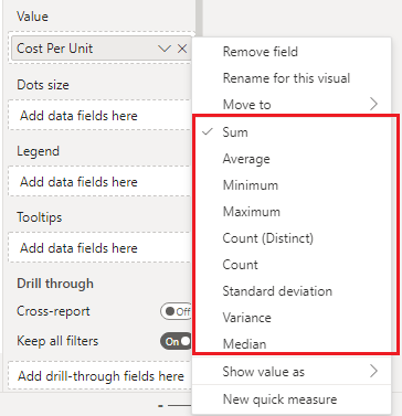
Are you using Box and Whisker chart by MAQ Software custom visual? It is required to use summarized data in values of the visual. You can right click on the values field and select an appropriate aggregation type for it or use a measure there.
Best Regards,
Community Support Team _ Jing
If this post helps, please Accept it as Solution to help other members find it.
- Mark as New
- Bookmark
- Subscribe
- Mute
- Subscribe to RSS Feed
- Permalink
- Report Inappropriate Content
Hello, yes I am using that visual.
However, it doesn't make sense for me to aggregate that visual...I have a column of 140,000 test scores. I would like to do a box whisker plot of the distribution of all of these scores - it doesn't make sense to aggregate them!
- Mark as New
- Bookmark
- Subscribe
- Mute
- Subscribe to RSS Feed
- Permalink
- Report Inappropriate Content
Thankfully not. It would be not just technically impossible but also physiologically useless.
Power BI visuals have limits on the number of data points they are willing to display before they start forced grouping. It's 500 for tables, 1000 for scatter plots, about 2000 for maps etc. But definitely far below your 30000.
As you said, pre-aggregation is a remedy. Re-sampling is not, as it may lead to skewed results.
Helpful resources

Fabric Data Days
Advance your Data & AI career with 50 days of live learning, contests, hands-on challenges, study groups & certifications and more!

Power BI Monthly Update - October 2025
Check out the October 2025 Power BI update to learn about new features.


