Fabric Data Days starts November 4th!
Advance your Data & AI career with 50 days of live learning, dataviz contests, hands-on challenges, study groups & certifications and more!
Get registered- Power BI forums
- Get Help with Power BI
- Desktop
- Service
- Report Server
- Power Query
- Mobile Apps
- Developer
- DAX Commands and Tips
- Custom Visuals Development Discussion
- Health and Life Sciences
- Power BI Spanish forums
- Translated Spanish Desktop
- Training and Consulting
- Instructor Led Training
- Dashboard in a Day for Women, by Women
- Galleries
- Data Stories Gallery
- Themes Gallery
- Contests Gallery
- QuickViz Gallery
- Quick Measures Gallery
- Visual Calculations Gallery
- Notebook Gallery
- Translytical Task Flow Gallery
- TMDL Gallery
- R Script Showcase
- Webinars and Video Gallery
- Ideas
- Custom Visuals Ideas (read-only)
- Issues
- Issues
- Events
- Upcoming Events
Get Fabric Certified for FREE during Fabric Data Days. Don't miss your chance! Request now
- Power BI forums
- Forums
- Get Help with Power BI
- Desktop
- How to make use of Table Visualization to get some...
- Subscribe to RSS Feed
- Mark Topic as New
- Mark Topic as Read
- Float this Topic for Current User
- Bookmark
- Subscribe
- Printer Friendly Page
- Mark as New
- Bookmark
- Subscribe
- Mute
- Subscribe to RSS Feed
- Permalink
- Report Inappropriate Content
How to make use of Table Visualization to get something like Matrix Visualization
Hi, Im new to Power BI. Appreciate any help for this
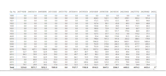
Below is the sample output of what I want my report to show with the colummn Op. No in the first column and the respective equipment number in the next few column in the first row. This is using the Matrix Visualization. But instead of using the Matrix Visualization I want to use the Table Visualization instead to get this output. How can I do that.

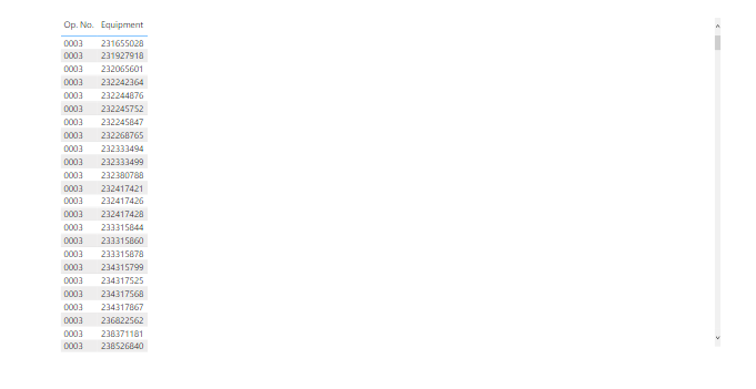
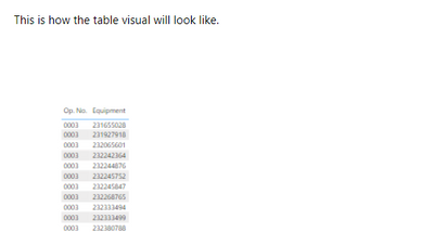
This is how the table visual will look like.
Solved! Go to Solution.
- Mark as New
- Bookmark
- Subscribe
- Mute
- Subscribe to RSS Feed
- Permalink
- Report Inappropriate Content
Hi, @ephramz ;
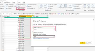
If you want change it to table ,i think pivot in power query is suitable.
1.cilck the Equipment coulmn ,and pivot .
2.The final output is shown below:
Best Regards,
Community Support Team_ Yalan Wu
If this post helps, then please consider Accept it as the solution to help the other members find it more quickly.
- Mark as New
- Bookmark
- Subscribe
- Mute
- Subscribe to RSS Feed
- Permalink
- Report Inappropriate Content
@ephramz Sorry but I'm not sure what you need or why - when you say 'this is how the table visual will look like' is that what you want? If it's not what you want, what difference do you need to the matrix visualization?
The only way I can think to do this as a table visual is to create explicit measures for EACH Equipment number, which seems like a lot of unnecessary work if the matrix already gives the right result.
Otherwise, try a new MEASURE:
EquipmentIDs= CONCATENATEX( VALUES( table[Equipment] ) , ", ")
to list the IDs of the equipment for each Op. No
Please @mention me in your reply if you want a response.
Copying DAX from this post? Click here for a hack to quickly replace it with your own table names
Has this post solved your problem? Please Accept as Solution so that others can find it quickly and to let the community know your problem has been solved.
If you found this post helpful, please give Kudos C
I work as a Microsoft trainer and consultant, specialising in Power BI and Power Query.
www.excelwithallison.com
- Mark as New
- Bookmark
- Subscribe
- Mute
- Subscribe to RSS Feed
- Permalink
- Report Inappropriate Content
Due to the limitations that PowerBI has when you attempt to download the report (matrix visualization) onto excel, it wont show the data as it is.
I'm thinking of a work around way to get past this limiations by using the (table visualization)
My end goal is to dynamically change the columns for Equipment with Op (Operation Number) as the first column, similar to how the first picture is shown.
Thanks!
Helpful resources

Fabric Data Days
Advance your Data & AI career with 50 days of live learning, contests, hands-on challenges, study groups & certifications and more!

Power BI Monthly Update - October 2025
Check out the October 2025 Power BI update to learn about new features.


