Party with Power BI’s own Guy in a Cube
Power BI is turning 10! Tune in for a special live episode on July 24 with behind-the-scenes stories, product evolution highlights, and a sneak peek at what’s in store for the future.
Save the date- Power BI forums
- Get Help with Power BI
- Desktop
- Service
- Report Server
- Power Query
- Mobile Apps
- Developer
- DAX Commands and Tips
- Custom Visuals Development Discussion
- Health and Life Sciences
- Power BI Spanish forums
- Translated Spanish Desktop
- Training and Consulting
- Instructor Led Training
- Dashboard in a Day for Women, by Women
- Galleries
- Webinars and Video Gallery
- Data Stories Gallery
- Themes Gallery
- Contests Gallery
- Quick Measures Gallery
- Notebook Gallery
- Translytical Task Flow Gallery
- R Script Showcase
- Ideas
- Custom Visuals Ideas (read-only)
- Issues
- Issues
- Events
- Upcoming Events
Enhance your career with this limited time 50% discount on Fabric and Power BI exams. Ends August 31st. Request your voucher.
- Power BI forums
- Forums
- Get Help with Power BI
- Desktop
- Re: How to make the dynamic data label?
- Subscribe to RSS Feed
- Mark Topic as New
- Mark Topic as Read
- Float this Topic for Current User
- Bookmark
- Subscribe
- Printer Friendly Page
- Mark as New
- Bookmark
- Subscribe
- Mute
- Subscribe to RSS Feed
- Permalink
- Report Inappropriate Content
How to make the dynamic data label?
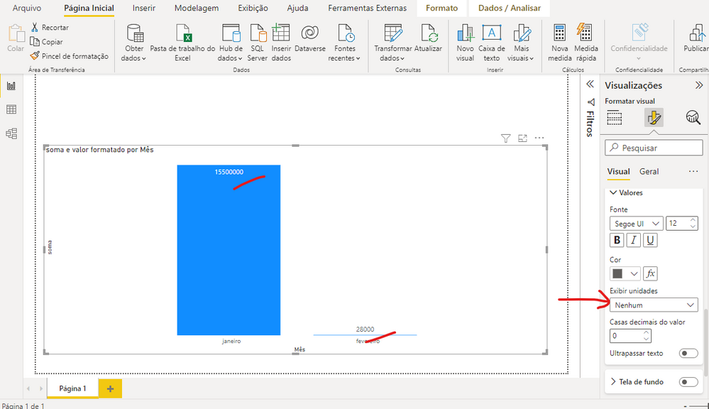
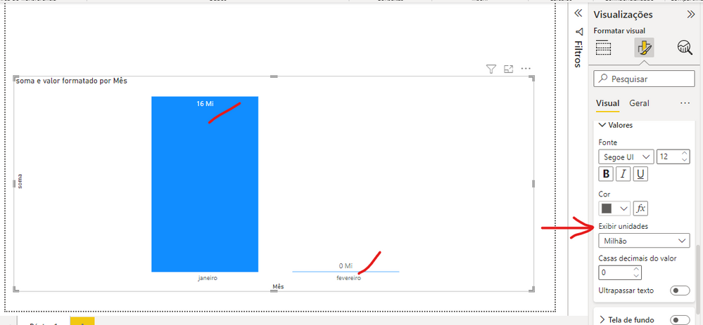
How to make the dynamic data label? Showing millions, thousand in columns of the same graph...
Solved! Go to Solution.
- Mark as New
- Bookmark
- Subscribe
- Mute
- Subscribe to RSS Feed
- Permalink
- Report Inappropriate Content
Hi @Amanda_Souza ,
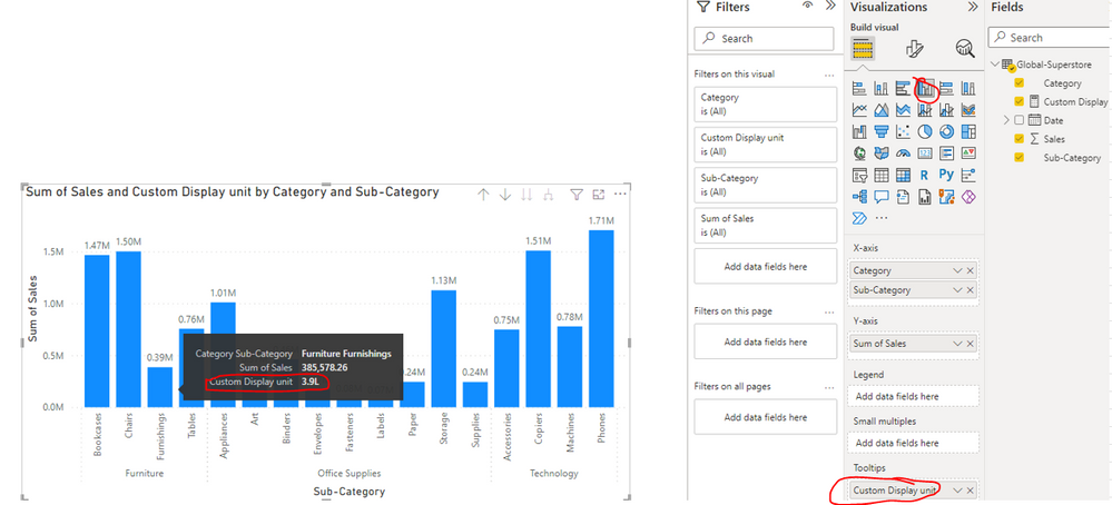
Since you add the measure to the option Tooltips, it will only shows the value of this measure with custom format when you hover over a data point on the column chart(see the below screenshot). The value of the data label still keep the original ones...
Customize tooltips in Power BI
Best Regards
- Mark as New
- Bookmark
- Subscribe
- Mute
- Subscribe to RSS Feed
- Permalink
- Report Inappropriate Content
Hi @Amanda_Souza ,
Whether your problem has been resolved? If yes, could you please mark the helpful post as Answered? It will help the others in the community find the solution easily if they face the same problem as yours. Thank you.
Best Regards
- Mark as New
- Bookmark
- Subscribe
- Mute
- Subscribe to RSS Feed
- Permalink
- Report Inappropriate Content
Hi @Amanda_Souza ,
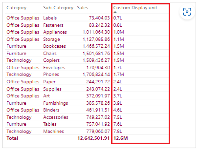
Base on my research, there no option to customize set the format of label values base on the different value range. You can refer the following blog to create another measure to get the value with different format and apply this measure onto Tooltips option.
Power BI - Change display unit based on values in table - Power BI Docs
Custom Display unit =
Var TotalSale = SUM('Global-Superstore'[Sales])
Var decimals = "0.0"
RETURN
SWITCH ( TRUE() ,
TotalSale > 1000000 , FORMAT ( TotalSale / 1000000 , decimals & "M" ) ,
TotalSale > 100000, FORMAT ( TotalSale / 100000 , decimals & "L" ) ,
TotalSale > 1000 , FORMAT ( TotalSale / 1000 , decimals & "K" ) ,
FORMAT ( TotalSale , decimals )
)
Best Regards
- Mark as New
- Bookmark
- Subscribe
- Mute
- Subscribe to RSS Feed
- Permalink
- Report Inappropriate Content
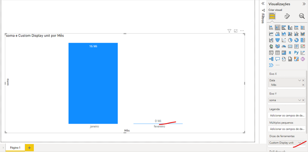
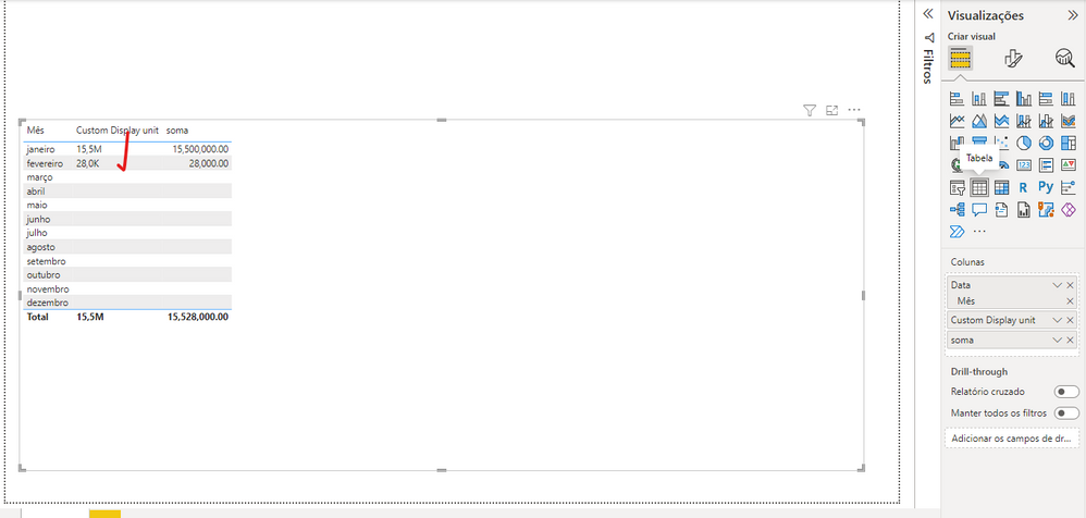
Hi, I did as you said but it only works in the table visual, when I switch to the column chart visual it keeps showing 0Mi... Could you try with using the column chart please?
Thanks a lot!!
- Mark as New
- Bookmark
- Subscribe
- Mute
- Subscribe to RSS Feed
- Permalink
- Report Inappropriate Content
Hi @Amanda_Souza ,
Since you add the measure to the option Tooltips, it will only shows the value of this measure with custom format when you hover over a data point on the column chart(see the below screenshot). The value of the data label still keep the original ones...
Customize tooltips in Power BI
Best Regards
- Mark as New
- Bookmark
- Subscribe
- Mute
- Subscribe to RSS Feed
- Permalink
- Report Inappropriate Content
As far as I know, you can't do this natively since there's no conditional formatting on this item. Your only hope could be (but not necessarily will) Calculation Groups/Items. But this is rather advanced topic. You need to use an external tool for this: Tabular Editor.
Helpful resources

Power BI Monthly Update - July 2025
Check out the July 2025 Power BI update to learn about new features.

| User | Count |
|---|---|
| 72 | |
| 72 | |
| 38 | |
| 31 | |
| 26 |
| User | Count |
|---|---|
| 95 | |
| 50 | |
| 43 | |
| 40 | |
| 35 |
