Join us at FabCon Vienna from September 15-18, 2025
The ultimate Fabric, Power BI, SQL, and AI community-led learning event. Save €200 with code FABCOMM.
Get registered- Power BI forums
- Get Help with Power BI
- Desktop
- Service
- Report Server
- Power Query
- Mobile Apps
- Developer
- DAX Commands and Tips
- Custom Visuals Development Discussion
- Health and Life Sciences
- Power BI Spanish forums
- Translated Spanish Desktop
- Training and Consulting
- Instructor Led Training
- Dashboard in a Day for Women, by Women
- Galleries
- Data Stories Gallery
- Themes Gallery
- Contests Gallery
- Quick Measures Gallery
- Notebook Gallery
- Translytical Task Flow Gallery
- TMDL Gallery
- R Script Showcase
- Webinars and Video Gallery
- Ideas
- Custom Visuals Ideas (read-only)
- Issues
- Issues
- Events
- Upcoming Events
Enhance your career with this limited time 50% discount on Fabric and Power BI exams. Ends August 31st. Request your voucher.
- Power BI forums
- Forums
- Get Help with Power BI
- Desktop
- Re: How to highlight Maximum and Minimum Column Ch...
- Subscribe to RSS Feed
- Mark Topic as New
- Mark Topic as Read
- Float this Topic for Current User
- Bookmark
- Subscribe
- Printer Friendly Page
- Mark as New
- Bookmark
- Subscribe
- Mute
- Subscribe to RSS Feed
- Permalink
- Report Inappropriate Content
How to highlight Maximum and Minimum Column Chart Bar in Power BI?
I have created Column chart in POWER BI. All the bars in the column chart are with same color. Now I need that Maximum Bar should have fill color of GREEN and Minimum bar fill color in RED and the remaining in any one color. How to do that?
Solved! Go to Solution.
- Mark as New
- Bookmark
- Subscribe
- Mute
- Subscribe to RSS Feed
- Permalink
- Report Inappropriate Content
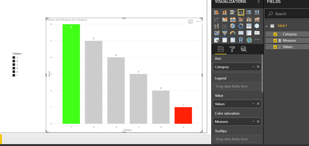
You can do it with the help of color saturation property of column chart
Please see the attached file
I defined a simple MEASURE and put it in the Color Saturation Field
Measure =
SWITCH (
    TRUE (),
    SUM ( Table1[Values] )
        = CALCULATE ( MAX ( Table1[Values] ), ALLSELECTED ( Table1[Category] ) ), 1,
    SUM ( Table1[Values] )
        = CALCULATE ( MIN ( Table1[Values] ), ALLSELECTED ( Table1[Category] ) ), 2,
    0
)
Regards
Zubair
Please try my custom visuals
- Mark as New
- Bookmark
- Subscribe
- Mute
- Subscribe to RSS Feed
- Permalink
- Report Inappropriate Content
Any step by step tutorial ?
- Mark as New
- Bookmark
- Subscribe
- Mute
- Subscribe to RSS Feed
- Permalink
- Report Inappropriate Content
I only learnt this technique by trial and error after your post ![]()
Thanks for this question
Regards
Zubair
Please try my custom visuals
- Mark as New
- Bookmark
- Subscribe
- Mute
- Subscribe to RSS Feed
- Permalink
- Report Inappropriate Content
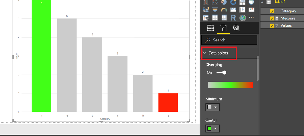
sorry i didn't mention it earlier
the colors can be chosen from the data colors section
Regards
Zubair
Please try my custom visuals


