Fabric Data Days starts November 4th!
Advance your Data & AI career with 50 days of live learning, dataviz contests, hands-on challenges, study groups & certifications and more!
Get registered- Power BI forums
- Get Help with Power BI
- Desktop
- Service
- Report Server
- Power Query
- Mobile Apps
- Developer
- DAX Commands and Tips
- Custom Visuals Development Discussion
- Health and Life Sciences
- Power BI Spanish forums
- Translated Spanish Desktop
- Training and Consulting
- Instructor Led Training
- Dashboard in a Day for Women, by Women
- Galleries
- Data Stories Gallery
- Themes Gallery
- Contests Gallery
- Quick Measures Gallery
- Visual Calculations Gallery
- Notebook Gallery
- Translytical Task Flow Gallery
- TMDL Gallery
- R Script Showcase
- Webinars and Video Gallery
- Ideas
- Custom Visuals Ideas (read-only)
- Issues
- Issues
- Events
- Upcoming Events
Get Fabric Certified for FREE during Fabric Data Days. Don't miss your chance! Learn more
- Power BI forums
- Forums
- Get Help with Power BI
- Desktop
- Re: How to get last and first selection of Date sl...
- Subscribe to RSS Feed
- Mark Topic as New
- Mark Topic as Read
- Float this Topic for Current User
- Bookmark
- Subscribe
- Printer Friendly Page
- Mark as New
- Bookmark
- Subscribe
- Mute
- Subscribe to RSS Feed
- Permalink
- Report Inappropriate Content
How to get last and first selection of Date slicer in X axis of chart or in columns of matrix
Hello Everyone,
I try to make a chart of a classic sum and I have for the X axis Date but this date I try to have only the last date and the first date chosen in the filter date slicer.
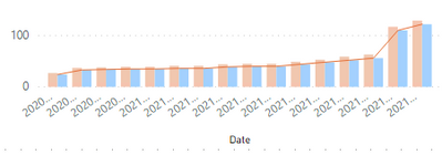
Now I get this result :
but what I want to have as a result a chart whith juste in X axis 2020-01-01 and 2021-03-31 ! of course I don't want to use a multiple choice drop down filter
I don't know if it's possible for a chart or for a column matrix ! thank you in advance for your help ^^
Bof,
Solved! Go to Solution.
- Mark as New
- Bookmark
- Subscribe
- Mute
- Subscribe to RSS Feed
- Permalink
- Report Inappropriate Content
Hi @SoufTC ,
You can add a visual level filter.
First you need to create a measure.
Measure = var _max=MAXX(ALLSELECTED('Table'),[Date])
var _min=MINX(ALLSELECTED('Table'),[Date])
return
IF(_max=MAX('Table'[Date])||_min=MAX('Table'[Date]),1)
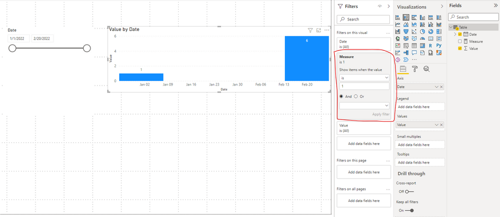
This is the stacked column chart with no visual level filter added.
When you add a visual level filter.
Best Regards,
Stephen Tao
If this post helps, then please consider Accept it as the solution to help the other members find it more quickly.
Helpful resources

Fabric Data Days
Advance your Data & AI career with 50 days of live learning, contests, hands-on challenges, study groups & certifications and more!

Power BI Monthly Update - October 2025
Check out the October 2025 Power BI update to learn about new features.


