Join the #PBI10 DataViz contest
Power BI is turning 10, and we’re marking the occasion with a special community challenge. Use your creativity to tell a story, uncover trends, or highlight something unexpected.
Get started- Power BI forums
- Get Help with Power BI
- Desktop
- Service
- Report Server
- Power Query
- Mobile Apps
- Developer
- DAX Commands and Tips
- Custom Visuals Development Discussion
- Health and Life Sciences
- Power BI Spanish forums
- Translated Spanish Desktop
- Training and Consulting
- Instructor Led Training
- Dashboard in a Day for Women, by Women
- Galleries
- Webinars and Video Gallery
- Data Stories Gallery
- Themes Gallery
- Contests Gallery
- Quick Measures Gallery
- Notebook Gallery
- Translytical Task Flow Gallery
- R Script Showcase
- Ideas
- Custom Visuals Ideas (read-only)
- Issues
- Issues
- Events
- Upcoming Events
Join us for an expert-led overview of the tools and concepts you'll need to become a Certified Power BI Data Analyst and pass exam PL-300. Register now.
- Power BI forums
- Forums
- Get Help with Power BI
- Desktop
- Re: How to get Power Bi to recognize and plot mult...
- Subscribe to RSS Feed
- Mark Topic as New
- Mark Topic as Read
- Float this Topic for Current User
- Bookmark
- Subscribe
- Printer Friendly Page
- Mark as New
- Bookmark
- Subscribe
- Mute
- Subscribe to RSS Feed
- Permalink
- Report Inappropriate Content
How to get Power Bi to recognize and plot multiple data points in the same time frame
Hello everyone, a little scary. I'm not a programmer, I am a guy who likes to use numbers to prove things and Power Bi seems to be that tool.
I am looking at metrics and I am trying to simply plot XX by Day. There are several issues.
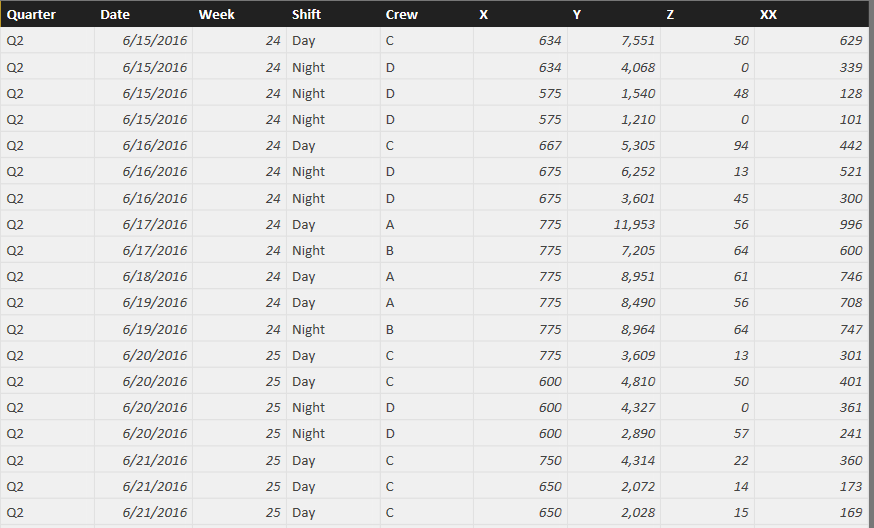
Since this is a 24/7/365 operation, we run 2 12 hr shifts, so there are multiple shifts in a day (A,B or C,D), each shift is a day or night, Add to that each shift could make multiple widgets, meaning A could make 3 widgets in 12 hrs, where B could make two seperate runs of 4 widgets in 12 hrs.
Here is what 7 days of data would look like:
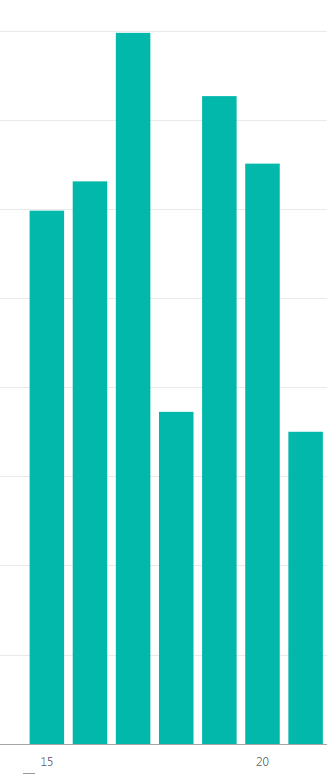
Because I am not aware of a way to plot individual points vs date, I get a bar chart that sums each day:
7 bars, shifts summed popped up, I was instead hoping to see 19 bars, that I can break out (Quarter Date, Week, ETC).
Is there a solution for this issue? Remember, I am not a programmer, so if there is a solution, I will have to be walked through the solution.
Thanks for your help in advance.
CincyKidd
Solved! Go to Solution.
- Mark as New
- Bookmark
- Subscribe
- Mute
- Subscribe to RSS Feed
- Permalink
- Report Inappropriate Content
Ok, almost there!
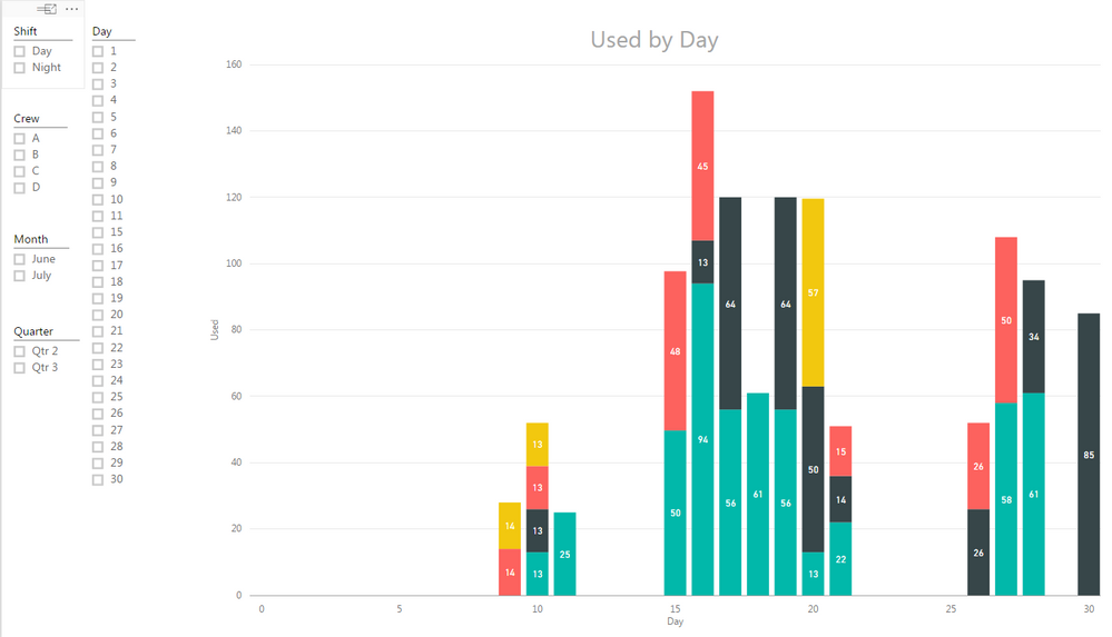
Lastly, my data is a running data set, meaning I started tracking on June 15th. I understand that I can use the Slicer function to brake the data into months, is there a way to see the data set in its entirity, right now it looks like it is limited to 30 days.
Thanks for all the help, much appreciated!
CincyKidd
- Mark as New
- Bookmark
- Subscribe
- Mute
- Subscribe to RSS Feed
- Permalink
- Report Inappropriate Content
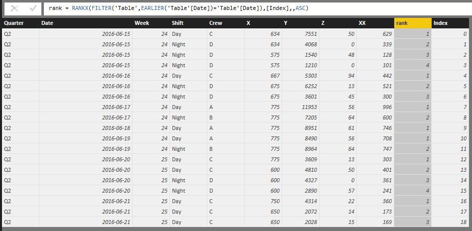
Not quite sure why you'd like 19 lines, data in report usually gets aggreaged instead. However some trick with RANKX can help to get 19 lines instead of 7.
Check more details in the attached pbix.
If it solves your problem, please accept it as solution. For more questions, feel free to let me know.
- Mark as New
- Bookmark
- Subscribe
- Mute
- Subscribe to RSS Feed
- Permalink
- Report Inappropriate Content
Eric- Thanks for the help, it looks like this might be the trick I was looking for, I will test it out later today and give a report.
By the way, I asked for the split instead of sum so I can look at specific performance. Now I will have the ability to look at combined performance or look at individual.
More to come and thanks again.
CincyKidd
- Mark as New
- Bookmark
- Subscribe
- Mute
- Subscribe to RSS Feed
- Permalink
- Report Inappropriate Content
Ok, two things.
1) what is the significance of the "Index" column?
2) how would I go about putting in the "Rank" column? I see there is code associated with the column.
Thanks.
CincyKidd
- Mark as New
- Bookmark
- Subscribe
- Mute
- Subscribe to RSS Feed
- Permalink
- Report Inappropriate Content
1) Index Column, give you starting to 0 or 1 a consecutive value to every row of your data table.
you can create this in Edit Query.

Lima - Peru
- Mark as New
- Bookmark
- Subscribe
- Mute
- Subscribe to RSS Feed
- Permalink
- Report Inappropriate Content
Victor-
Could you explain step by step how to develop the "Index" column? I understand how to get into the "Query Editor", but I am lost past that.
Thanks for your help and patience.
CincyKidd
- Mark as New
- Bookmark
- Subscribe
- Mute
- Subscribe to RSS Feed
- Permalink
- Report Inappropriate Content
Figured out how to get the "index Column"!
Keeping on working the problem.
Thanks.
CincyKidd
- Mark as New
- Bookmark
- Subscribe
- Mute
- Subscribe to RSS Feed
- Permalink
- Report Inappropriate Content
Lima - Peru
- Mark as New
- Bookmark
- Subscribe
- Mute
- Subscribe to RSS Feed
- Permalink
- Report Inappropriate Content
Ok, almost there!
Lastly, my data is a running data set, meaning I started tracking on June 15th. I understand that I can use the Slicer function to brake the data into months, is there a way to see the data set in its entirity, right now it looks like it is limited to 30 days.
Thanks for all the help, much appreciated!
CincyKidd
- Mark as New
- Bookmark
- Subscribe
- Mute
- Subscribe to RSS Feed
- Permalink
- Report Inappropriate Content
It is glad that your problem is resolved. 🙂
Please accept any reply making sense as as solution to close this thread. Thanks.
- Mark as New
- Bookmark
- Subscribe
- Mute
- Subscribe to RSS Feed
- Permalink
- Report Inappropriate Content
2) Rank: this is the dax formula, its take in this case the index column and ranked in ascending. (1,2,3, etc)
Create a calculated column and put this:
Rank = RANKX(all('TableName');'TableName'[index];;ASC)
An you can create by this way:

Lima - Peru
Helpful resources

Join our Fabric User Panel
This is your chance to engage directly with the engineering team behind Fabric and Power BI. Share your experiences and shape the future.

Power BI Monthly Update - June 2025
Check out the June 2025 Power BI update to learn about new features.

| User | Count |
|---|---|
| 72 | |
| 68 | |
| 53 | |
| 39 | |
| 33 |
| User | Count |
|---|---|
| 70 | |
| 63 | |
| 57 | |
| 49 | |
| 46 |


