FabCon is coming to Atlanta
Join us at FabCon Atlanta from March 16 - 20, 2026, for the ultimate Fabric, Power BI, AI and SQL community-led event. Save $200 with code FABCOMM.
Register now!- Power BI forums
- Get Help with Power BI
- Desktop
- Service
- Report Server
- Power Query
- Mobile Apps
- Developer
- DAX Commands and Tips
- Custom Visuals Development Discussion
- Health and Life Sciences
- Power BI Spanish forums
- Translated Spanish Desktop
- Training and Consulting
- Instructor Led Training
- Dashboard in a Day for Women, by Women
- Galleries
- Data Stories Gallery
- Themes Gallery
- Contests Gallery
- QuickViz Gallery
- Quick Measures Gallery
- Visual Calculations Gallery
- Notebook Gallery
- Translytical Task Flow Gallery
- TMDL Gallery
- R Script Showcase
- Webinars and Video Gallery
- Ideas
- Custom Visuals Ideas (read-only)
- Issues
- Issues
- Events
- Upcoming Events
Get Fabric Certified for FREE during Fabric Data Days. Don't miss your chance! Request now
- Power BI forums
- Forums
- Get Help with Power BI
- Desktop
- How to find difference of two identical tables in ...
- Subscribe to RSS Feed
- Mark Topic as New
- Mark Topic as Read
- Float this Topic for Current User
- Bookmark
- Subscribe
- Printer Friendly Page
- Mark as New
- Bookmark
- Subscribe
- Mute
- Subscribe to RSS Feed
- Permalink
- Report Inappropriate Content
How to find difference of two identical tables in Power BI Visualisation Matrix
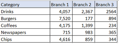
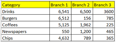
Hi Guys, I am new to power BI. I got visualization of two tables using 'Matrix' option in build visual.
1. Actual Sales
2. Target Sales
Actual Sales
Target Sales
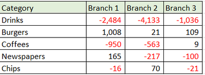
Now, I'm struggling to create another 'Matrix' visual table that can give me difference of two tables.
3. Difference in table values.
I can't find any visuals, that could help be do this subtraction between the visuals tables ?
Thanks in advance.
Cheers!
Solved! Go to Solution.
- Mark as New
- Bookmark
- Subscribe
- Mute
- Subscribe to RSS Feed
- Permalink
- Report Inappropriate Content
Hi @vivek09 ,
Please try below steps:
1. create measure with below dax formula
Branch1 =
VAR cur_cty =
    SELECTEDVALUE ( 'Target Sales'[Category] )
VAR _a =
    CALCULATE (
        MAX ( 'Actual Sales'[Branch 1] ),
        'Actual Sales'[Category] = cur_cty
    )
VAR _b =
    CALCULATE (
        MAX ( 'Target Sales'[Branch 1] ),
        'Target Sales'[Category] = cur_cty
    )
RETURN
    _a - _b
Branch2 =
VAR cur_cty =
    SELECTEDVALUE ( 'Target Sales'[Category] )
VAR _a =
    CALCULATE (
        MAX ( 'Actual Sales'[Branch 2] ),
        'Actual Sales'[Category] = cur_cty
    )
VAR _b =
    CALCULATE (
        MAX ( 'Target Sales'[Branch 2] ),
        'Target Sales'[Category] = cur_cty
    )
RETURN
    _a - _b
Branch3 =
VAR cur_cty =
    SELECTEDVALUE ( 'Target Sales'[Category] )
VAR _a =
    CALCULATE (
        MAX ( 'Actual Sales'[Branch 3] ),
        'Actual Sales'[Category] = cur_cty
    )
VAR _b =
    CALCULATE (
        MAX ( 'Target Sales'[Branch 3] ),
        'Target Sales'[Category] = cur_cty
    )
RETURN
    _a - _b
A =
VAR _a = [Branch1] RETURN IF ( _a > 0, "black", "red" )
B =
VAR _a = [Branch2] RETURN IF ( _a > 0, "black", "red" )
C =
VAR _a = [Branch3] RETURN IF ( _a > 0, "black", "red" )
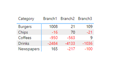
2. add a matrix visual with table filed and measure, apply A,B,C measure to conditional format for font color
Please refer the attached .pbix file.
Best regards,
Community Support Team_Binbin Yu
If this post helps, then please consider Accept it as the solution to help the other members find it more quickly.
- Mark as New
- Bookmark
- Subscribe
- Mute
- Subscribe to RSS Feed
- Permalink
- Report Inappropriate Content
Thanks very much for this. If I have like 15 to 20 branches, do I need to create individual measures to capture these ? or is there a simpler way for aggregation?
Thank you
- Mark as New
- Bookmark
- Subscribe
- Mute
- Subscribe to RSS Feed
- Permalink
- Report Inappropriate Content
Hi @vivek09 organize your data so in new column you have Branch 1/2/3 so you can slices / show it in column with matrix visual. Hope this help.
Did I answer your question? Mark my post as a solution!
Proud to be a Super User!
Helpful resources

Power BI Monthly Update - November 2025
Check out the November 2025 Power BI update to learn about new features.

Fabric Data Days
Advance your Data & AI career with 50 days of live learning, contests, hands-on challenges, study groups & certifications and more!


