FabCon is coming to Atlanta
Join us at FabCon Atlanta from March 16 - 20, 2026, for the ultimate Fabric, Power BI, AI and SQL community-led event. Save $200 with code FABCOMM.
Register now!- Power BI forums
- Get Help with Power BI
- Desktop
- Service
- Report Server
- Power Query
- Mobile Apps
- Developer
- DAX Commands and Tips
- Custom Visuals Development Discussion
- Health and Life Sciences
- Power BI Spanish forums
- Translated Spanish Desktop
- Training and Consulting
- Instructor Led Training
- Dashboard in a Day for Women, by Women
- Galleries
- Data Stories Gallery
- Themes Gallery
- Contests Gallery
- Quick Measures Gallery
- Notebook Gallery
- Translytical Task Flow Gallery
- TMDL Gallery
- R Script Showcase
- Webinars and Video Gallery
- Ideas
- Custom Visuals Ideas (read-only)
- Issues
- Issues
- Events
- Upcoming Events
To celebrate FabCon Vienna, we are offering 50% off select exams. Ends October 3rd. Request your discount now.
- Power BI forums
- Forums
- Get Help with Power BI
- Desktop
- Re: How to filter Pie chart with a measure
- Subscribe to RSS Feed
- Mark Topic as New
- Mark Topic as Read
- Float this Topic for Current User
- Bookmark
- Subscribe
- Printer Friendly Page
- Mark as New
- Bookmark
- Subscribe
- Mute
- Subscribe to RSS Feed
- Permalink
- Report Inappropriate Content
How to filter Pie chart with a measure
| Customer | Score | grade | Q1 | Q2 |
| AA | 80 | gold | 1 | 1 |
| BB | 75 | silver | 1 | 1 |
| CC | 80 | gold | 1 | 1 |
| BB | 75 | silver | 2 | 2 |
| CC | 75 | silver | 2 | 2 |
| DD | 80 | gold | 2 | 2 |
| CC | 65 | bronze | 3 | 3 |
| DD | 75 | silver | 3 | 3 |
| EE | 100 | platinum | 3 | 3 |
I have a table as above. my aim is to compare in 2 pie chart that only customers belongs to compare months.
İ.e If i compare q1 and q2
bb and cc need to be compared because aa is not in q2 and dd is not in q1. and grade need to be q1 1 silver 1 gold, q2 2 silver
if compare q1 and q3 only cc need to be copared in pie chart.
I have 2 slicers for quarters in my page and can check changes in table but not in pie chart.
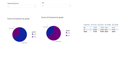
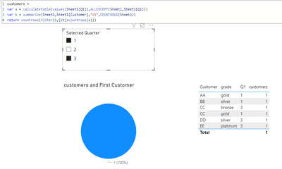
As you can see on power bi pi charts shows 3 customer and comparing them for quarters. however, as you can see on table there are only 2 customer in both quarter and I want to compare them in pie charts. So i need a slicer to see new customers and removed customers and customers that active on both quarter. below you can check the test pbix file.
Solved! Go to Solution.
- Mark as New
- Bookmark
- Subscribe
- Mute
- Subscribe to RSS Feed
- Permalink
- Report Inappropriate Content
Hi @selpaqm,
I have a super-complicated solution for your problem with 4 additional auxiliary tables.
If you have a small dataset and won't be frightened by the look of this solution, it will do, otherwise - hope someone proposes a cuter solution.
Here you can download the PBIX file - https://www.dropbox.com/s/p038xljt4ejghy0/community-2-pies-v2.pbix?dl=0
Here's how it works:
1. The initial table is the same but without the Q2 column. It will be added later and will be different from yours.
2. We create 2 additional tables with the help of the following [DAX] code:
Augmented Table 1 =
VAR _tbl = SELECTCOLUMNS ( 'dataset',
                           "Customer2", [Customer],
                           "Q2", [Q1] )
VAR _hugetbl = CROSSJOIN ( 'dataset', _tbl )
VAR _filter1 = FILTER ( _hugetbl, [Customer] = [Customer2] )
VAR _filter2 = FILTER ( _filter1, [Q2] <> [Q1] )
RETURN _filter2
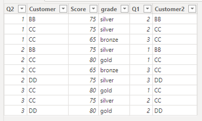
You'll get something like this:
Customer2 is not needed here, it is used only for filtering earlier but I don't remove it in order not to make code even more complicated.
3. We create Q1 and Q2 tables which we will use in slicers:
Q1 = VALUES ( 'dataset'[Q1] )

Q2 = SELECTCOLUMNS ( VALUES ( 'dataset'[Q1] ), "Q2", [Q1] )
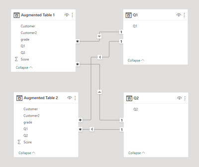
4. We arrange 4 connections between tables in this auxiliary model:
'Q1'[Q1] -> 'Augmented table 1'[Q1]
'Q1'[Q1] -> 'Augmented table 2'[Q2]
'Q2'[Q2] -> 'Augmented table 1'[Q2]
'Q2'[Q2] -> 'Augmented table 2'[Q1]
5. We use 'Augmented table 1' for the first pie chart and 'Augmented table 2' - for the second.
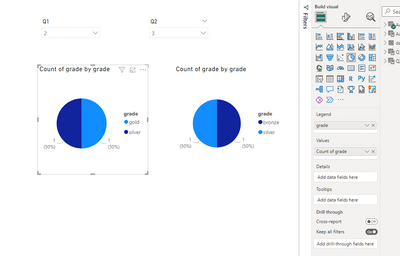
As you can see, the results are the ones you expect to obtain:
Should you need any clarifications, let me know.
- Mark as New
- Bookmark
- Subscribe
- Mute
- Subscribe to RSS Feed
- Permalink
- Report Inappropriate Content
@barritown thanks for the solution. it is too complicated but it seems it is working. my dataset has 2k rows and it will be fine.
- Mark as New
- Bookmark
- Subscribe
- Mute
- Subscribe to RSS Feed
- Permalink
- Report Inappropriate Content
@lbendlin thanks for your kind message. However, this is not what I need. I need 2 pie charts with grades. thanks again.
- Mark as New
- Bookmark
- Subscribe
- Mute
- Subscribe to RSS Feed
- Permalink
- Report Inappropriate Content
