cancel
Showing results for 
Search instead for 
Did you mean: 

July 7 - July 17 | Round 2 of the Power BI Dataviz World Championships. Don't miss your chance! Learn more

Reply
Anonymous
Not applicable

How to do complex conditional formatting

Hello Guys, I have face an issues based on conditional formatting. Hope you can help

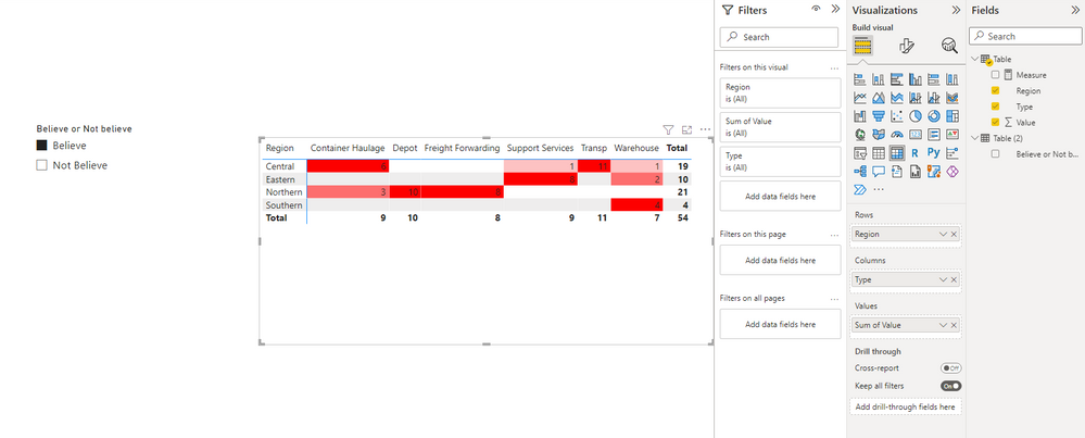
What I plan to do know is, when I click on "believe" (shown as 1 below), the highest number in the table should show th darkest red, and smallest number should show lightest red


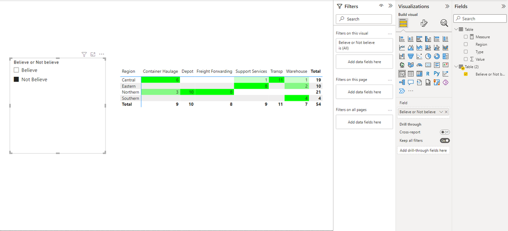
On the other side, when i click on "not believe" (shown as 2 below), the highest number in the table should show darkest green, else, lightest green

YongZhao_0-1664172241311.png


1 ACCEPTED SOLUTION
Anonymous
Not applicable

Hi @Anonymous ,


Gradients in conditional formatting cannot currently change color gradients dynamically.

As a workaround, You could create a measure, define color intervals, and apply it to conditional formatting.

For example, here I define three intervals.

Measure = 
var _max=MAXX(FILTER(ALLSELECTED('Table'),[Type]=MAX('Table'[Type])),[Value])
var _value=SUM('Table'[Value])
var _red=SWITCH(TRUE(),_value>0&&_value<=_max/3,"#FDC2C2",_value>_max/3&&_value<=_max/3*2,"#FD6E6E",_value>_max/3*2&&_value<=_max,"#FD0000")
var _green=SWITCH(TRUE(),_value>0&&_value<=_max/3,"#CCFECC",_value>_max/3&&_value<=_max/3*2,"#86F986",_value>_max/3*2&&_value<=_max,"#00FF00")
return SWITCH(SELECTEDVALUE('Table (2)'[Believe or Not believe]),"Believe",_red,"Not Believe",_green)

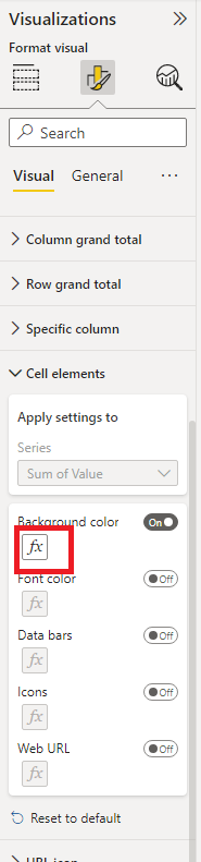
Click the "fx" under the cell elements.

vstephenmsft_0-1664245237422.png

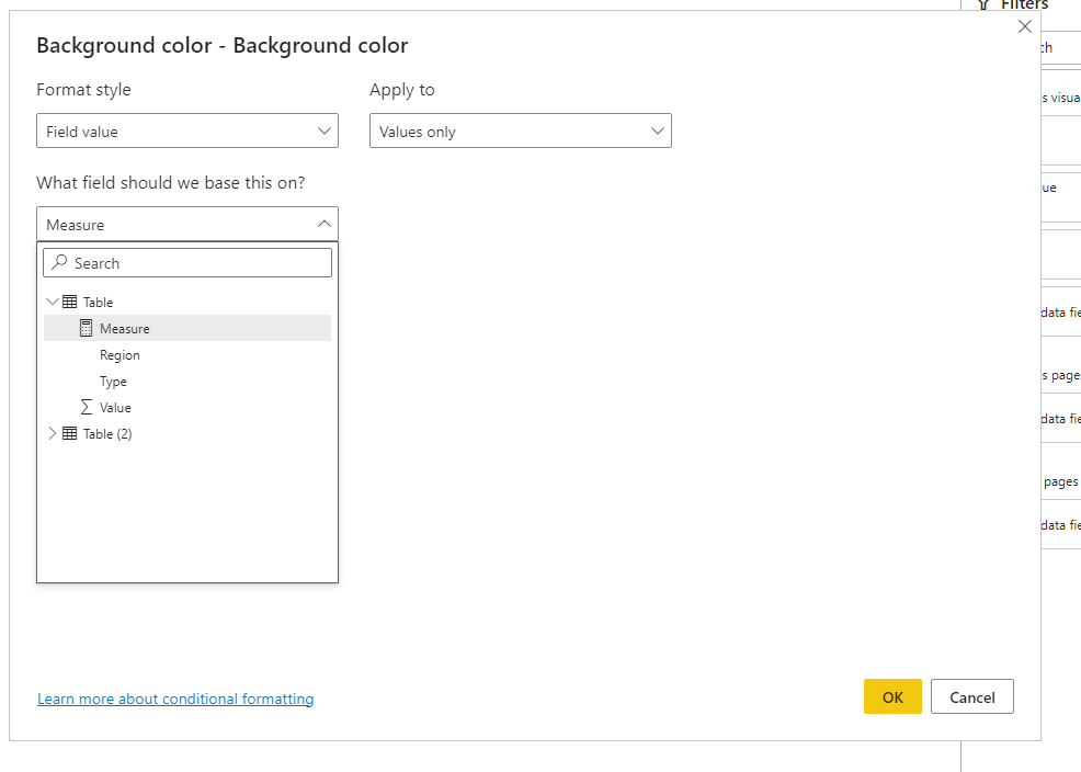
Select Based on the measure I created.

vstephenmsft_1-1664245279566.png

vstephenmsft_2-1664245337388.png

vstephenmsft_3-1664245356221.png


Best Regards,

Stephen Tao


If this post helps, then please consider Accept it as the solution to help the other members find it more quickly.


View solution in original post

1 REPLY 1
Anonymous
Not applicable

Hi @Anonymous ,


Gradients in conditional formatting cannot currently change color gradients dynamically.

As a workaround, You could create a measure, define color intervals, and apply it to conditional formatting.

For example, here I define three intervals.

Measure = 
var _max=MAXX(FILTER(ALLSELECTED('Table'),[Type]=MAX('Table'[Type])),[Value])
var _value=SUM('Table'[Value])
var _red=SWITCH(TRUE(),_value>0&&_value<=_max/3,"#FDC2C2",_value>_max/3&&_value<=_max/3*2,"#FD6E6E",_value>_max/3*2&&_value<=_max,"#FD0000")
var _green=SWITCH(TRUE(),_value>0&&_value<=_max/3,"#CCFECC",_value>_max/3&&_value<=_max/3*2,"#86F986",_value>_max/3*2&&_value<=_max,"#00FF00")
return SWITCH(SELECTEDVALUE('Table (2)'[Believe or Not believe]),"Believe",_red,"Not Believe",_green)

Click the "fx" under the cell elements.

vstephenmsft_0-1664245237422.png

Select Based on the measure I created.

vstephenmsft_1-1664245279566.png

vstephenmsft_2-1664245337388.png

vstephenmsft_3-1664245356221.png


Best Regards,

Stephen Tao


If this post helps, then please consider Accept it as the solution to help the other members find it more quickly.


Helpful resources

Announcements
FabCon and SQLCon Barcelona 2026

FabCon & SQLCon – Barcelona 2026

Join us in Barcelona for FabCon and SQLCon, the Fabric, Power BI, SQL, and AI community event. Save €200 with code FABCMTY200.

60 days of Data Days Carousel

Data Days 2026

Join Fabric Data Days 2026: 60 days of free live/on-demand sessions, challenges, study groups, and certification opportunities.

Power BI DataViz World Championships carousel

Power BI DataViz World Championships - June 2026

A new Power BI DataViz World Championship is coming this June! Don't miss out on submitting your entry.

Top Solution Authors