Huge last-minute discounts for FabCon Vienna from September 15-18, 2025
Supplies are limited. Contact info@espc.tech right away to save your spot before the conference sells out.
Get your discount- Power BI forums
- Get Help with Power BI
- Desktop
- Service
- Report Server
- Power Query
- Mobile Apps
- Developer
- DAX Commands and Tips
- Custom Visuals Development Discussion
- Health and Life Sciences
- Power BI Spanish forums
- Translated Spanish Desktop
- Training and Consulting
- Instructor Led Training
- Dashboard in a Day for Women, by Women
- Galleries
- Data Stories Gallery
- Themes Gallery
- Contests Gallery
- Quick Measures Gallery
- Notebook Gallery
- Translytical Task Flow Gallery
- TMDL Gallery
- R Script Showcase
- Webinars and Video Gallery
- Ideas
- Custom Visuals Ideas (read-only)
- Issues
- Issues
- Events
- Upcoming Events
Score big with last-minute savings on the final tickets to FabCon Vienna. Secure your discount
- Power BI forums
- Forums
- Get Help with Power BI
- Desktop
- How to display a bar chart with variations and arr...
- Subscribe to RSS Feed
- Mark Topic as New
- Mark Topic as Read
- Float this Topic for Current User
- Bookmark
- Subscribe
- Printer Friendly Page
- Mark as New
- Bookmark
- Subscribe
- Mute
- Subscribe to RSS Feed
- Permalink
- Report Inappropriate Content
How to display a bar chart with variations and arrows
Hi All,
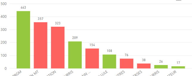
I am trying to reproduce the bar chart below in power BI
The down arrow and the -36% represent the percentage variation with previous year
Below is my attempt in power BI
Now my challenge is how to display the down arrow and % variation just like on the first bar chart? How can I solve this?
- Mark as New
- Bookmark
- Subscribe
- Mute
- Subscribe to RSS Feed
- Permalink
- Report Inappropriate Content
Thanks. This definitely is one solution but i was able to get my solution from another user. Yours however is another version of it. Thanks!
- Mark as New
- Bookmark
- Subscribe
- Mute
- Subscribe to RSS Feed
- Permalink
- Report Inappropriate Content
Hi @Anonymous ,
Bar chart doesn't support it in Power BI currently.
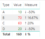
However you could use table or matrix visual to do it.
Here is my test file for your reference.
If this post helps, then please consider Accept it as the solution to help the other members find it.
Helpful resources
| User | Count |
|---|---|
| 64 | |
| 59 | |
| 47 | |
| 32 | |
| 31 |
| User | Count |
|---|---|
| 84 | |
| 73 | |
| 52 | |
| 50 | |
| 44 |


