FabCon is coming to Atlanta
Join us at FabCon Atlanta from March 16 - 20, 2026, for the ultimate Fabric, Power BI, AI and SQL community-led event. Save $200 with code FABCOMM.
Register now!- Power BI forums
- Get Help with Power BI
- Desktop
- Service
- Report Server
- Power Query
- Mobile Apps
- Developer
- DAX Commands and Tips
- Custom Visuals Development Discussion
- Health and Life Sciences
- Power BI Spanish forums
- Translated Spanish Desktop
- Training and Consulting
- Instructor Led Training
- Dashboard in a Day for Women, by Women
- Galleries
- Data Stories Gallery
- Themes Gallery
- Contests Gallery
- Quick Measures Gallery
- Notebook Gallery
- Translytical Task Flow Gallery
- TMDL Gallery
- R Script Showcase
- Webinars and Video Gallery
- Ideas
- Custom Visuals Ideas (read-only)
- Issues
- Issues
- Events
- Upcoming Events
Calling all Data Engineers! Fabric Data Engineer (Exam DP-700) live sessions are back! Starting October 16th. Sign up.
- Power BI forums
- Forums
- Get Help with Power BI
- Desktop
- Re: How to display Month Year instead of Year in ...
- Subscribe to RSS Feed
- Mark Topic as New
- Mark Topic as Read
- Float this Topic for Current User
- Bookmark
- Subscribe
- Printer Friendly Page
- Mark as New
- Bookmark
- Subscribe
- Mute
- Subscribe to RSS Feed
- Permalink
- Report Inappropriate Content
How to display Month Year instead of Year in X Axis
I have data with Dates, amount value for every date. I tried line graph but it is showing year not able to show Month year on x axis. I tried new column "Month-Year" and set on x axis but line graph looks change it is not same look as done with Date. It consider sum for months and year. Please let me know how i can fix this
- Mark as New
- Bookmark
- Subscribe
- Mute
- Subscribe to RSS Feed
- Permalink
- Report Inappropriate Content
Hi @Anonymous
If you've fixed the issue on your own please kindly share your solution. if the above posts help, please kindly mark it as a solution to help others find it more quickly.thanks!
If this post helps, then please consider Accept it as the solution to help the other members find it more
quickly.
- Mark as New
- Bookmark
- Subscribe
- Mute
- Subscribe to RSS Feed
- Permalink
- Report Inappropriate Content
Hi @Anonymous
Use below formula to convert the Date as a new calculated column:
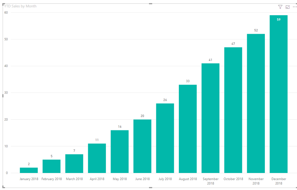
Month = FORMAT('Date'[Date], "mmmm") & " " & YEAR('Date'[Date])Then drag it to X-axis:
If this post helps, then please consider Accept it as the solution to help the other members find it more
quickly.
- Mark as New
- Bookmark
- Subscribe
- Mute
- Subscribe to RSS Feed
- Permalink
- Report Inappropriate Content
If you've created a manual mth-year column and your data on the graph looks strange, it's probably because the graph is sorted/ordered alphabetically. You will need to create a column that will show the order of the mth-year.
Mth Year Mth Year Index
Jan-19 1
Feb-19 2
Mar-19 3
Then in the Modelling section, select the column that you have Mth-Year in and then select the Sort by Column option and then select the Mth Year Index, this will order your Mth Year Index properly.
Did I answer your question? Mark my post as a solution!
Proud to be a Super User!
- Mark as New
- Bookmark
- Subscribe
- Mute
- Subscribe to RSS Feed
- Permalink
- Report Inappropriate Content
thanks for the quick response. I will try that but i need to display "Month -year" in x axis instead of "year"
- Mark as New
- Bookmark
- Subscribe
- Mute
- Subscribe to RSS Feed
- Permalink
- Report Inappropriate Content
If you create a Mth-Year column in your data model and have a Mth-Year index then it'll work fine.
Let me know how you get on, happy to help.
Did I answer your question? Mark my post as a solution!
Proud to be a Super User!
- Mark as New
- Bookmark
- Subscribe
- Mute
- Subscribe to RSS Feed
- Permalink
- Report Inappropriate Content
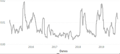
using date field in x axis my graph looks like but it should year. I need show in this format but in x axis display month and year
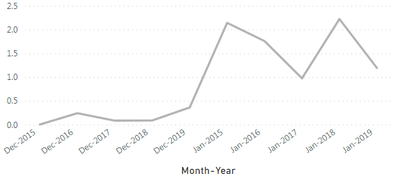
as suggested in this post, i tried doing new columns month-year and month year index , my graph looks like this which is incorrect
- Mark as New
- Bookmark
- Subscribe
- Mute
- Subscribe to RSS Feed
- Permalink
- Report Inappropriate Content
Hey, the graph is incorrect as you needed to order the Mth-Year otherwise it orders alphabetically, that's why you see Dec-2017 beside Dec-2018. I think I've misunderstood what you wanted originally, you still want the intervals to show individually and not rolling them up into a monthly view.
Did I answer your question? Mark my post as a solution!
Proud to be a Super User!
- Mark as New
- Bookmark
- Subscribe
- Mute
- Subscribe to RSS Feed
- Permalink
- Report Inappropriate Content
I still want the intervals to show individually
- Mark as New
- Bookmark
- Subscribe
- Mute
- Subscribe to RSS Feed
- Permalink
- Report Inappropriate Content
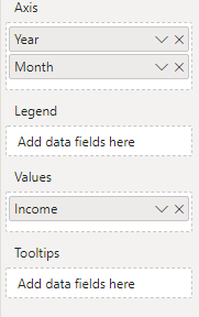
You can get this by putting the year and month separately in the Axis, then using the expand down option. See the pics below... 
Helpful resources

FabCon Global Hackathon
Join the Fabric FabCon Global Hackathon—running virtually through Nov 3. Open to all skill levels. $10,000 in prizes!

Power BI Monthly Update - October 2025
Check out the October 2025 Power BI update to learn about new features.


