- Power BI forums
- Updates
- News & Announcements
- Get Help with Power BI
- Desktop
- Service
- Report Server
- Power Query
- Mobile Apps
- Developer
- DAX Commands and Tips
- Custom Visuals Development Discussion
- Health and Life Sciences
- Power BI Spanish forums
- Translated Spanish Desktop
- Power Platform Integration - Better Together!
- Power Platform Integrations (Read-only)
- Power Platform and Dynamics 365 Integrations (Read-only)
- Training and Consulting
- Instructor Led Training
- Dashboard in a Day for Women, by Women
- Galleries
- Community Connections & How-To Videos
- COVID-19 Data Stories Gallery
- Themes Gallery
- Data Stories Gallery
- R Script Showcase
- Webinars and Video Gallery
- Quick Measures Gallery
- 2021 MSBizAppsSummit Gallery
- 2020 MSBizAppsSummit Gallery
- 2019 MSBizAppsSummit Gallery
- Events
- Ideas
- Custom Visuals Ideas
- Issues
- Issues
- Events
- Upcoming Events
- Community Blog
- Power BI Community Blog
- Custom Visuals Community Blog
- Community Support
- Community Accounts & Registration
- Using the Community
- Community Feedback
Register now to learn Fabric in free live sessions led by the best Microsoft experts. From Apr 16 to May 9, in English and Spanish.
- Power BI forums
- Forums
- Get Help with Power BI
- Desktop
- Re: How to deal with a "(BLANK)" value in a card v...
- Subscribe to RSS Feed
- Mark Topic as New
- Mark Topic as Read
- Float this Topic for Current User
- Bookmark
- Subscribe
- Printer Friendly Page
- Mark as New
- Bookmark
- Subscribe
- Mute
- Subscribe to RSS Feed
- Permalink
- Report Inappropriate Content
How to deal with a "(BLANK)" value in a card visualization
My dashboard showed "(BLANK)" as the value in a card visualization - when I really wanted to see "0".
Is there a best practice to deal with this, or a simple way to adjust this?
Here is my current solution.
Note: This does not seem to be a data type issue. The card is calling on a measure that is calculated as follows:
Total CRs that have moved to P = CALCULATE([Total CRs - for calculations], 'Release_CRs_Systems (CRs Moved Only)'[Friendly System Name] = "P")
2) The data type for "Total CRs - for caculations" is "Whole Number"
3) [Total CRs - for calculations] is a SUM function - type "Whole Number"
CURRENT SOLUTION:
Create a new measure that evaluates [Total CRs that have moved to P] and uses IF(ISBLANK)
DISPLAY CALC FOR CR IN P =
IF( ISBLANK('Release_CRs_Systems (CRs Moved Only)'[Total CRs that have moved to P])
, 0
, ( 'Release_CRs_Systems (CRs Moved Only)'[Total CRs that have moved to P]))
*****
Can anyone provide a more elegant solution?
- Mark as New
- Bookmark
- Subscribe
- Mute
- Subscribe to RSS Feed
- Permalink
- Report Inappropriate Content
Create a simple Measure.
A measure Is just like a column in the data which you can add logic expression.
My problem was counting rows and then the output was blank.
I solved by;
- Mark as New
- Bookmark
- Subscribe
- Mute
- Subscribe to RSS Feed
- Permalink
- Report Inappropriate Content
I have done it this way as well.
- Mark as New
- Bookmark
- Subscribe
- Mute
- Subscribe to RSS Feed
- Permalink
- Report Inappropriate Content
Hi,
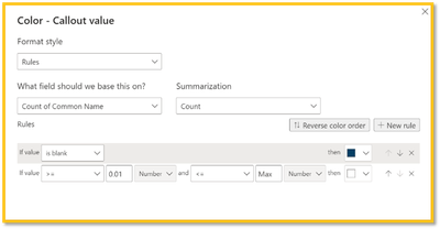
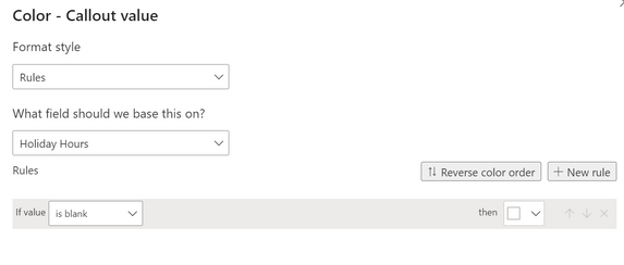
You can hide the blank value using a Conditional Formatting rule on the Callout Value. The rule is 'if blank' then select the same color as the card or canvas background.
I have created a video tutorial on how to create the conditional rule: https://youtu.be/Xsmbfpa4oCA
- Mark as New
- Bookmark
- Subscribe
- Mute
- Subscribe to RSS Feed
- Permalink
- Report Inappropriate Content
This only works if you have a singular color background/fill. Is there a solution to this if you have a gradient fill background? I'd like to simply display nothing for the value instead of the text (Blank) in the card.
- Mark as New
- Bookmark
- Subscribe
- Mute
- Subscribe to RSS Feed
- Permalink
- Report Inappropriate Content
Hi, I cant say its a great solution, but I found that applying a conditional formatting to the 'Callout value' solved it for me.
for a card Visual: --> Format Visual --> Callout Value --> colour (fx)
Then set Format style to Rules, field based on whatever column you are counting from, summarization: Count--> and set 2 rules:
1: If Value Is blank --> set the text colour to the same as the background it is on
2: if value > 0 Number and < 10000000 Number --> then colour to whatever colour you want the text when it isnt 0/blank
- Mark as New
- Bookmark
- Subscribe
- Mute
- Subscribe to RSS Feed
- Permalink
- Report Inappropriate Content
This is how I do it as well. I have found it to be the least complicated and straight forward approach. I agree it seems as thought this could just be a setting in Power BI. Also, I have only applied the first (Is Blank) rule above without the 2nd rule and it seems to work just fine.
- Mark as New
- Bookmark
- Subscribe
- Mute
- Subscribe to RSS Feed
- Permalink
- Report Inappropriate Content
I agree, this has saved me from recreating all my output values as measures which I don't think should be necessary.
I applied the second rule in my case as without it the text colour default to Black (for me it did at least), where as I needed mine to be white text.
- Mark as New
- Bookmark
- Subscribe
- Mute
- Subscribe to RSS Feed
- Permalink
- Report Inappropriate Content
Thanks, It works. But I have to say this is so stupid. Why the hell is power bi missing so many features.
- Mark as New
- Bookmark
- Subscribe
- Mute
- Subscribe to RSS Feed
- Permalink
- Report Inappropriate Content
Generally i agree with you. It looks really awkward
- Mark as New
- Bookmark
- Subscribe
- Mute
- Subscribe to RSS Feed
- Permalink
- Report Inappropriate Content
For the card(s) with (blank), go to Data label
1. Right click on color of the Data label
2. Choose conditional formatting
3. on Format By drop down choose Rules
4. on Base on field choose the field that is used for the card in question
5. Choose appropriate Summarization you want (I chose Sum)
6. Under Rules select drop down if value and choose is blank
here is the trick. my cards are for heat map with 5 by 5 cards for a total of 25
quadrant 1x1 is green, so for that card my choise is
is value = is blank so I choose color gree which hides the Data Label of (Blank)
- Mark as New
- Bookmark
- Subscribe
- Mute
- Subscribe to RSS Feed
- Permalink
- Report Inappropriate Content
Great idea! Thank you!
- Mark as New
- Bookmark
- Subscribe
- Mute
- Subscribe to RSS Feed
- Permalink
- Report Inappropriate Content
This worked perfectly for me.
- Mark as New
- Bookmark
- Subscribe
- Mute
- Subscribe to RSS Feed
- Permalink
- Report Inappropriate Content
If I use the card visual in relation to 'gender', I am having issues solving the blank dillemma because there is no zero value in my data, its either male or female. On my dashboard, when I click the male icon the female icon will appear as blank and vice versa. Ideally when I click on the male icon I would like the female icon to appear as "N/A" or "Zero" is anyone able to help me with this issue I am having, any help is greatly appreciated 🙂
- Mark as New
- Bookmark
- Subscribe
- Mute
- Subscribe to RSS Feed
- Permalink
- Report Inappropriate Content
Similar issue here, dealing with non-numeric values.
It'd be nice if you could conditionally format the card, so if it have no data to present, I can conditonal the background color and text color as same, creating the illusion that nothing is presented on the card.
- Mark as New
- Bookmark
- Subscribe
- Mute
- Subscribe to RSS Feed
- Permalink
- Report Inappropriate Content
Just add + 0 after your measure for e.g. "Your Measure" + 0.
- Mark as New
- Bookmark
- Subscribe
- Mute
- Subscribe to RSS Feed
- Permalink
- Report Inappropriate Content
This generally works for me but didn't with my gauge visual. Might be user error.
- Mark as New
- Bookmark
- Subscribe
- Mute
- Subscribe to RSS Feed
- Permalink
- Report Inappropriate Content
- Mark as New
- Bookmark
- Subscribe
- Mute
- Subscribe to RSS Feed
- Permalink
- Report Inappropriate Content
Hi even though it seems you have solved this issue , this might be helpful for you to understand the scenario
http://powerbidax.com/how-to-deal-and-remove-blank-and-nan-value-in-power-bi/
- Mark as New
- Bookmark
- Subscribe
- Mute
- Subscribe to RSS Feed
- Permalink
- Report Inappropriate Content
Has someone created a suggestion to add functionality to the fields to add a 0 if blank? Creating a measure for every card is too excessive and limits functionality......
- Mark as New
- Bookmark
- Subscribe
- Mute
- Subscribe to RSS Feed
- Permalink
- Report Inappropriate Content
Agree.
Many times I do counts and place these in a card. I do this not by creating a new column or measure but by counting some attribute in the data.
For a count the card should show zero rather than (Blank).
Or at least that option should be available without having to create a new column or measure.
Helpful resources

Microsoft Fabric Learn Together
Covering the world! 9:00-10:30 AM Sydney, 4:00-5:30 PM CET (Paris/Berlin), 7:00-8:30 PM Mexico City

Power BI Monthly Update - April 2024
Check out the April 2024 Power BI update to learn about new features.

| User | Count |
|---|---|
| 114 | |
| 100 | |
| 81 | |
| 70 | |
| 62 |
| User | Count |
|---|---|
| 147 | |
| 116 | |
| 104 | |
| 88 | |
| 65 |


