FabCon is coming to Atlanta
Join us at FabCon Atlanta from March 16 - 20, 2026, for the ultimate Fabric, Power BI, AI and SQL community-led event. Save $200 with code FABCOMM.
Register now!- Power BI forums
- Get Help with Power BI
- Desktop
- Service
- Report Server
- Power Query
- Mobile Apps
- Developer
- DAX Commands and Tips
- Custom Visuals Development Discussion
- Health and Life Sciences
- Power BI Spanish forums
- Translated Spanish Desktop
- Training and Consulting
- Instructor Led Training
- Dashboard in a Day for Women, by Women
- Galleries
- Data Stories Gallery
- Themes Gallery
- Contests Gallery
- QuickViz Gallery
- Quick Measures Gallery
- Visual Calculations Gallery
- Notebook Gallery
- Translytical Task Flow Gallery
- TMDL Gallery
- R Script Showcase
- Webinars and Video Gallery
- Ideas
- Custom Visuals Ideas (read-only)
- Issues
- Issues
- Events
- Upcoming Events
The Power BI Data Visualization World Championships is back! Get ahead of the game and start preparing now! Learn more
- Power BI forums
- Forums
- Get Help with Power BI
- Desktop
- Re: How to de-mean Bar Chart?
- Subscribe to RSS Feed
- Mark Topic as New
- Mark Topic as Read
- Float this Topic for Current User
- Bookmark
- Subscribe
- Printer Friendly Page
- Mark as New
- Bookmark
- Subscribe
- Mute
- Subscribe to RSS Feed
- Permalink
- Report Inappropriate Content
How to de-mean Bar Chart?
Hi All,
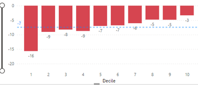
From the example bar chart below, the blue dotted line is the average line. (-16+-9+...)/10 = -7. Instead of plotting the average as a line, I would like to subtract (-7), to all the y-values in the bar chart and the y-values are measures. For example, the value I want for decile 1 is -16-(-7)=-9.
Any help greatly appreciated, Thanks.
qngu
Solved! Go to Solution.
- Mark as New
- Bookmark
- Subscribe
- Mute
- Subscribe to RSS Feed
- Permalink
- Report Inappropriate Content
Ok, that makes way more sense.
Try:
Values minus mean for measure 1 =
VAR _Mean =
    AVERAGEX ( ALLSELECTED ( Table[Decile] ), [Your measure] )
RETURN
    IF ( NOT ( ISBLANK ( [Your Measure] ) ), [Your Measure] - _Mean )
Did I answer your question? Mark my post as a solution!
In doing so, you are also helping me. Thank you!
Proud to be a Super User!
Paul on Linkedin.
- Mark as New
- Bookmark
- Subscribe
- Mute
- Subscribe to RSS Feed
- Permalink
- Report Inappropriate Content
In that case:
Values minus mean for measure 1 =
VAR _Mean = DIVIDE([Measure 1] + Measure 2] + Measure 3] ...and so on upto Measure 10] , 10)
RETURN
[Measure 1] - _Mean
and repeat for each of the measures
You can't make it dynamic with your structure
Did I answer your question? Mark my post as a solution!
In doing so, you are also helping me. Thank you!
Proud to be a Super User!
Paul on Linkedin.
- Mark as New
- Bookmark
- Subscribe
- Mute
- Subscribe to RSS Feed
- Permalink
- Report Inappropriate Content
Sorry, I mis-understood you when you said each bar is a measure. Each bar is is calculated using a single measure. A simple example:
Table1
Date | Value | Decile
1/1/2000 | -8 | '1'
1/1/2001 | -8 | '1'
1/1/2000 | -4.5 | '2'
1/1/2001 | -4.5 | '2'
....
Measure_1 = sum(Value) is set as the y-values and the x-values is set with the Decile column. So for decile 1, the measure will be -8+-8=-16, which is what we see in the bar chart and so on for each decile.
So there's only 1 measure, not 10. Sorry for the mis-understanding.
- Mark as New
- Bookmark
- Subscribe
- Mute
- Subscribe to RSS Feed
- Permalink
- Report Inappropriate Content
Ok, that makes way more sense.
Try:
Values minus mean for measure 1 =
VAR _Mean =
    AVERAGEX ( ALLSELECTED ( Table[Decile] ), [Your measure] )
RETURN
    IF ( NOT ( ISBLANK ( [Your Measure] ) ), [Your Measure] - _Mean )
Did I answer your question? Mark my post as a solution!
In doing so, you are also helping me. Thank you!
Proud to be a Super User!
Paul on Linkedin.
- Mark as New
- Bookmark
- Subscribe
- Mute
- Subscribe to RSS Feed
- Permalink
- Report Inappropriate Content
Awesome. Thanks for the solution, I was looking for this and accepted this as the solutin as well.
- Mark as New
- Bookmark
- Subscribe
- Mute
- Subscribe to RSS Feed
- Permalink
- Report Inappropriate Content
Is each bar a measure then? If so, will there only ever be 10 data points?
Did I answer your question? Mark my post as a solution!
In doing so, you are also helping me. Thank you!
Proud to be a Super User!
Paul on Linkedin.
- Mark as New
- Bookmark
- Subscribe
- Mute
- Subscribe to RSS Feed
- Permalink
- Report Inappropriate Content
Yes, each bar is a measure. Yes, there will only ever be 10 data points in this case. I'm hoping that it can be generalized to the number of categories on the X-axis though.
Thanks for taking a look,
qngu
Helpful resources

Power BI Dataviz World Championships
The Power BI Data Visualization World Championships is back! Get ahead of the game and start preparing now!

| User | Count |
|---|---|
| 40 | |
| 38 | |
| 36 | |
| 29 | |
| 28 |
| User | Count |
|---|---|
| 127 | |
| 88 | |
| 78 | |
| 66 | |
| 65 |


